First published in Max Bill, Fundación Juan March, 2015
Interview by Manuel Fontán del Junco | Courtesy of Fundación Juan March
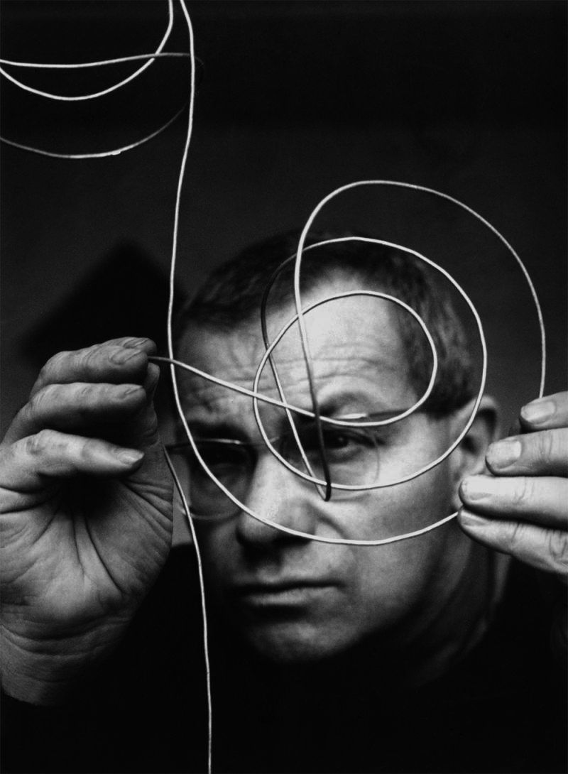
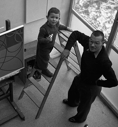
The following text contain a long conversation about Max Bill – especially his painting and sculpture–, which took place in the library of the Fundación Juan March in Madrid on April 20, 2015. In view of the abundant literature about the Swiss artist’s work, from texts by Margit Staber and Eduard Hüttinger to more recent essays, the idea for this interview emerged as an opportunity to enrich it with the testimony of someone very familiar with Bill the artist: Jakob Bill. Born in Zurich in 1942, this doctor in archaeology and artist is the son of Max and Binia Bill. As such, he has been a privileged observer not only of his father’s life but also his work over the course of several decades. Apart from being his son, Jakob Bill is also a particularly important witness for other reasons: first, because he is an artist himself –not long ago the Haus Konstruktiv in Zurich did a retrospective of his work –; second, because he has been a curator and advisor for many of the exhibitions by and about his father; and finally, because, as the director of the max, binia + jakob bill stiftung [max, binia + jakob bill foundation], his knowledge of his father’s life and work extends to his writings, a good deal of which he has already published, specifically the ones about architecture and design.
*a custom followed at the bauhaus, which max bill adopted, was to write in lowercase letters. jakob bill’s answers in this interview appear in lowercase.
Let’s start with something that’s surprising about Max Bill: the variety of his activities and his intensity. Your father was what we might now call a multi-talented man: he was an architect, painter, sculptor, designer, educator, essayist, publisher… My first question is: how did he manage? How did he find the time to do so many different things? Can you remember anything about that?
you’ve put it very well: he was a multi-talented man. there are those who have referred to him using the medieval concept of homo universalis. he was regularly informed about what was going on in all those fields and he never took any vacation; it was as if, by going from one area of interest into another, he regenerated himself. it filled him with energy again and again every time he turned to something different.
That is to say that for him, switching activities helped him not get tired… What was a day in the life of Max Bill like?
i can only answer part of that question. until 1949 bill worked at home. later he had an office in the city. in the book about the exhibition die gute form [good design] i’ve described bill’s activities during the period of preparations for the show, inaugurated in basel in 1949. i tried to reconstruct his everyday activities over the course of a few months. naturally, he had people working for him. the teams that carry out projects like the ones he and his team did are much bigger today. if you visit an architecture or a design studio you might find up to 20 or more people working there. bill had, at most, two or three assistants and one secretary; that’s the ratio.
What kind of work did he do at that studio?
projects related to architecture, design… and he also wrote.
And did he paint?
no, he painted at home only in the original studio, in höngg. most of the ideas for sculptures occurred to him at home; sometimes at the office. later, when he was working in ulm, he had some of the sculptures made in the a workshop owned by the school specialized in plaster and then he would touch them up, like the monument to georg büchner for example8 .
As a sculptor, did he always work with the same workshops?
he used several different ones, depending on the materials he was working with. in the 1930s he worked with a turner on wood sculptures; then with a workshop that soldered the metal pieces, which were then sprayed by others. there was also a former classmate of his from his time at the school of arts and crafts, a silversmith, who would make the sculptures. the final touch, the polishing of the surfaces, was partially done by bill himself, at least until the 1950s. and the plaster casts for the large sculptures were done by a plasterer.
Did Bill do any painting when he was at the School of Arts and Crafts in Zurich, from 1925 to 1927?
yes, but not at the school.
By the way: Bill was not the first artist in the family, because there’s an ancestor of yours who was a painter.
yes. bill had an uncle on his mother’s side, ernst geiger, a forest engineer, who subsequently became a painter. and his godfather, adolf weibel, was curator of the collection of the canton of aargau since 1927; he was a drawing teacher and a painter. and bill’s father, my grandfather, was also the secretary of the swiss art association; by profession he was assistant stationmaster of the railway station in winterthur, an industrial city north of zurich, where bill was born.
Let’s jump ahead in time a few years. Whilst studying in Zurich at the School of Arts and Crafts, your father went to Paris to visit the 1925 International Exhibition.
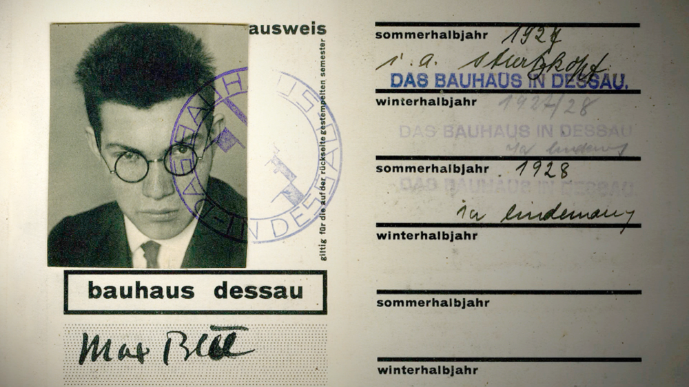
that’s right. the works he did in silver as a student at the school of arts and crafts in zurich had been selected for the exposition internationale des arts décoratifs et industriels modernes [international exhibition of modern decorative and industrial arts]. and he was able to go to paris to see them on show. we still have a picture he took of the showcase where they were displayed. but in addition to visiting the exhibition, he also had the chance to admire the new modern architecture, which he had never seen before, and was greatly impressed by the pavilions designed by le corbusier, konstantín mélnikov and frederick kiesler, among others.
And did he have the chance to discover Parisian painting from that time?
well… i guess he was able to see modern painting in the same le corbusier pavilion “l’esprit nouveau”…
Yes: Le Corbusier’s own works and paintings by Juan Gris, Pablo Picasso…
during his childhood he also had the chance to visit several exhibitions with my grandfather. for example, there is a little sketch he did at a very young age of a painting by ferdinand hodler at the winterthur museum. in any case, let me tell you that at home, there was very little talk about my parents’ history and life before i was born. i’ve had to research it myself many times later on. the truth is, my parents did not find the past particularly interesting. at home, we talked about the present and future.
That seems very characteristic of your father. You really never talked about the past?
well, hardly. with me it’s different: i’m a historian, an archaeologist. my father was more of… a futurist.
He concentrated on the present and looked to the future. In other words, he lived in the moment. Going back to my first question, and to be more specific: how did he optimize his time? How did he manage to fit it all in? Did he work until late at night?
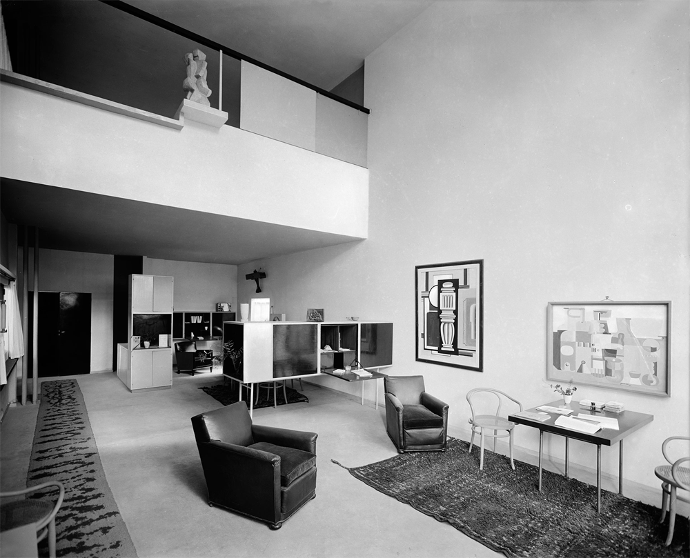
to answer that question, we have to talk about his profession again. he saw himself as an architect his entire life, and he always referred to himself as such, although he never actually got a degree in that field. at the bauhaus he was finally able to study architecture, although first he had to pass the vorkurs [preliminary course]. but it was while he was taking that course that he entered his first architecture competition. he tied for third place in a competition to design a residential and office building in osaka (japan). a japanese classmate of his at the bauhaus helped him with the translations he needed to do. at the bauhaus he finished three semesters and went back to zurich in late 1928. in the 1930s, he designed and built our family home in zurich höngg (from 1932 to 1933), and a house for some relatives in the vicinity of basel (1936), as well as the swiss pavilion at the milan triennale (1936). but to go back to your question: the fact is, when there was an interesting architecture competition, he would set aside all his other work –graphic design for advertising, painting, lectures, etc. –and work on the project night and day.
Now that you’ve returned to the subject of his career, let me ask you about your father’s ideas about the “profession” of the artist. To be precise, he believed (and he argued this in his writings) that all artists should have another job to earn their daily bread.
yes, that’s an idea that he spread later on; and i see it as he did: artists only have the freedom to do what they really want when they also have a job to live on.
And Bill was an example of that belief you and he share. yes. in his case, he didn’t get many architecture commissions and he won few competitions, which is why he couldn’t make a living as an architect alone.
In any case, with that stance he broke with an entire artistic tradition. I’m talking about that idea that took hold during Romanticism, of the pure artist and art for art’s sake; the idea that an artist must be only an artist.
yes.
Has that also been the case of the other “concrete” artists? well, for example, richard paul lohse started out as a graphic designer…
And Theo van Doesburg also worked as a designer and a graphic artist… What about Georges Vantongerloo? vantongerloo was a different story. he had studied sculpture at the fine arts academy and only worked as an artist.
So, let’s talk about painting. At the Bauhaus, your father attended Josef Albers’ Vorkurs. What other workshops did he take there?
both during and after the vorkurs, which was mandatory, he attended the official bauhaus workshops. during the second semester he took the metal workshop, and during the third he studied with hannes meyer in the architecture department. he also took oskar schlemmer and xanti schawinsky’s theater workshop. and he attended the free painting classes [freie malklassen] taught by paul klee and wassily kandinsky, which took place in the teachers’ homes. with schawinsky and klee he was also able speak swiss german, which was his native tongue, not german.
Before that, at the School of Arts and Crafts in Zurich, did Bill study painting?
there they had to pass different courses depending on what profession they were pursuing: drawing, modeling, metalworking…
But not painting.
no, not painting. that wasn’t one of the subjects in the curriculum. he actually got his taste for painting from his uncle, ernst geiger. bill would spend his vacations at his home next to lake biel or in the canton of ticino, painting.
You could say, then, that as a painter, and probably as a sculptor, Bill was sort of a selftaught artist trained at the Bauhaus, not an academy artist.
that’s right. he wasn’t an academic artist but rather self-taught, yes.
There wasn’t a Fine Arts Academy in Zurich?
no, there wasn’t. that wasn’t the swiss model. swiss students who wanted to receive that type of training would go to paris or munich…
Or Berlin or Vienna… Fine, now let’s go back to Bill’s ability to optimize his time and divide it up among his various projects. Did Bill draw distinctions between his different activities?
no, not very precise ones. in fact, in his writings it’s clear how he applied concepts from one field to another. when my father died, this is what made me decide not to split up his archive. one institution was interested in his architecture, another in some other part of his work. and i was against it, because breaking it up like that went against his work, which brought everything together: architecture, painting, sculpture, spatial planning… everything is interrelated: typography and painting and viceversa, etc. today, with hindsight, we might be able to say: this should be put in this category or the other… but my father was not in favor of a very strict separation: this is this and that is that. no: as he saw it, everything went hand in hand.
And when did that constant transfer of ideas among his different fields of activity begin?
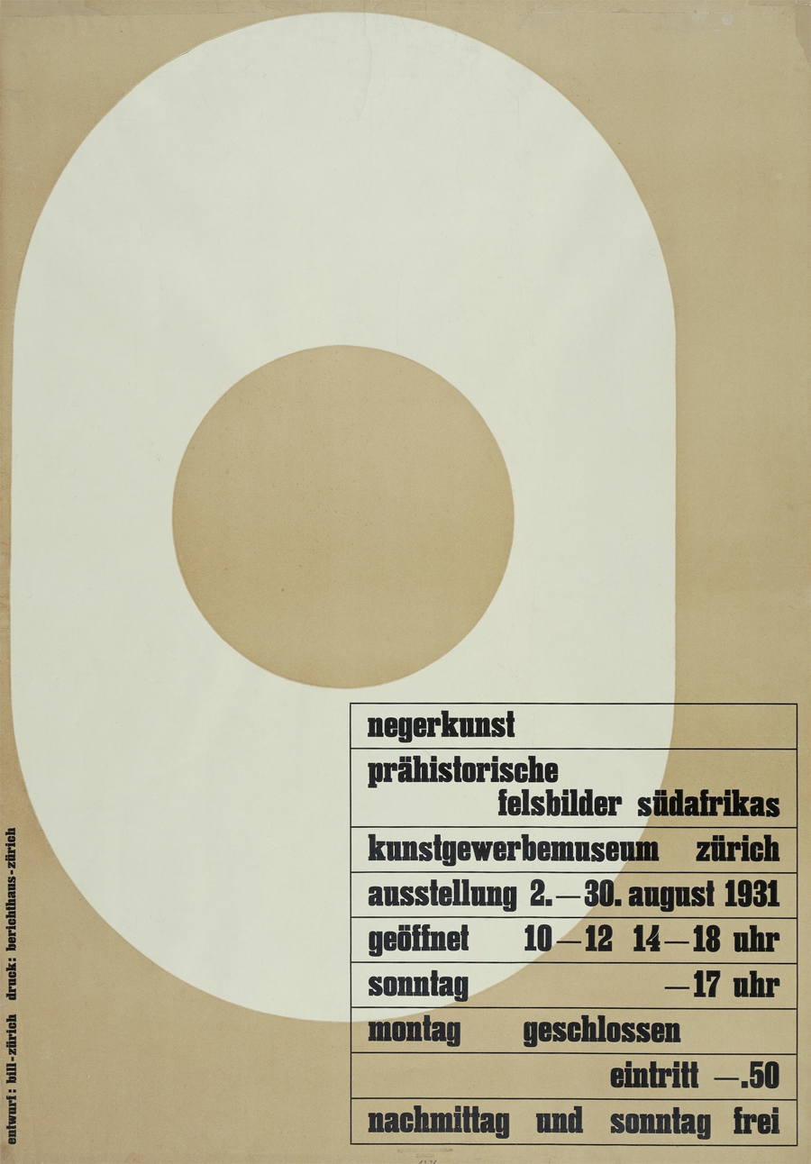
examples of that way of going about things can be found as early as the 1930s. there is, for instance, his 1931 design for the poster for the exhibition negerkunst [negro art ] –back then this expression was still acceptable–, an oval in a vertical position with a hole in the middle that can be tied to his first well-relief [relief with waves], a horizontal oval he did that same year, or the “o” from the font bill created for the company wohnbedarf. the idea is the same, but applied differently according to the field.
In the case you’ve just mentioned, we also actually have a poster, a logo and an object, which is a work of art. And in the well-relief there is also a connection between painting and sculpture…
that’s right.
Our recent exhibition in Palma and Cuenca shows in many cases –as you yourself have explained from time to time– that painting has influenced his graphic work, and vice-versa.
well, more like the other way around. in general, graphic work has not influenced his painting. with the graphic work, what happens is that ultimately, other technical possibilities come into play that allow a work to be reproduced exactly, with the same qualities, allowing a wider dissemination of the piece.
And how did his “architectural” mentality influence his painting?
that’s hard to say because for him, the essential thing in his architecture was the surroundings, the topography, as in the case of the villiger house, the building for the ulm school of design, his project for a school in freudenberg and the house in höngg, which bill also adapted to the landscape. this is very dominant in his architecture.
Topography, of course, has no use, no application in painting…
painting is two-dimensional and has nothing to do with the surrounding landscape.
Although it does have to do with architecture and sculpture.
yes, but sculpture is closer to exhibition design. sculpture is volume related to space.
Yet in one of his texts, Bill clearly points out that the design of exhibition spaces is a function of architecture. naturally. that’s why bill referred to it as exhibition architecture.
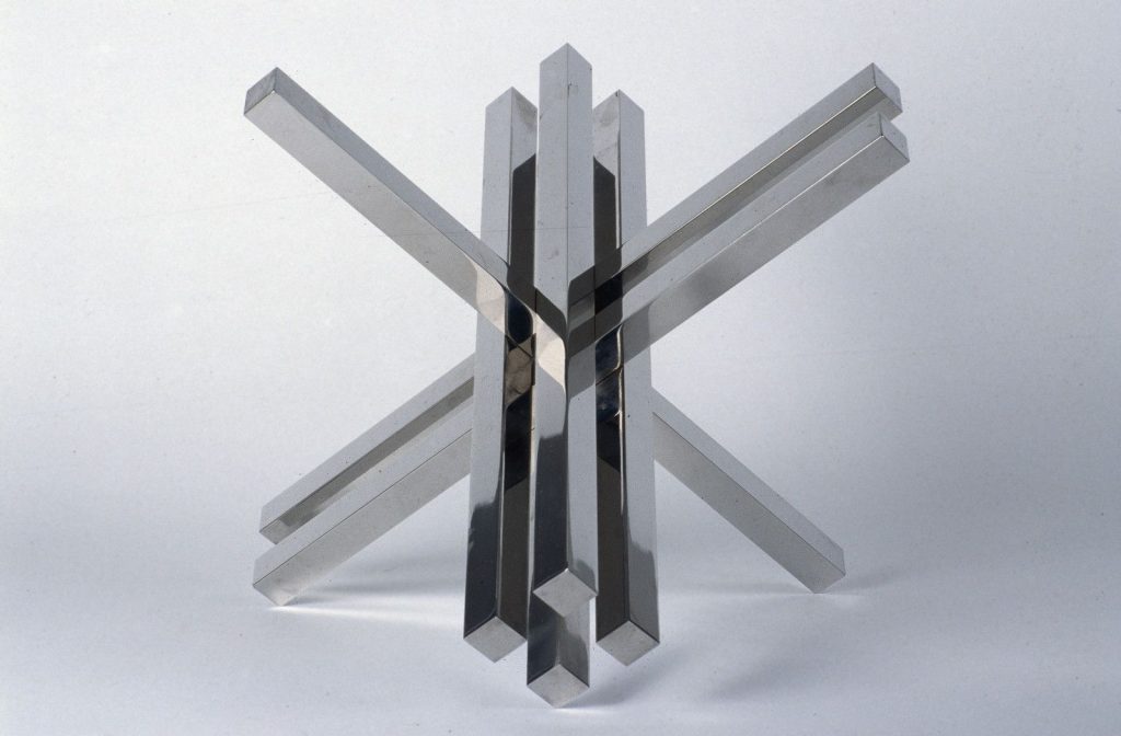
architecture essentially has to do with the spatial. and from there we have a link to painting. the connection between architecture and painting appears in the 1940s. in the exhibition die gute form the two things are related in certain paintings, such as unbegrenzt und begrenzt [unlimited and limited], from 1947. there is also a connection between sculpture and architecture, or between sculpture and landscape; there is, for instance, the design for the shore of lake zurich, where bill put a fountain, a sculpture called konstruktion aus 7 kreisringen [construction from 7 circular rings ], where the disc that makes up the base reminds us of a chinese pi-disc. on the disc there are circular rings sculpted in such a way that their diameter increases proportionately; their cut surface changes by 15-degrees, rotating from the vertical to the horizontal. the rings are arranged in a spiral pattern on the disc. as you can see, there are many interrelated elements at play. my father did various sculptures and paintings like that, where there is not only one single order, but at least two or three.
As we’ve already seen, Bill thought of himself above all as architect. What was the second most important field of activity to him? Painting, sculpture, design?
that’s hard to say. if you look at his entire oeuvre, the field where he was the most prolific is painting.
More than architecture?
much more! around a dozen buildings have survived. if you count his projects, there are 80 altogether. that’s very little for an architect.
In other words, quantitatively, painting was his main focus.
yes. and there are quite a number of sculptures as well.
What about graphic design?
are you talking about prints or graphic design for advertising?
Prints. Graphic art.
about three hundred and fifty pieces of his graphic art were printed. his early period includes the years before the bauhaus and his time as a student there. later, from 1935 to 1938, he did the quinze variations, and continued to produce some more work until the 1950s. it was in the 1960s, in the middle of the graphic art boom, that his work exploded, with extensive, mass-produced prints, sometimes with thousands of copies. many of these prints were also used as exhibition-posters. but bill did not see himself as a printmaker. his vision of graphic art can’t be compared to pablo picasso’s, for example, for whom that art form was as important as painting or sculpture. for bill, it was more of a way to make it possible for anyone to own an original for a small amount of money. he wrote about this too, as you can see in our catalog for the exhibition in palma and cuenca i mentioned earlier. he saw it as a political issue: it was about democratizing art.
Could you add something about his way –rather common in his work– of doing series?
bill’s graphic oeuvre includes series that he later numbered “1-14”. they were conceived as portfolios that are closely related to the subject, yet at the same time, in a very didactic way, they provide the key to contemplating the series.
What about graphic design for advertising?
graphic design for advertising was very important to my father in the 1930s, often accompanied by the pictures my mother took. that’s how they made a living at the time. as for book design, he did that up until the final years of his life, when he designed his own catalogs or catalogs for his friends (for example, for sophie taeuber and georges vantongerloo). bill always felt that good design was important for books, just like for posters.
He also designed everyday objects, household items.
in the 1930s, a few. it wasn’t until the early 1940s that bill began to design objects for everyday use. starting in 1949-50 the first of this famous chairs and tables were produced and as of 1957 he designed watches for junghans.
Despite all that design work, he still basically considered himself an architect.
well, in spite of everything, he saw himself first and foremost as an architect and then as an artist. although we mustn’t forget that his teaching work was very important to him as well. from 1944 to 1945 he received his first teaching-related job: to teach “theory of form” at the zurich school of arts and crafts. then came the ulm school [of design]. in addition to being the architect who designed the building, he was its first rector and head of the architecture department from 1951 to 1956. finally a professorship was created for him at the school of fine arts in hamburg, a chair in environmental design. he taught there from 1967 until he became a professor emeritus in 1974.
That is, he saw himself as an architect, but he was also a prolific artist and designer as well as a professor…
and he was also involved in politics.
That’s right, because in the 1960s Bill was very active politically, as an independent.
at one point he was nominated by a political party, but he was never a cardholding member. that was during the period when he received the support of the landesring der unabhängigen as the freethinking swiss citizen he was. from 1961 to 1968 he served on the council of zurich (that is, on the local level) and from 1967 to 1971 on the national council, the swiss parliament.
Let’s go back to art. Can we say that for Bill, there was a hierarchy between painting and sculpture?
not really. but there is one major difference: he did the paintings himself, whereas the sculptures were done by other craftsmen under his supervision, although he sometimes had a hand in finishing them.
Commission can be interpreted two different ways: do you mean that he commissioned them or that he received commissions from third parties?
he would have the plaster prototypes made. then he’d wait for a commission from a third party before making them out of stone or cast metal. he needed someone to finance the bigger sculptures.
What happened to the plaster prototypes after that?
some of them broke. others have survived.
Are they interesting from an exhibition standpoint? Can they be exhibited?
in 2008 we showed the original plaster model of kontinuität [continuity], the sculpture in front of the deutsche bank in frankfurt, at an exhibition in zurich. that model still has all the measuring points on it, which is why it’s a valuable record of the process of creating such an important work by my father. by the way: there is also a wonderful documentary film by ernst scheidegger that tells the story of the work’s production from the moment the block of stone is broken off in the quarry in sardinia until the finished piece is displayed in frankfurt. but most of the prototypes aren’t fit to be exhibited. the plaster is old, and they generally do not remain intact.
Jakob, let’s explore the idea of Bill’s painting a bit more, the influence of the individuals who we might call his four teachers in painting: Kandinsky, Klee, Mondrian and Vantongerloo. Shall we start with Kandinsky?
very well. kandinsky was bill’s professor at the bauhaus in dessau in 1927 and 1928. in his free painting classes –he took intuitive learning classes– bill learned various techniques. kandinsky’s influence is evident in bill’s early work, although the differences are significant. here is an amusing anecdote for you: one time kandinsky had to go to bill’s student flat to see a painting he called tanzendes mädchen [dancer] (1929, private collection), because it was so large that it wouldn’t fit in the tramway bill usually took to go to the bauhaus. years later, when kandinsky was living in paris, bill contacted him again. then after kandinsky’s death, bill published, together with nina kandinsky, his former teacher’s theoretical writings, which had sold out. in 1949, bill won the kandinsky award.
Let’s talk about Klee.
in dessau, klee was like a rock for bill: first of all, because they spoke the same language, swissgerman.
he attended klee’s free painting classes and also learned a great deal from him. theory too. among other things, bill started mounting his watercolors on passe-partouts and signing them like klee did. he imitated his methods and his handwriting. but unlike klee, bill never kept a record of them.
bill’s watercolors from the bauhaus period and the ones he did shortly thereafter went back in forth, in type and technique, between klee and kandinsky. i’ll tell you another story: in 1930, bill visited the gallery owner jeanne bucher in paris and showed her his portfolio. she told him that the gallery already represented his models –kandinsky and klee–, and to come back when he had developed his own style of painting.
that inspired bill to work differently, marking a turning point in his work: my father’s painting can be divided into the works produced before and after 1930.
bill stayed in touch with klee until the latter’s death, and then he wanted to publish his theoretical writings.
there is a painting my father did between 1944 and 1946 in which i think he confronts both klee (in the color and the arrangement of the signs in black) and mondrian (in the way the painting is divided up).
Now that you’ve mentioned him, let’s move on to Mondrian.
there is some correspondence between my father and mondrian from 1935 onwards, although it isn’t very interesting. it consists mostly of requests for illustrations for articles, or stuff like “visit me when you’re in paris.” when the war broke out, mondrian went to london and then to new york.
He admired Mondrian of course, and he wrote about him as well. Do you remember that your father gave a lecture at the Fundación Juan March in 1981 on Mondrian?
It was the opening lecture for the exhibition about the founder of Neo-Plasticism entitled “Mondrian und der Raum” [Mondrian and Space], which you can listen to on our website, and which we have been able to read recently in Chantal’s transcription. But let’s move on to another one of his teachers, perhaps the least known of all: Vantongerloo. When did Bill meet him?
in 1933. in the show abstraction-création, inaugurated in paris on december 22 of that year, bill showed his lange plastik [elongated sculpture]. in that exhibition there were works by vantongerloo, marlow moss and joaquín torres-garcía, among others, as well as pieces by artists who were living in paris or switzerland like bill himself, hans fischli and hans erni. bill got to be a part of that show thanks to hans (jean) arp. later, he and vantongerloo became very close friends. correspondence with him also begins in 1935, owing to the publication of the journal abstraction-création, the exhibitions… then the war broke out and my parents would send him materials so he could work and eat. after the war, georges would come to our home for vacation every year, and he and bill got to spend a lot of time together, discussing and sharing knowledge and opinions.
Now I’m thinking about another key figure, perhaps the fifth most influential: László Moholy-Nagy.
bill also learned a great deal from him in dessau. moholy would have his students create a work out of the materials he gave them. bill learned the theoretical foundations of how to go about making a work. we know from photos taken during that period of two abstract sculptures by bill. before that, in 1925, he had done a woman’s head cast in bronze.
Your father was also a student of Josef Albers, who became a kind of one-man band at the Bauhaus, because he would cover for other teachers when they were absent and someone else had to take over their classes.
albers played a decisive role in the preliminary course at the bauhaus. he and bill corresponded after albers had gone to black mountain college. albers wanted bill to join him there, just as moholy-nagy wanted him for the new bauhaus in chicago. but bill couldn’t imagine moving to america. when my parents went to brazil in 1953, albers and bill saw each other again in peru for the first time in 25 years. then bill travelled on to aspen (colorado), where he gave the lecture entitled a, b, c, d…
Yet another name: Arp…
bill’s relationship with arp was important, possibly because of the latter’s first wife, sophie taeuber-arp. i don’t know exactly when bill met sophie because there are different versions and they had various things in common. sophie was a member of the jury that chose bill’s silver pieces in the 1925 international exhibition in paris. during their 1933 visit to the show abstraction-création my mother took pictures of arp and his work, but not of sophie, which is curious. later on bill published several books by hans and sophie arp through allianz-verlag, a publishing house he founded in 1941. bill remained friends with arp until the latter’s death. arp’s second wife, marguerite hagenbach, was my “godmother” (as she liked to call herself). there’s a letter that tells this story in the catalog for the exhibition im mondquadrat [on the square of the moon] at the former museum liner (now the kunstmuseum appenzell).
And there’s more…
yes. we have to talk about bill’s relationship with hans hinterreiter and fritz glarner. hinterreiter came from the same city as bill, winterthur, and he worked with wilhelm ostwald’s theory of forms and colors. at first he did small, interesting works on paper. bill convinced him to do them in a bigger size, that is, to do paintings, and he got him his first exhibition in switzerland, because hinterreiter was living in ibiza, relatively isolated. glarner is a different story. he was also swiss, he came from the world of abstract art –influenced by mondrian–, and produced independent works in the united states. during his stay there, he kept in touch with bill. in 1966, on his way back to new york by boat, he had a serious head injury that caused permanent damage. he went back to switzerland in 1971 and bill tried to keep him occupied. together, the two of them created a portfolio based on drawings that bill turned into silkscreen prints
Finally, beyond painting, we mustn’t forget Le Corbusier… of course. it was le corbusier who inspired him to become an architect. as i was saying earlier, bill had seen his “l’esprit nouveau” pavilion in paris in 1925 and then he attended at least one of the lectures that le corbusier gave in zurich in 1926, a year before bill entered the bauhaus. later he would design, for the publishing house h. gisberger, the covers of the first two volumes of the complete works of le corbusier (published in 1935 and 1936 respectively), and in 1939 he was in charge of the overall design of the third volume.
Might we say that each one of these artists, sculptors and architects influenced Bill’s painting and sculpture? i’d say yes, but not directly because of their respective work, but because of who they were as people and their artistic personalities. in terms of his painting technique, first his uncle ernst geiger and then kandinsky and klee were more decisive influences.
And Marcel Duchamp, to whom Bill dedicated at least one text and an exhibition of documents?
bill met duchamp in 1938 in paris. he was there to work in the printer’s studio on the abovementioned quinze variations. in paris he was struck by duchamp’s rotoreliefs, and from then on he took an interest in his work, which he followed.
Let talk a bit more about influences. We know that your father had a personal collection of objects from early cultures: African masks, figures from the Cyclades, Chinese jades, etc. In 1976 he wrote an article about this collection that appeared, with illustrations of all of them, in the journal Du, entitled the magic of designed objects. As an archaeologist, can you tell us anything about that? For example, do you see any connection between the little statues designed by different cultures and Bill’s own sculptures?
well, as an archaeologist those are territories that i feel unsure about. from an aesthetic point of view i can understand it: the objects “speak” to me too. but they’ve been removed from their cultural context, and on a professional level that is conflicting to me. my father only looked at them from a purely aesthetic perspective. he saw them as beautiful objects that inspired him, forms that said something to him aesthetically. they were, if you will, objects “for spiritual use” (für den geistigen gebrauch), to paraphrase my father. he had been familiar with the african objects since 1931, since the exhibition negerkunst. the jade discs from china have many things in common with the project for the fountain we mentioned earlier. but he didn’t collect those objects until later on. he was not a systematic collector of primitive art. he did not let himself be inspired by it like picasso, for example.
Or like Willi Baumeister, who recreated them artistically… But if we’re talking about possible precursors to his art, at the beginning of his career Bill defined himself as… a Surrealist –if I’m not mistaken, he even knew Max Ernst–, although in Bill’s later works there isn’t even a trace of Surrealism, in my opinion…
in 1929, back in zurich, bill tried to get involved in exhibitions. in the end he only managed to do one, in his own studio/home. siegfried giedion was putting together an exhibition about surrealism at the time and bill, who wanted to be in it at all costs, sent him a letter “recommending himself” as a “surrealist painter.” he was rejected. traces of surrealism in my father’s work can be found, at most, in 1929. i’m thinking about the hermaphroditen and some other figurative works. and ernst appears in this story because he painted a fresco for the corso movie theater, in 1934, and bill was also working there. he was in charge of the signs and graphic art and had designed a window for the bar. ernst would come to stay at my parents’ house sometimes.
Very well. Now let’s move on, if you don’t mind, from Surrealism to concrete art. As you know, konkrete kunst [concrete art] is a concept invented by Theo van Doesburg, but it was Bill who gave it intellectual muscle. I’d like to know more about it. Especially about the opposite nature of the words “concrete” and “abstract.”
after van doesburg’s death, when leo luppi founded the allianz group in zurich, bill was his first theorist. he wrote about the subject for the first time in 1936, and the correct definition, derived from that initial one, would come later, in 1942 and 1944. Both Van Doesburg and Bill saw the abstract and the concrete as opposing concepts. at least they saw them as separate concepts. the concrete comes from abstraction. this can be seen in the cases of van doesburg and vantongerloo: though their early works looked like concrete art, they really were not, because they were direct derivatives –abstractions– of figurative images. as for vantongerloo, for me his first concrete work was a table from 1919 that he created out of nothing; that is, he didn’t follow any model from nature or start from a sketch of something natural that he later abstracted. the case of van doesburg is a bit more complex. many of his paintings were not a product of what we understand as “concrete”. they come from abstraction, at least until 1920. only after that does the concrete appear in his work. when concrete art was born is a subjective matter; it depends on how you define it. giacomo balla, for instance, had already done pieces to that effect back in 1912… as for bill, in 1930 he was still doing things like those heads that look at each other. then that same year he broke away from that and started to do concrete art.
Would you like to say anything about socalled “concrete poetry”? About how it is related to concrete art and painting? that’s something that can be traced to eugen gomringer. born in bolivia, he came to switzerland and hung out with people from the journal spirale: marcel wyss, dieter roth and bill. then, when bill went to ulm, he took gomringer with him as his secretary. naturally, they mutually influenced each other. they were also in contact with the brazilian concrete poets…
Like Augusto and Haroldo de Campos… But did the concept of “concrete poetry” exist before Ulm?
i don’t think so. gomringer came up with the definition. before ulm we can already find certain texts that could fall under that term, by bill as well. there are a couple of examples in catalogs, where bill develops the titles of his works in the form of concrete poetry –although they’re really more like clarifications about how to read a painting than titles. they played with each other optically and verbally. concrete poetry is visual, and in that respect bill took part in it. unfortunately, concrete poetry does not translate well into other languages.
Was your father interested in literature? Did he read novels or poetry?
very little. he really didn’t have the time for it. he did read bertold brecht, but above all he read architecture journals: das werk, bauen und wohnen, architectural forum… the newspaper neue zürcher zeitung, and, when he was in parliament, piles of papers…
Let’s switch subjects again. Sometimes concrete painting is said to be somewhat cold: geometry, no relationship with nature, flat surfaces, primary colors, a composition that is perhaps overly logical… You, who are also a representative of Swiss concrete art, do you think that is true? Is it cold?
that’s the title of karl gerstner’s famous book, kalte kunst? [cold art?]. for me this is not the case, because concrete art is not cold. it can express a sensation and that sensation might be very romantic or sensual, directly or indirectly… there are many possibilities. these sensations also arise when you look at my father’s painting. there are transitions from one color to another –using a technique that’s different from mine–, and these shifts in color these gradients, they’re not… you can’t say they’re cold. it may be hard for these paintings to appeal to you if you’re not used to them, but that’s always been the problem of the concrete “form” of a work. where does the concrete idea come from? not from a natural model, but from an image of an idea that the artist has.
The image of an idea… now we’re getting into the dialectics between the coldness of reason versus the warmth of feelings, of emotions…
that is precisely what’s behind the title of the book: “cold” as a synonym of rational.
Would you say that Bill’s art is rational?
rational, yes. in any case, if someone wants to use the word “cold” to describe one of his paintings, fine, but making it clear that it might be loaded with feeling. in bill’s work there are delicate colors, pastel tones, though not always. that has to do with the artist’s own feelings, with the need to paint in one palette or another. color can even exude warmth…
All of that is very interesting because where do these adjectives (“pastel” tones, “delicate” colors) come from? They’re extremely “natural”…
“subtle” you know why i say “subtle”. there was a man who served as the mayor of zurich for a long time, emil landolt, a real father of the city, who came to all the openings of my exhibitions. as you know, after graduating from university i worked as an assistant in the prehistory department of zurich’s national museum. one day i was with the director and someone knocked on the door. in came the former mayor, who was also the president of the museum’s foundation. the director wanted to introduce me, since i was new, and landolt said: “oh yes, i know him, he’s the painter of subtle colors!”
That’s a nice story. And I agree, the adjective “subtle” can be used to describe to concrete painting, as in your case. But the thing is, concrete art somehow entails a distance from nature (whereas abstract art is abstraction based on nature). Yet it seems that in order to define the former we also need “naturalistic” adjectives. Might we say that concrete art is concrete because of the way in which it is created, not the way it is received?
concrete art is a personal creation that starts out with a concrete thought. it has a different effect on the viewer, however. for the viewer, the work becomes the object of contemplation.
And the effect is not “concrete”; that’s the thing: concrete art provokes a combination of rational impressions and non-rational feelings.
yes. you conceive the ideas in a rational manner, you assess them rationally, and the result is the artwork. but what the painting or sculpture transmits back to you does not necessarily have to be rational. you consider it in relation to what is going on outside.
Then concrete art aims not only to spark our logic or understanding or reason, but also our feelings; perhaps even our political convictions.
political convictions or other convictions. as you are well aware, i, for instance, worship caspar david friedrich. and there are aspects of philipp otto runge’s painting and other romantics that reproduce sensations that a work of concrete art can also create… without following any figurative ideas.
Friedrich, Runge…Was your father also interested in German Romanticism?
he was familiar with it, of course. but, as far as i know, he didn’t go to exhibitions about german romanticism.
Jakob, now that we’re back in Germany, let’s return to the Bauhaus: Klee, Kandinsky, Albers, they were all teachers there and they were all artists. But at the Bauhaus, as you know, the goal was not to train artists. Yet Bill, a painter and sculptor –in other words, an artist– studied at the Bauhaus. Is there any characteristic that defines the “Bauhaus artist”?
bill tried to apply the methods of the bauhaus over and over. in 1929, just after he returned to zurich, he proposed a preliminary course at the city’s school of arts and crafts. in the 1940s he presented another program to modernize that school, based on his experiences as a student at the bauhaus. then he went to germany, where after the war there was no school to properly study architecture. the americans sent bill on tour all around germany to give lectures and test the waters with the goal of opening a new school. that was how he came into contact with the volkshochschule [popular university] in ulm. there grew the idea, together with inge scholl and otl aicher, to do something new. when they were trying to come up with a name, “geschwister scholl schule” which was ruled out because of the political connotations. my father neutralized it and it ended up being called “hochschule für gestaltung” [ulm school of design], the name he had proposed. walter gropius had given him permission to even use the name “bauhaus”, and honored the inauguration ceremony with his presence in 1955.
We often refer to phases or periods in an artist’s work. Would you say that there are any periods in Bill’s work?
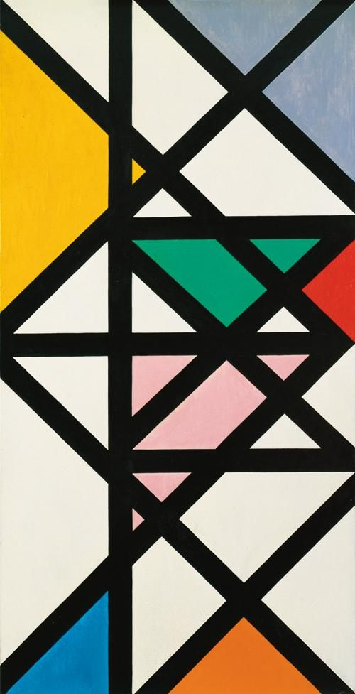
it’s hard to talk about periods in his case, at least in the sense of, say, someone like picasso, with his blue and rose periods, cubism… with bill, as i was saying before, we can talk about two periods in his work: one, which goes from his beginnings as a sculptor and painter to 1930, when he arrives at abstraction through nature; and a second, from that date on, when his work is fully defined as concrete art. dividing up those two phases any more than that is problematic. in the second half of the 1940s, until 1950 or 1951, there was a period when he tended to mix colors, but that was just a temporary thing, something that he was particularly interested in at the time, but that doesn’t necessarily mean that he abandoned all other forms of expression.
Listening to you, it occurred to me that when we talk about concrete art, we’re usually referring to concrete painting, but there is concrete sculpture as well. Would you apply the adjective “concrete” to sculpture as rigorously as it is applied to painting?
definitely. one example of this is the pythagorean theorem, the relationship 3:4:5. it appears over and over in my father’s sculptures from the 1930s until the end of his life. this is a specific problem that he thought about a lot, so much that you could almost say that it came to him naturally. in fact, my father spoke, precisely, about mathematical thinking in art, which is related to what we were talking about. one example of this would be the different results you can obtain from sectioning a sphere.
Can we say that in Bill’s sculptures, you can see more natural forms than in his paintings?
It would be easy to call them organic forms. but they too have a mathematical basis. the organic is generated through the density of material in the stone or metal structures, such as for example in rhythmus im raum [rhythm in space], from 1947-48. by the way: there is one thing that we haven’t mentioned yet: the jewelry that my father made for my mother. those are indeed very organic, very closely related to the jugendstil.
Are they from the 1930s?
well, he made them until my mother’s death in 1988. the settings often have something very organic to them, hardly mathematical. although there is the bracelet binia und bill [binia and bill], made for my parents’ wedding, which is purely typographical.
Let’s talk now about the techniques and materials Bill used. Which ones did he prefer and why?
that depends on the period and the interests of wherever he was at the time. at the bauhaus, for example, he experimented with techniques and materials, though all of them were traditional: printmaking, watercolors, oil on canvas, oil on pavatex… and he painted in a conventional manner, spattering with a brush, etc.: many of the techniques, in short, used by klee and kandinsky. in the 1930s bill often painted with tempera on pavatex and in the late 1930s with oil on canvas, his medium of choice from then on. and until 1950 or 1951 he alternated applying oil with a normal brush and distributing it with touches of a blunt brush. after that he used a palette knife.
And what about his sculptures?
first he worked in wood and metal, for two reasons: the durability of these materials and cost –a metal sheet and a pipe are not expensive. in the case of metal, copper and tin deteriorate with time and they need a protective layer. the metal sculptures are yellow, red or white. the yellow and red ones are gilded; the white ones are chrome plated. in the 1970s, a new method appeared, optalloy®, a procedure that replaced chrome plating.
Did he use lacquers?
yes. there are lacquered metals very early on, starting in the 1930s.
Before you mentioned plaster prototypes. Were they done only for sculptures that were to be later crafted out of marble or stone?
no. in the 1936 milan triennale he showed some plaster models –there is a picture of him painting one using a spray gun, in white. it was done that way because it was cheaper. the subsequent plaster models were made to be produced later out of stone or metal.
Did he use acrylics in his paintings?
barely. he brought some acrylics from the united states, to try, but he almost never painted with them.
Did you ever hear you father explain why he only used oil paint on canvas instead of trying other possibilities or combinations?
in that regard, the truth is that he worked in a very conventional way: he used what he was familiar with and had mastered. i do the same. a while back i used acrylics and i might use them again, but only if the colors are pure. acrylic dries very quickly and it’s hard to do gradients. with oil colors you can attain gradient tones; you can control the color much better. my father and i have that in common.
And because the oil dries so slowly, many painters usually work on several paintings at once…
well, yes. you can work on a series of paintings at the same time, because oil paintings can take at least a month to dry.
Did Bill paint on an easel or on a horizontal surface?
usually on an easel, but sometimes on a table. as for me, i paint almost exclusively on a table.
Would you like to add anything about frames in Bill’s work?
in the 1940s, he had frames made with different cross-sections. then he used white laths that served to protect the work, which could be replaced.
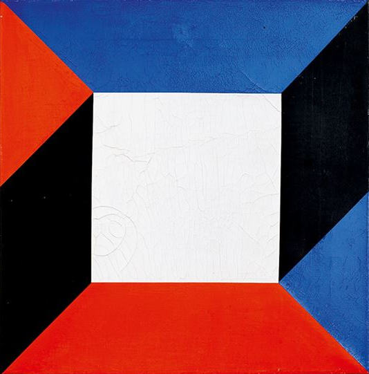
Let’s talk about color. Bill’s work is festive and colorful.
color… there are several things we must talk about here. for example, color as material. we have colors in oil, acrylic, tempera or watercolor. they’re all colors; the only thing that changes is that the pigment is applied on different supports. another question is: which colors did he prefer; which ones dominate his pictures? greens, yellows, reds, blues, blacks, whites? or mixed colors like brown?
Sure. Did Bill have any preferences?
in bill’s work all the colors are in there, really. there are some that he used less, like earth tones, although he did when they suited what he wanted to paint. but he also used pure colors, exactly as they came out of the tube, as well as mixed colors.
And which ones did he use the most?
mainly the mixtures, which he usually made on a piece of glass. but he never mixed them according to exact proportions like karl gerstner did, for example.
Or Josef Albers. The fact is, in that flexibility of mixtures, in that imprecision, Bill seems “romantic” to me somehow…
you could say that. there is a certain romantic spontaneity, yes. but you could also say that bill pointed his “nose” right at where he wanted to go. he had a kind of very keen sense of color. the same occurs with me, only i apply it differently.
Are there any main colors in your father’s work?
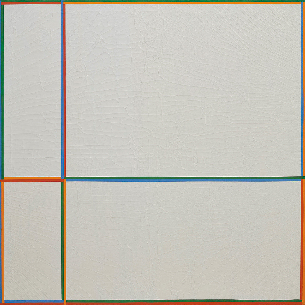
yes, of course. especially starting in the 1960s, when he regulated the size of the surfaces he painted on or structured them in a similar way. he used yellows, reds, greens, blues and also intermediate tones: oranges, violets and turquoises, often combined with whites, and sometimes with contrasting blacks and whites.
Whites and blacks. We talked about that before. Did Bill use white as a color?
yes, he let the white background of the canvas act as a color. in part he also used it so that a painting hung from a white wall would give the impression that it was spilling over the canvas. suddenly the white background –in other words, the white wall– matched the white center of the painting or its surface, giving rise to a picture that went beyond the edges of the frame.
And the color black (if black is even a color)?
he used it in his paintings to contrast with white. his sculptures are a different story. they depended on the colour of the material, black granite or different shades of stone colors. for his sculptures bill used marble, granite, calcareous stone from belgium and also artificial material.
And what about the pedestals for his sculptures?
the pedestals for his small sculptures were usually wooden. the ones for the large outdoor sculptures were usually made of stone or reinforced concrete.
And the giant size of some of the sculptures?
his last sculptures were bigger and bigger. he wanted to push the limits of the feasible. the granite version of kontinuität [continuity] for deutsche bank (1986, frankfurt) was, at the time, the largest monolithic sculpture in the world.
Did he try to do something like that in other cases, with other materials?
yes, with steel. the konstruktion aus drei gleichen kreisscheiben [construction from three circular discs]. there weren’t any sheets of steel big enough at the time to cut pieces with a diameter of three meters out of them. or with hightech ceramic, like the kind rado uses to make their watches. the company commissioned some artists to do a series of artworks. only bill used that type of ceramic to make the biggest sculpture that the material would allow, technically speaking, einheit aus sechs gleichen elementen [unity from six identical elements], one stick 50 centimeters in length. it couldn’t be any bigger, and a new type of glue also had to be developed, because the material didn’t have any pores!
With his sculptures, then, Bill was obsessed with pushing the limits of the feasible. Would you say that this was something that also interested him in painting?
no. two by two meters is the largest possible surface one can paint with a palette knife without any assistance.
Don’t you find it surprising that, considering all the time he spent on architecture and design, Max Bill never painted any frescoes?
well, not exactly: to do paintings on a wall he used another method, enameled plates, which can also be used outdoors. and he also did a multiple with this type of paint. the sheets can be either mounted on a wall or as a freestanding sculpture. that’s the method that he used in his columns: in the two columns in front of the bauhaus-archiv in berlin, the one at the university clinic in ulm, the one at the mercedesmuseum in stuttgart, the one at the münchengrosshadern university clinic in munich, etc.
Why did he use a diamond format in some of his paintings?
it’s a very interesting format: it allows you to create the illusion that the painting penetrates more into the surrounding space. bill didn’t invent it though. mondrian, van doesburg and marlow moss, a student of mondrian’s, used it before he did. when you hang a painting in that position, there’s an outward movement that goes beyond the format of the picture, strictly speaking. our eye completes, for instance, a square, even though its corners are cut off. this can be seen, in fact, in the series acht transcolorationen (12. reihe) [eight transcolorations (12th series)].
We’re coming to the end of our interview. But before we finish I wanted to ask you, even though you’ve already mentioned it, about the presence of science (mathematics and physics) in Bill’s work; about positive science as a source of inspiration.
it is hard to say whether they were sources of inspiration, but he was interested in scientific questions. he knew physicists such as fritz zwicky and mathematicians like norbert wiener and adrien turel… it’s a subject that sparked bill’s interest in the 1950s. during that period he set up exhibitions –the most well-known of them, die gute form, which we’ve already mentioned, or one that he did later in the shop
windows of the department store chain globus, called die unbekannte gegenwart [the unknown present]–, in which he tried to incorporate the latest breakthroughs in science and technology. bill confronted for what was current at the time, and once again he pushed the limits. during that period there was a very interesting american journal, fortune, more or less scientific, which was a good source of ideas…
Did Bill read any scientific publications?
only with precise objectives, concentrating on what interested him. what interests me? what is the current situation in the field of science? what is interesting in terms of the evolution of the history of culture? those are the kinds of questions he asked himself.
And many other times, his approach to science would be more intuitive, as in the case of the sculpture unendlichen schleife [infinite loop], of which he did many variations.
he designed that sculpture in 1935. only later did he realize that it was the already-known moebius strip. but that didn’t dissuade him, and he actually did a lot of structures and sculptures based on that idea.
What do you think Bill would have thought about new media in art? About the internet, about video?
he was interested in videos, but he thought that, as art, they were nothing special. film already existed. they didn’t need to be regarded as art.
Do you think that Bill’s work is still a source of inspiration for painting?
you should say “for today’s art”, because the word “painting” seems to denote an “antiquated model”. bill’s work may be a source of inspiration, although now materiality is different, more in keeping with modern-day technology. i myself am like a dinosaur in that respect.
Finally, how would you define Bill’s particular contribution to art of the 20th century?
that is hard for me to answer, because i’m both judge and jury. i can’t answer objectively.
You are right, but that doesn’t keep you from being objective. And I can think of nothing better now, for future readers, than to recall, here, something that your father wrote about you in a lovely essay that I’ve already mentioned, the one that appeared in the journal Du in 1976 entitled “the magic of designed objects”. In these pages, Bill reviewed and commented on many of the works of art and objects that he kept around him in his studio. “I need,” he said, “primitive objects and artifacts from foreign cultures. I draw energy from all these objects in my everyday surroundings. It is their standards of quality that really interest me.” The last of these “objects” is a painting of yours from 1973, and the text your father wrote that appears next to the illustration of your work reads: jakob bill (born in 1943) is a prehistorian by profession, and is employed as such at the schweizerisches landesmuseum [Swiss National Museum] in zürich. he is a scholar deeply committed to scientific research and his dissertation, the bell-beaker culture and the early bronze age in the French rhone basin and its relationship to southwestern Switzerland, has received considerable attention. since childhood he has constantly painted for his own amusement and has found his own way despite obstacles: obstacles because he is my son, and so according to the general opinion, he should have rebelled against his father. but since that didn’t happen, and since he even followed in his grandfather and greatgrandfather’s footsteps by specializing in prehistory, i can only admit that even with all the independence that characterizes his work i still think of him as an outstanding example of an uninterrupted tradition. he paints pictures that are related to mine only in their orientation, pictures that i myself would never paint: that is why i treasure them and hang them in my workplace as if they were by any other young artist. the picture shown here is typical of his work from a few years ago: nr. 12 [nº 12], 1973 . oil on canvas, 120 x 120 cm.
The underline is mine, Jakob: “even with all the independence that characterizes his work,” said Bill Sr. of Bill Jr. Like your father, I have found your answers to be “an outstanding example of an uninterrupted tradition.” Thank you.