First published in Geoform, 2006 and expanded for The Aesthetics of Precision exihibiton catalog, 2013
Interview by Julie Karabenick | Courtesy of Geoform
Timothy App received a BFA in 1970 from Kent State University in Kent, Ohio, and an MFA in 1974 from the Tyler School of Art at Temple University in Philadelphia, PA. He was an Assistant Professor of Art at Pomona College in Claremont, CA from 1974-78, an Associate Professor of Art at the University of New Mexico in Albuquerque, NM from 1978-90, and has been a Professor of Art at the Maryland Institute College of Art in Baltimore, MD since 1990. He retired from teaching in 2017, and is now Professor of Art, Emeritus.
App’s awards include a National Endowment for the Arts Fellowship (1987-88), and a Maryland State Arts Council Individual Grant (1999-2000). Since 1970 App’s work has been widely exhibited throughout the US as well as in Poland and Japan. It has been featured in 19 solo exhibitions and included in over 100 group exhibitions. App’s work appears in numerous public and corporate collections, including: the Albright-Knox Art Gallery in Buffalo, NY; the Baltimore Museum of Art; the Long Beach Museum of Art in Long Beach, CA; the Museum of Fine Arts in Santa Fe, NM; Tamarind Institute in Albuquerque, NM; and the Tucson Museum of Art in Tucson, AZ. App lives and works in Baltimore, MD, where he is exclusively represented by Goya Contemporary.
You’ve said that all your life you’ve been attracted to geometry and its measured proportions.
A propensity for this logical way of dividing form and space has been with me since childhood. I loved the precise, linear quality of the mechanical drawings in my father’s sheet metal business and later, the architectural drawings I saw in books and architects’ offices.
At age 12, I took mechanical drawing lessons from a neighbor who was studying mechanical engineering in college. In high school, plane geometry was a favorite course. At that time, while I considered becoming an architect, never did I think this innate interest in precision and logical systems had anything to do with art.
And you were also fascinated with objects.
Long before I knew what Minimalism was, I was interested in things—in objects in and of themselves. A book has particular proportions, a color, a weight, even a smell, all of which interested me equally with its contents. As a kid, I would build things of all sorts before I would draw pictures, and I was convinced that these things had a life of their own.
And there were a number of other domains in which you appreciated their geometric forms.
One was the Catholic Mass and its cyclical, opulent rituals. As an altar boy, I was privy to the backstage realities of color and form—much of it geometric—that made the Mass a mystical experience.
My deep involvement in sports, especially baseball, cannot be ignored as an early influence. Playing these sports and learning their rules and strategies were, and still are, of great interest to me. The pristine, geometric aesthetics of playing fields—baseball diamonds, tennis courts, football gridirons, golf courses—have captivated my imagination for nearly six decades.
Another source of influence is music.
Music—especially instrumental music, whether early American folk or 19th century classical—has been a continuing interest. The color and mood of the Delta Blues or the emotive sonority of a Brahms symphony have played a role in my development as a painter. The very structure of music and its reliance on mathematical organization have had a direct influence on the way I handle proportioning of space in my paintings.
And the relationship of geometry to nature is an important theme in my work. Certainly, my paintings do not depict nature, and nowhere in them can one see anything that looks like nature. Geometry, I would postulate, underlies appearances in nature. It is a universal that points to the particular, and therein lies the metaphysical nature of my work. So geometry for me is not mechanistic or rational, even though the forms are measured and ruled into position. For the work to succeed, the particulars of its making have to be transcended—the whole must be greater than the sum of its parts.
Given these interests, it’s not surprising that we see your affinity for geometric form and proportion, even in early work done as an undergraduate at Kent State University.
Since 1968, I have used various forms of measurement to generate space in my work. After painting like everyone from Pollock to Andrew Wyeth, I saw firsthand the work of George Ortman, an artist who constructed his geometric paintings with panels, blocks, inserts and such. Through him, I discovered that a painting could be built or assembled as well as painted in the conventional manner.
And at that time, you came face to face with Minimalism.
While Abstract Expressionism was the first modern movement to capture my imagination, Minimalism was the first to resonate completely with my sensibility. On maiden voyages to New York in 1967 and 1968, I discovered Minimalism and Color Field painting. In the summer of 1968, I saw an exhibition at MOMA entitled Art of the Real, which featured reductive and Minimalist works by a host of artists. I immersed myself in the work of Donald Judd, Sol LeWitt, Carl Andre, and Dan Flavin. Constructivist art also interested me.
The specificity of this art, its orderly simplicity, its spare means, and its systematic directness freed me to begin making art in a way that seemed compatible with my sensibilities. It gave me the impetus I needed to construct paintings, thinking of them more as objects than pictures. From Untitled onward, the ideas and work simply flowed out of me. I would say that it marked the beginning of my life’s work as an artist. I was twenty-one years old at the time.
Untitled, 1968 is a favorite early work of mine. The idea of “drawing” a shape by insertion, thus creating an actual line rather than a virtual one, came directly from Minimalist work I’d seen and inspired me to do several constructed paintings. The separately primed cavases were rubbed with grey oil paint, giving them a grey patina suggesting industrial anonymity, with one canvas inserted into the other. This was a truly Minimalist work, asserting the painting as specific object.
Yet you were aware that the Minimalist aesthetic was in some important ways at odds with your convictions about the nature of painting.
Despite my initial enthusiasm, I found the literalness of Minimalist objects limiting on many levels. The factual, literal forms seemed insufficient to address questions about illusion, association, metaphor, emotional power, and transformation. These were lingering concerns of mine from the metaphysical branch of Abstract Expressionist painting—Rothko, Reinhardt, Newman—but also from the larger history of painting. The problem, as I saw it, was how to take what I needed from Minimalism without relinquishing these other concerns.
Seasoned painters who seemed to be forging this path at the time were Brice Marden, Jo Baer, Robert Mangold, Dorthea Rockburne, Robert Ryman, and Agnes Martin. These Post-Minimalists were responding to issues posited by Minimalism, but doing so through the medium of painting with an eye on its long tradition. Rather than using the term Minimalist to describe these artists, I preferred the term Reductivist because Minimalism in the orthodox sense was anti-painting.
Finding a way to resolve your concerns within your own art-making would take years.
Yes. Although my convictions were strong, it would be another eight years of hard searching before I would truly find my own way.
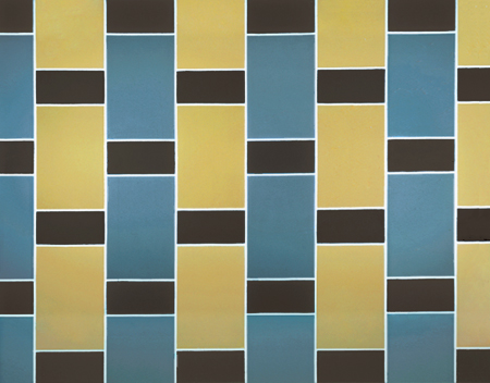
In 1970, upon finishing undergraduate study and after much experimentation with specific objects, installations, kinetic art and outdoor works, I returned to painting, which had always been my primary interest. Red Relay is one of my best early paintings. It’s a large work—12 feet long—that sweeps down the wall with optical drama.
In it I was trying to use the anonymous, repetitive modular forms of Minimalism in the context of painting. Also, I was looking at Frank Stella and Kenneth Noland and responding to their direct and emblematic use of form and color. This painting, like all of my work from that time, was developed on graph paper beforehand and executed using industrial latex paint.
The floating forms in Red Relay and all the paintings in that group were quickly followed by paintings with more complex grids, creating even more spatial complexity. Caren’s Joy was, to my eye, one of the best paintings of that second group, with its interwoven spatial ambiguity and its warm, neutral color.
You also began to vary the format of your paintings.
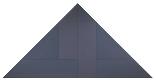
Experimenting with various formats—horizontally elongated in the case of the Voyages—was an attempt on my part to expand the expressive possibilities of reductive painting.

Voyage #1, acrylic on canvas, 15 x 183 cm, 1971. Collection of Michael McCafferty and Ann Obery, Seattle, WA.
I brought the Voyage paintings with me to graduate school at the Tyler School of Art in 1972. There, I continued to seek ways to synthesize the poetics of painting with the literalness of Minimalism.
One aspect of this exploration focused on color.
At that time, I was straddling the fence between Minimalism and Color Field painting. The logical, systematic structures of minimal art still intrigued me. At the same time, I was interested in the pure feeling of color and its potential for expressing a wide range of thought and feeling, much the way, say, symphonic music does. I began to slow down the painting process and to dig deeper for color and its relationships.
And you also moved away from strictly modular and repeating forms in your compositions.
In the Ascent paintings, I attempted shaped canvases for the first time. Cropping the repetitive sequences of prior compositions seemed like an interesting option at the time, especially because it rendered the symmetry of those structures asymmetrical. Was symmetry too absolute and limiting? Did asymmetrical balance signal something more yielding, imperfect and alive? Was Mondrian’s idea of “dynamic equilibrium” important to me after all? These were questions that dogged me during those years.
Lurking in the background was the ghost of Mondrian. I studied his work and his writings in depth, learning all I could about this quiet giant of the early 20th century. All the artists in whose work I was interested had to deal with Mondrian in one way or another. And then there was Cezanne before him. For the first time, I began to realize how powerful and important the undertow of history is to serious art.
So it was a very propitious time for you to hear firsthand Agnes Martin’s ideas about making art.
I heard Agnes Martin deliver her first public talk in February, 1973, at the University of Pennsylvania. The lecture was titled “On the Perfection Underlying Life,” and it affected me profoundly. I could directly relate to her work—its classicizing restraint, metaphysical overtones, evanescent palette. But she did not talk about art so much as the state of mind of the artist—the role of inspiration, the inevitability of defeat, and the importance of awareness of moments of perfection. I left that lecture hall a changed person, and from that moment forward, my work and the making of my work dramatically changed.
Later when living in New Mexico, I became acquainted with Martin. She helped me to know and understand myself as an artist. She helped me to see beyond the formal, historical, and certainly political aspects of work to a transcendent understanding of art and a humanistic approach to abstraction.
In your next series of paintings, you were to continue your ongoing dialogue with Minimalism from this newfound perspective.
After some soul-searching, I began the Zone paintings. I slowed down my working process, crafting the works arduously with many layers of paint, sanding the surfaces and adding more layers of greyed color. The color came from complementary mixtures of hues and depended as much on value as color for its spatial effects.
Mostly, I was interested in the neutrality of such color and was fascinated by the subtle incongruities that occurred in the square format. I liked the fact that while the color bands were centered in these paintings the corners were structurally different from one another. These ambiguities allowed for an element of surprise in the context of rigorous geometry. This in-betweenness was anathema in the Minimalist rubric, yet I began to realize its potential.
The Zone works seem to recall Jo Baer’s austere paintings of the 60s.
Despite appearances, my work came from a different place. I was not really interested in theories of visual perception as Baer was. I was interested in the feeling the painting created as well as the associations provoked by the work, and not in ideas. Therein is the poet in me and my link to Abstract Expressionism.
After graduating from Tyler, you continued to work on this series on the West coast where you began your teaching career at Pomona College in Claremont, California.
I struggled with the Zone paintings for another year before I broke loose and began painting in a much more fluid, sensual way. I was in the company of some artists who had roots in the West and had a romantic view of painting. My work began to reflect my new environment and is something of an anomaly in its overall development. The tryst was short-lived, but of great importance to the development of my use of color. It helped open up my palette and encouraged an open-ended spontaneity. It set the stage for what came next.
Fortunately, there is just so much imprinting one can abide. For all the youthful adventure of raiding the annals of modern art by 1976, I had come to the end of that part of my life. I felt exhausted and stranded, standing alone in the studio, having to face myself at the edge of what seemed like an abyss.
Yet despite your consternation, you were able to look back over your investigations to that point and identify some enduring convictions about painting.
Yes. For example, I knew that working in series felt right. To extend a theme with its variations appealed to me greatly. It was a way to keep a single idea alive and vital, to uncover its possibilities. Classical, elemental form appealed to me as well, as did measured space and proportion. They gave me a place to start in a work and provided me with a grounding.
Since your undergraduate days, you’d struggled with the modernist dictum that painting should be flat.
While I had been trying to flatten space in my work, I knew that illusion and ambiguity were painting’s greatest allies and that I had to find a way to accommodate them. And realizing that I was no colorist, I knew that a greyed, subdued palette felt truer to my sensibilities. I also knew that the subversion of subjectivity in favor of the universal was of utmost importance. Making paintings that did not depend on the particulars of time and place, but rather were transcendent, was my goal. With these convictions, I entered a period of inactivity and contemplation, something that has happened to me several times over the years.
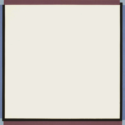
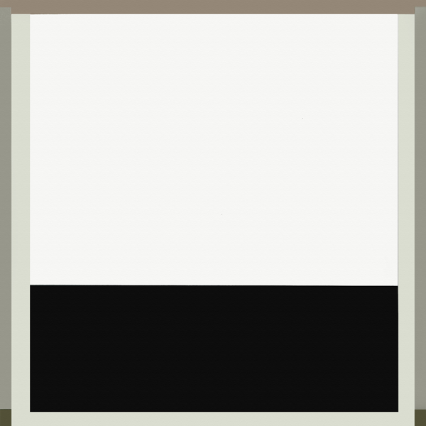
You emerged from this hiatus with your Vessel series.
Yes. For me, these paintings signaled a breakthrough—I was doing paintings that, for the first time, felt truly honest. The Vessel paintings were hard-edged, though hand-painted, and open in composition.
acrylic on canvas, 183 x 152 cm, 1977. Collection of artist.
They were evanescent in color, flat and opaque in surface, and anthropometric in scale. They came comparatively easily and quickly as well as abundantly. My friend and fellow Claremont painter, Karl Benjamin, included my work in a small but mighty group show near Claremont. La Fenêtre N’est Pas Noire was hanging with the best painters in LA, including Richard Diebenkorn, Ed Moses, and Karl. You can imagine how good it felt to have my work recognized in this way. I was 30 years old and had arrived at an integration of concept and execution that would propel my work for another eight years.
Years later in your next series, you revisited the use of shaped canvases and moved away from symmetry—as you had with the Ascent paintings in the early 70s.
I wanted to gain some expressive freedom without giving up certain gains I’d made with the Vessel paintings. The static, iconic symmetry of those works began to seem constricting, and I was looking for a way to get some movement going. I was doubting the power of the rectangular format and wanted to challenge that notion without destroying it. I developed a dynamic relationship between a single interior shape and a format that altered the classic rectangle. The close-valued hues were continued from the Vessel paintings.
After the Vessel series, you were once again ready for a change in the direction of your work.
In mid-1986, I had exhausted myself with the Vessel and Shaped paintings and simultaneously was beginning a full-year sabbatical leave from the University of New Mexico—an auspicious coincidence. I embarked on a five-month period of open-ended experimentation that involved, among other things, a long hard look at my work from the past. Among that work was a series of works on paper done in India ink mixed with acrylic matte medium, all black, white and grey, with long, tripartite compositions. I decided to reconfigure these long compositions by folding them in on themselves. I was immediately excited about the results, even though it meant foregoing what had become a signature palette.
In the work that emerged, we find you re-engaging with Mondrian, with relational composition and the nature of space in painting.
The major complaint that Donald Judd had about painting was that anything, even one mark placed on a flat surface, created an illusion of space and not space itself, and thus was less real. From that moment on, scores of artists, myself included, tried desperately to flatten the space in paintings. This mass effort, I would argue, actually denied painting its real power, which is illusion on a flat plane. I gave up trying to flatten the space in my paintings in about 1987. Frank Stella’s book Working Space helped me immeasurably at that time to understand the problem.
And in your work from this point onward, we see the development of a more complex and ambiguous space.
I relish the complexities and ambiguities that result from this tension and balance between the architecture on the canvas and the poetry of illusionistic space.
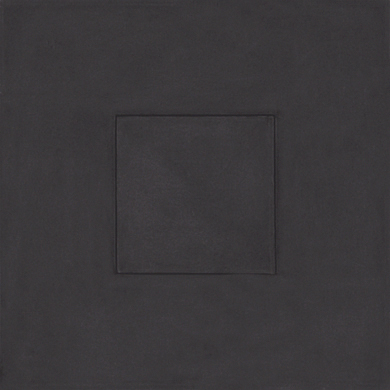
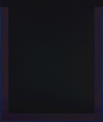
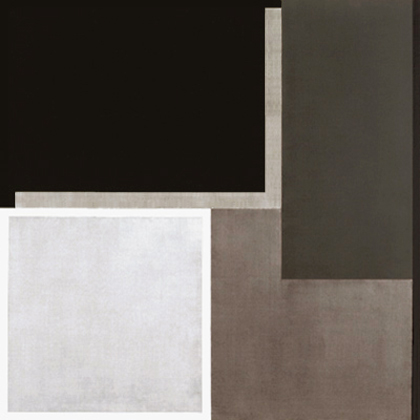
The Black paintings are the first series in this new relational work.
In this series, I was using a more complex system of proportioning and positioning of forms in order to achieve asymmetrical, relational composition.
The systemic approach that had been used in Minimalism and in my own reductive paintings to purge composition was now being used, ironically, to create it—albeit with rectilinear forms that conformed tenaciously to the directional forces of the grid. At first unwilling to give up chromatic color, I settled upon black, white and grey, confidently regarding grisaille as color.
I was attempting to create a visually complex and psychologically potent space while extending my use of the conceptual basis of my earlier work. These refreshing discoveries opened the way to an entirely new body of work, the reverberations of which are apparent in my paintings to this day.
Having made this leap that seemed simultaneously forwards and backwards, I was more convinced than ever—with a sense of wonder—of the circuitous, overlapping, often contradictory and definitely synthetic nature of the creative process.
Were you doing preparatory studies for these works?
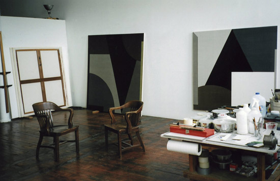
Previously, I had played down the role of studies in my work, often doing none at all and arguing for an honest directness unimpeded by preparatory work. But for the Black paintings, I made many formal studies. For each painting, there is a study on paper from which the painting is done directly. This practice continues to the present.
After almost ten years of working on this series, you once more felt the need to move on.
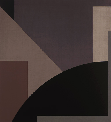
As I developed the compositions for work beginning in late 1997, I wanted an expanded vocabulary of form and more complex compositions.
My thinking was additive and not reductive. The opening up of full-bodied, relational and asymmetrical space flew in the face of minimalist precepts, of course, but nonetheless offered me a way to keep my paintings alive and psychologically engaging.
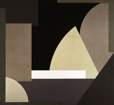
When I began these works, they were organized in a similar way to the Black paintings, with the canvases subdivided in halves, quarters, thirds, sixths, and eighths. The forms were expanded to include curves and angles, providing a more complex interaction of elements and thus more possibilities for expression. Suddenly more was more, and that seemed vital.
Your use of color had also changed.
While I had been glazing to establish a grisaille effect in the Black paintings, I had not used chromatic color. Now, in order to situate and distinguish one form from another in these more complex compositions, I needed a larger palette of color. I began glazing some of the greys with primary colors—red, yellow and blue with an occasional green, the “fourth primary.” Often the glazes were very subtle, barely visible, and other times very dramatic.
These Multiform works were organized in a similar way to the Black paintings, with the canvases subdivided in to halves, quarters, thirds, sixths, and eighths. But the forms were expanded to include curves and angles, providing a more complex interaction of elements: These paintings also maintained the same scale relationship to the viewer as the Vessel and Black paintings – that is, a body-sized address to the viewer. Since my first encounter with that Pollock painting, I have favored large, anthropometric canvases, with their undeniable physical and psychological presence. My aim has been to engage the viewer both emotionally and intellectually – thought and feeling all at once.
In the Homage series that followed, you increase the complexity of your compositions.
I began the Homage paintings in 2005 and continued them through 2008. They allowed me to resume the Multiform series, but with even greater complexity. Containing ten or eleven interacting forms rather than the seven or eight of their predecessors, they also arose from a new motive. Certain masterworks from the past by Caravaggio, Velazquez, Poussin, Vermeer, Gericault and others acted as 20 springboards for new compositions. Ironically, these masterworks are miles apart from what Ido as an abstract painter. Nonetheless, they provided me a catalyst that launched my work into more complex formal territory. This project preoccupied me intermittently for about three years.
What developments have occurred in your most recent works to date?
My recent paintings, which I refer to as the Threshold paintings, revisit themes involved with symmetry, framing elements, and a window or proscenium kind of space. Like the Vessel paintings from 1977 to 1987, they are body-sized, confrontational, and square off with the viewer, placing him or her in stasis. Unlike those paintings, which have a contemplative aura, I attempt in the new work to induce a moment of apprehension, of theatrical disquiet, as well as a sense of potentiality. I’m not finished with the Threshold paintings just yet. One never knows where one will end up after all is said and done. There are always ideas from my past work that will haunt me, dog me, until I find in them a way forward. So, the problem is never a lack of ideas or inspiration; there is just never enough time.