First published in 2010 in Geoform, a curatorial project by Julie Karabenick, and republished with permission.
Interview by Julie Karabenick
Mark Emerson received an Associate of Arts degree from Sacramento City College, California in 1974. He studied at the California College of Arts & Crafts (now the California College of the Arts) in 1975 with a concentration in painting and film. He received a BA from California State University, Sacramento in 1979, and an MFA from the University of California, Davis in 1984. To date his work has been featured in 24 solo exhibitions and numerous group exhibitions. Emerson has taught art since 1986, most recently at California State University, Sacramento from 2002 to the present, and The Art Institute of California, Sacramento since 2008. Emerson’s work is found in many private, corporate and public collections, including in California: the Crocker Art Museum, Sacramento; the Berkeley Art Museum/Pacific Film Archive, Berkeley; the University of California Davis Medical Center, Sacramento and Roseville; California State University Art Department, Sacramento; the University of California Art Department, Davis; Sacramento City College Art Department Permanent Collection, Sacramento; Kaiser Hospitals of California; and in Ohio, the Progressive Insurance Art Collection, Cleveland. Emerson lives and works in Sacramento, California.
You often refer to the importance you place on responding to the picture plane in your painting.
How can you not pay attention to it? It’s the form on which we artists generally do our business, and I refer to it constantly. The painting surface is not just where a painting ends—it’s integral to the whole structure.
I find the two-dimensional picture plane a remarkable opponent. How can I resolve what to do on this picture plane—generally for me a square or rectangle? It’s always a struggle. Yet there are so many possibilities—painters haven’t been able to exhaust them.
I believe the geometry of the picture plane lends itself to geometric work. One of the things that has always struck me about the process of making and viewing art is honesty. Confronted with a painting, sculpture, film or drawing, I ask: Does the artist own it? Are the marks or ideas his own? Is he being straight up in his intentions? I’ve always responded to squares, stripes, and rectangles. Therefore, my honesty is held in the persistent reaction to geometric form as the compositional basis of my paintings.
A square or rectangle would seem to be the antithesis of forms in our organic world. Nothing in nature is rectangular or square. Nonetheless, we base our human lives on these shapes—buildings, formats on which we write and produce visual expressions.
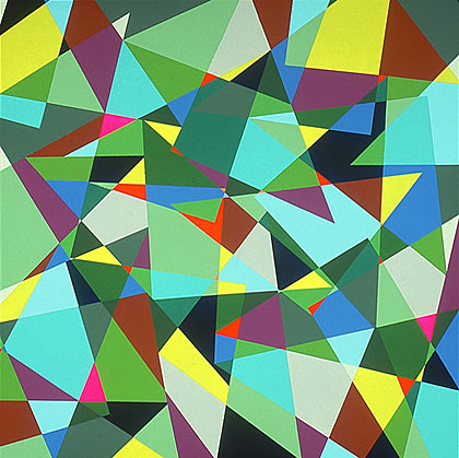
I believe that the job of an artist is not to respond to all that is witnessed, but to hone and present a judicious response to visual experience. For example, look at Mondrian’s Broadway Boogie-Woogie. The forms in New York City at the time were not exclusively rectangular, and the colors were certainly not limited to black, white, red, yellow and blue. Mondrian’s presentation reduced the rhythm and flavor of the scene to a personal and effective structure.
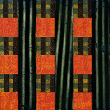
You’ve most frequently used the grid as your organizing structure.
My interest in the grid began in high school and continued into junior college where I was a commercial art major focusing on graphic design. Graphic and interior design use both geometry and the grid. The grid both breaks up and unifies at the same time. Repetition is a unifying structure, and the grid repeats and unifies the picture plane. It also produces many formats and multiple opportunities to work with more than one image.
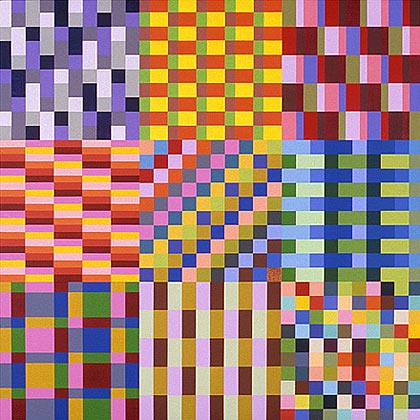
And you’ve often used repeating bands or the grid to capture sights and impressions of the natural world—even those as ethereal as the quality of light or the night sky.
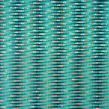
My attention to the picture plane has led me to translate organic form into a geometric structure. And I think there’s visual structure in nature, perhaps not purely geometric, but a natural thrust—for example, trees grow straight and tall vertically and rivers flow horizontally, setting up a very direct vertical and horizontal dynamic.
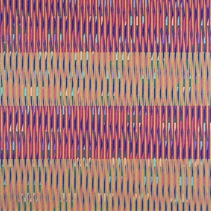
Your more recent work seems to have less to do with capturing qualities of light and atmosphere and more to do with vibrant juxtapositions of pattern.
Yes, the newer work represents a different direction—trying to compartmentalize and break up space.
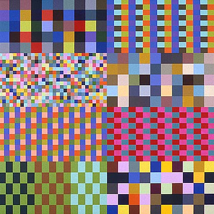
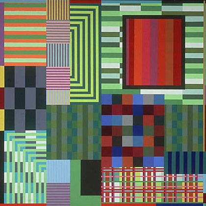
In One More Minute and Away We Go, I’ve divided the canvas into squares or rectangles. Each has its own pattern and color scheme.
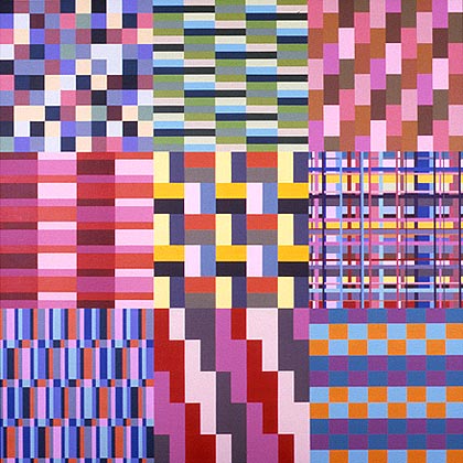
Were you interested in art as a child?
As a young child, I could draw representationally very well. I was always considered the class artist from elementary through high school. My art education in the public schools was poor—primarily making crafts or copying magazine photos. I showed some talent and was left to work independently. I learned next to nothing.
I recall that in seventh grade, an art teacher displayed the famous Life Magazine piece on Jackson Pollack. I still remember those images vividly. Instead of making fun of the work or being repulsed by it, I thought it was remarkable that someone could actually make art by throwing paint around. I was excited by the possibilities. Of course at that time, the process also looked like fun. A few years later, I saw a photo of a work by Bridget Riley. Again, I was taken by the fact that this remarkably non-objective image was indeed art.
My parents responded to my interest in art. By the time I was in junior high, we would visit galleries or museums to see their master works. Of course, neither my parents nor I had studied art history, so we were at somewhat of a loss to understand what we were looking at.
I entered junior college at Sacramento City College as an advertising major. I took drawing and painting classes, and I knew I wanted to become an artist and teach. I excelled at a class in rendering—descriptive drawing—but I felt something was missing, that I just could not make art in this way. Abstract art held mystery and uncertainty for me; it seemed so open to possibilities. My own paintings have always been abstract. We often visited the Berkeley Art Museum where they had a large collection of Hans Hoffman paintings. I was drawn to his dynamic use of color and value in resolving problems of composition.
The work of Richard Diebenkorn, Elmer Bischoff, David Park, and Joan Brown were on view in regional museums and had a broad influence on teaching in this area. By the end of my undergraduate studies, I was doing brushy abstract expressionist paintings that I tamed into a Bay Area style. I was exploring different methods of paint application, here using broad joint taping knives. In these paintings I was starting to respond to landscape—not the literal landscape, but the power of atmosphere and light.
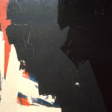
Once again, I felt that something was missing in these works. As I’ve said, I’ve always been concerned with structure in painting and its relation to the picture plane. I wanted to establish clear boundaries separating areas of color and pattern, and in graduate school, I began to use masking tape to create crisp mechanical edges. It was at that time that geometry started to play an important role in my work. I was looking at a group of Los Angeles painters—painters like Karl Benjamin and others—who were involved with visual structure based on geometric patterning.
I made two large folding screens of four panels each. To this point I’d done little sculpture, and this was a brief attempt. But I found that what I really responded to was the frontality of the picture plane, not the all-around nature of these screens. I folded the screens in different configurations and tried to translate their three-dimensional nature onto the flat picture plane, as in these paintings of the screens, below.
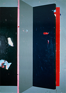
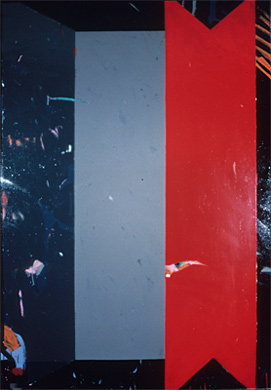
Next we see you beginning to use the grid to structure your work. These paintings seem to prefigure, if in a more simplified form, the juxtapositions of discrete areas of pattern that characterize your more recent work.
After graduate school, I rented a studio in the downtown area of Sacramento. I made a set of large paintings about location or mapping. Their structures refer to the very strong grid layout of the city.
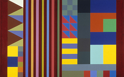
At the time, I hadn’t really begun to explore color, and my palette consisted of either pure or neutralized hues. In the painting below, the black, grey and white areas match the values of the corresponding colored areas on the left.
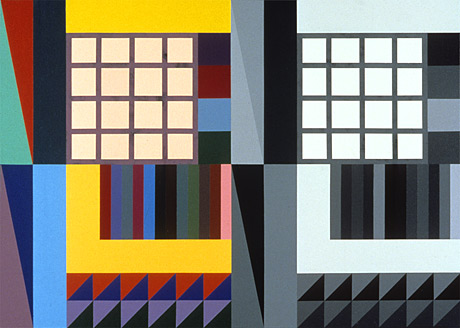
A teaching job at a local junior college opened up for which I was well qualified, but I didn’t get the job. I decided I wanted a change. I moved to Los Angeles, leaving a house and ample studio space for a small apartment where I had to drastically reduce the scale of my work.
While in Los Angeles, I had an epiphany. I was living in Venice, which is just south of Ocean Park, the area on which Richard Diebenkorn based his Ocean Park series. I loved that work—its scale, color and geometry. One evening at dusk while driving through Ocean Park, I really saw those paintings spread out before me. I saw how they captured a sense of place—the atmosphere, the local color, the telephone poles and wires. It really hit me how powerfully the color of light in a specific location had been affecting me for some time. I felt it was something that couldn’t be captured literally. I’d have to show it though non-objective form. Working on a traditional two-dimensional plane, geometry seemed the right choice.

I began a series of small works on paper that would reflect the local color and atmosphere of Los Angeles. There the Southern California smog diffuses the light, muting colors and reducing value contrasts. And not only did I look at the sky, I was also looking at the color of buildings, which is also rather idiosyncratic to the region—aquas, pinks and corals are prominent in the architecture and decor.
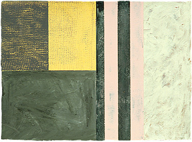
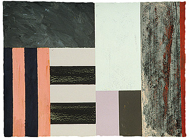
I was also exploring texture. To this point, I’d used acrylic paint in a very flat manner. In Los Angeles, I tried to push the paint and make it do as much as I could. I was using glazes, impasto, dragging paint with a comb, contrasting matte to gloss, using very thick next to very thin paint applications.
In 1990 you moved back north to Sacramento.
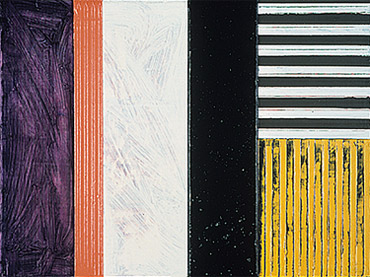
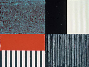
I returned with a better sense of what I was working towards. I was still responding in my painting to the color of light. In Northern California the sun shines very brightly, making strong contrasts of light to dark colors with a broad range in between. Shadows are deep and dense in color and value. I also continued a path of process, pushing the medium. In fact, I often manipulated the painting surface to the point of abuse, then moderated these effects, making the textures more subtle. And I was interested in the idea of palimpsest—evidence of markings below the surface that have been obscured by the treatment of the top surface. And the textured surfaces also referenced the surfaces of the landscape.
Vox was the first of what I called my “ying-yang” paintings, in which I limited myself to a single division of the picture plane so I could concentrate on color and texture. I wanted two sides that were very different, but of equal visual weight. Vox is one of my infrequent black and white paintings. It contrasts a dark matte side against a creamy, textured and glossy side. I was trying to capture and flatten the magic of the atmosphere.
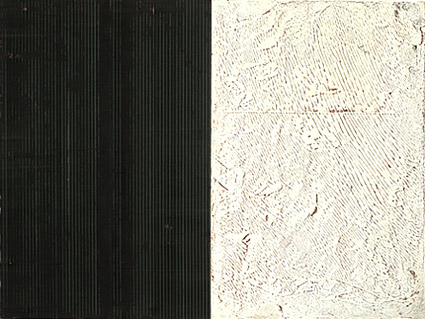
These paintings evolved through a layering process—texture upon texture and color upon color until I felt the two sides both competed with and complimented each other. These paintings were of medium size, but they were also about three and a half inches deep. They projected out from the wall to slightly invade the viewer’s space. They felt a bit like sculpture.
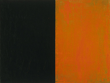
At about this same time, I happened to see some large vertical paintings that had two treated sides and hung perpendicular to the wall. This led me to do several two-sided works that hung on edge at right angles to the wall. They were indeed sculptural pieces. The title of one—Liberté—suggests the liberation of the picture plane from the wall. But I felt confused about how to enter and view these works. These two-sided works didn’t have that same confrontational aspect that a painting does. They didn’t feel quite honest enough for me.
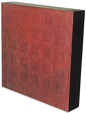
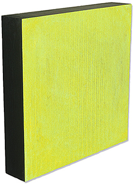
Bedim was the first of a number of paintings that were a direct response to the night sky. Evening, dusk or early morning—the variations are quite stunning. The night sky isn’t really visible in Los Angeles due to the smog. In northern California, the sky is alive with color and texture. In this painting there’s a discrepancy of color as the surface opens to a new reference to space.
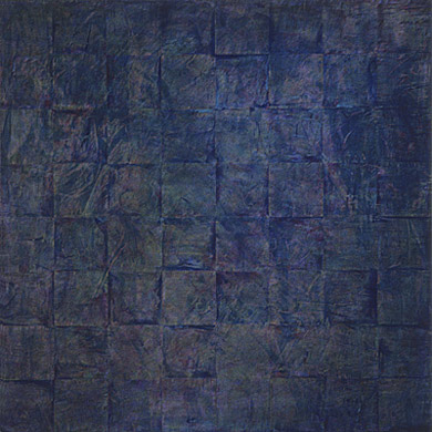
After the two-sided paintings, I began to divide the format into thirds for a stable, but unequal structure. This was really the beginning of my interest in visual rhythm, which I’m involved with today. And I was still exploring textural elements that would draw the viewer to the picture plane.
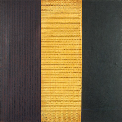
I was also exploring the rhythm and speed of the forms. For example, thin stripes placed close together seemed faster than blocks of color and wider stripes.
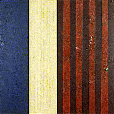
Juxtaposing complementary colors produced tension as did opposing the geometric and the organic.
Candide is a seminal work from this period, one of those occasional paintings that seems to paint itself. The left half is dense and lush with warm colors, while the right half is cooler with a fog-like atmosphere.
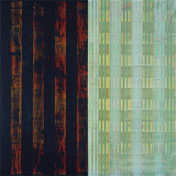
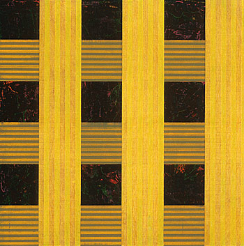
Night Sky III is quite vibrant, with an upward thrust despite its grid.
I’m looking at both the landscape and the atmosphere. When I say “atmosphere,” I always look up, as people do when they say, “Let me think.” Is the answer in the heavens? Is the atmosphere in the heavens or right in front of you? These vertical bars are directional and active, almost strident.
We see your work increasing in complexity.
At the time, I was questioning my approach to color and trying another direction. I wanted to step away from surface treatment as theme. I was after a more geometrically derived color arrangement. Colors were at this point referencing not only the atmosphere, but flora found in the area.
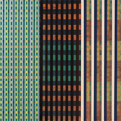
I began to reexamine the work of Georges Seurat. I have felt for a long time that Seurat was born a bit too early. From his scientific approach to painting, one might expect him to have been an abstractionist. I was interested in how Seurat achieved very different visual effects when his work was viewed up close and from a distance.
In a painting like A Sunday Afternoon on the Island of La Grande Jatte, Seurat’s tiny drops of different colored paints optically blend when the viewer stands back from the work.
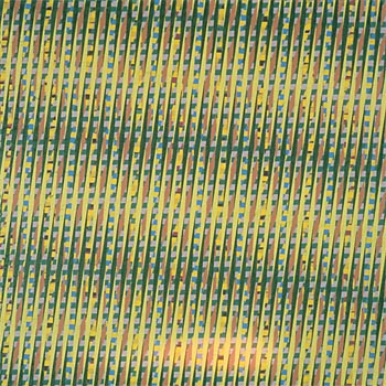
Yes. I was interested in creating a very vibrant and active surface, a field that would come alive when viewed up close and that would almost melt into solid areas of color from a distance. If yellow dots next to blue dots would optically mix to produce green, it made sense that yellow stripes paired with blue stripes would produce a similar optical effect. Thus began a series of paintings that dealt with color relationships and rhythms on a given field.
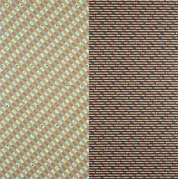
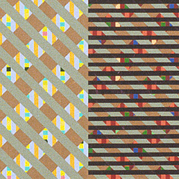
These paintings function on two levels. Up close, they work as arrangements of small color chips that expose separate and distinct forms. From a distance, they blend to create areas of a third color, while maintaining a wiggle effect from the color dynamics. The diagonals also contribute to a sense of movement. In Night Sky #5, juxtaposing complementary colors yields a vibrational quality, and the aqua green shapes appear to hover in front.
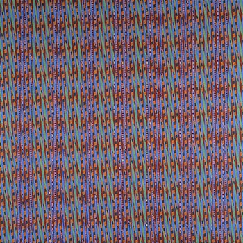
The color arrangement has—for lack of a better word—pixilated. These small color areas suggest texture, though I applied the paint in a flat, even film—no brushstrokes, no variations of hue. The bands of color are “woven” together as in the weaving of fabric.
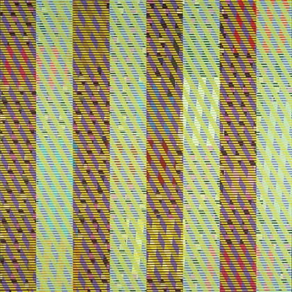
A number of works completed over the next two years would be shown at the Crocker Art Museum in Sacramento in an exhibition entitled Optimum Rhythm.
These paintings contained a visual rhythm that was related to my interest in music. I respond to music and its abstract nature in that music doesn’t have any literal translations. It’s always surprised me that there’s an acceptance of music that’s quite abstract, while abstract art, whose practice is over 100 years old, is still met with some objection.
I play at the drums and have a simple kit in the studio that I often play while paint is drying. I look at rhythm shifts and tempo in classical music and jazz to inform my paintings. Music is based on math, and my paintings use many elements of math—scale, fractions, division and multiplication of form and color.
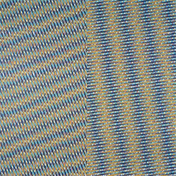
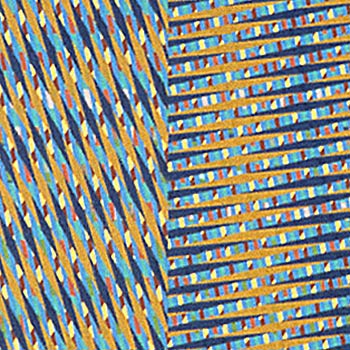
These paintings are also about process and were very labor intensive. They contain 23 to 24 layers of stripes. I made no drawings and had no preconceived notions of their final outcomes. I applied layer after layer, and, since I couldn’t see under the masking tape, every step was a surprise or a disappointment when I’d lift the tape.
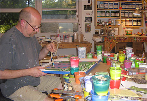
Here we see you removing tape from a newly painted area. You’ve used acrylics for most of your career.
Because of the nature of my work, acrylic is the best paint for me. I can mask an area off, lay paint down, dry the area with a hair dryer and remove the tape fairly quickly. Marcel Duchamp said he gave up painting because it was too much filling in. I’m the opposite—I love the act of painting, the filling in.
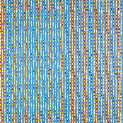
You sometimes incorporate a contrasting rectangle or square of contrasting pattern into a larger field.
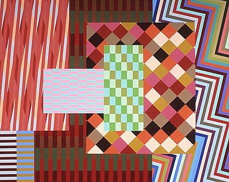
I enjoyed how Sean Scully created large fields of stripes and would then insert a small change-up of pattern, texture or color. In Nip & Tuck, I was thinking about Scully’s work, creating a box that appears to hover over the field and that actually disappears when you get up close.
You continued to incorporate contrasting areas into larger paintings.
I had to opportunity to exhibit at the Huntington Beach Arts Center, an enormous space that I got to share with Karl Benjamin. I felt that it was time for a change in scale and approach in my painting. I wanted to work larger and break up the space on the picture plane in a different way. The only door into my studio was 71 inches, so I built eight panels that were 70 by 70 inches. These paintings are for me a body-size format—they’re as tall as I am.
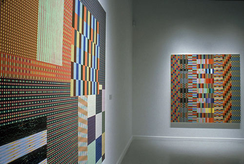
The work from my Optimum Rhythm show had dealt with surface, texture and color. In this new work, I intended to break up the picture plane with rectangles and squares to create an illusion of space and depth. These new paintings were “built” by laying down an area to establish a pattern or grid, evaluating its visual effect, and then laying in adjacent forms that either complemented or acted against the previous area.
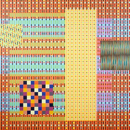
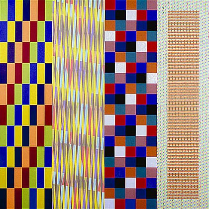
In Centcom, I began by dividing the painting into four squares filled with very fine textures. The two boxes that appear to hover were added last and are filled with patterns composed of larger shapes.
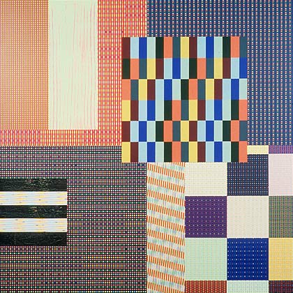
In 3-Way, I returned to an earlier format in which I would divide the field into 3 vertical areas. The left and right panels are composed of 1/4″ patterns and tend to recede a bit behind the central checkerboard.
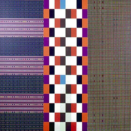
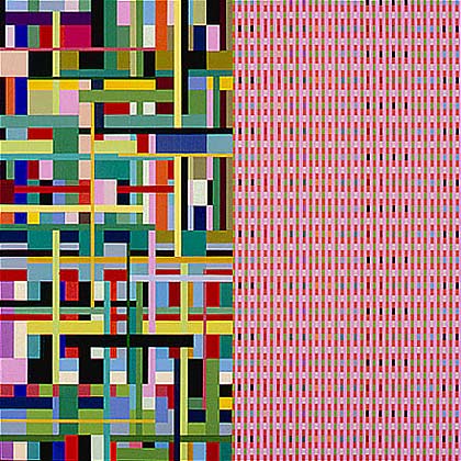
In Let Me Know, I decided on the compositional structure in advance, so I could focus solely on the resolution of rhythm and color. I set up eight vertical bars, each filled with different patterns and rhythms. I tried to create a certain speed of color and pattern in this painting—a constant buzz across the picture plane.
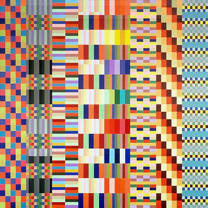
Animal Dance is also structured with vertical bars of pattern that contrast quite strongly with one another.
In part it’s the similar hues within the two left- and right-most panels that help give the work cohesion.
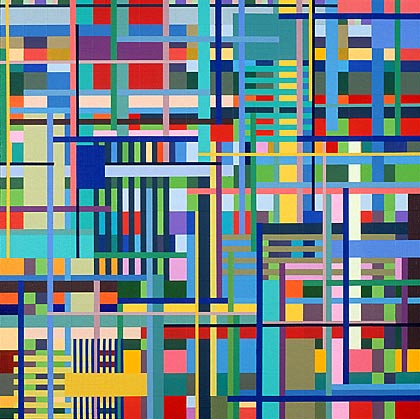
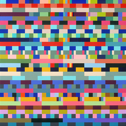
In addition to continuing to work with the grid and discrete areas of pattern and color, you made some more allover paintings.
I was trying to get more depth of space. The tempo and rhythm of the painting is equal over the surface. Also, I’m trying to make the picture plane arbitrary, that is, the image is contained only by the physical boundaries of the surface, but could continue endlessly.
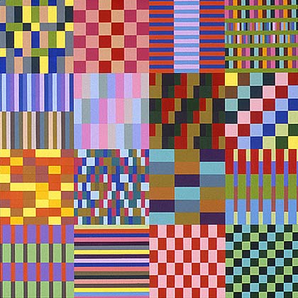
You were also making works that were strongly grid-based.
I was thinking a lot about music, specifically jazz—its improvisation, shifts of beat and tempo, color and phrasing or patterning. I wanted to set up verticals and horizontals, changing each section as in counterpoint.
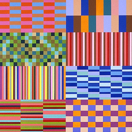
In a series of works on paper, you began to allow diagonals back in.
Untitled #906 was the first in a new body of work that I made in the new studio I built in 2006. In every other studio that I had worked in up to this point, another artist had occupied it. Now I had a studio with no ghosts of previous creative spirits. I wanted to plant my own spiritual seed. I decided to move away from dividing the picture plane equally. I removed chunks of larger areas of pattern and used diagonals to alter the speed and flavor of the work.
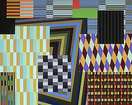
Where does the title Utfart comes from?
I was in Sweden in 2006, and this word appeared everywhere by doorways. It’s Swedish for “exit.” Utfart was informed by the changes I had introduced in Untitled #906. I was trying to get as much information as I could into these paintings. Diagonals zip around three sides and move the eye around the work. I was exploring patterns and shapes I hadn’t used before. A rectangle of four different patterned areas floats above the others. I included framing elements, partially disrupted, to reaffirm the picture plane—just as Suerat had done when he painted the actual frames.
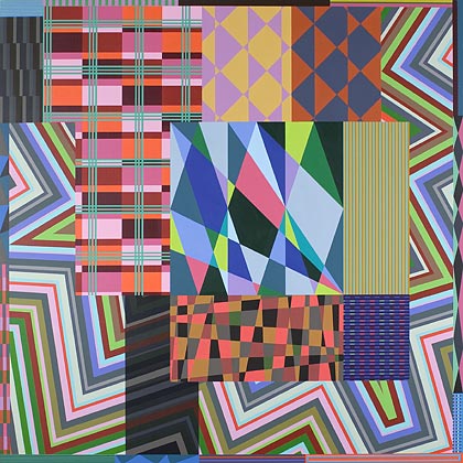
My daughter has books with mazes that she can solve almost immediately as I could as a child. The formal structure of Pussy Wiggle Stomp uses a maze structure. I began with the middle section and continued around it. I limited myself to a color palette of around 9 colors. I wanted to set some limits and explore the possibilities available within them by using different juxtapositions of color.
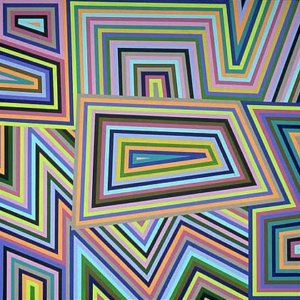
Tears of Joy looks like a grid that’s been fractured by cross-cutting diagonals.
This is the first painting of this nature. I was doing quick sketches, trying to break up space and leave my comfort zone of hanging onto the grid. This is the first painting based on diagonals, triangles, diamonds.
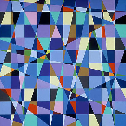
With Momentum, I’m using triangles and diagonals to try to create a circular rhythm.
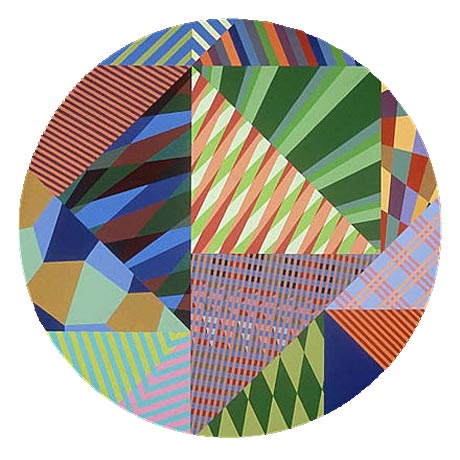
With Ollerchoke, you’ve clearly entered new terrain.
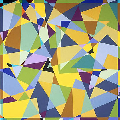
The rhythm of Ollerchoke is much more fluid and gives the feeling of varied time signatures. The diagonals are directional lines that create movement. I’ve gone from the broad patterned areas that abut one another in the grid-based work to little pinch points that I equate to small areas of percussion, flashes of cymbals here and there.
I’ve been painting seriously for almost 40 years, and sometimes I forget why I’m doing what I do—I just do it. It’s my job; I can’t wait for the muse. As Chuck Close says, “Inspiration is for amateurs.”
The thing about making art is that it, like life, changes constantly. Paintings start in a certain direction, an idea or sketch. As we draw the forms, apply the paint, if we are paying attention, the work reveals things about itself, things that cannot be seen or touched by any other means. In painting, these things are visual not verbal. The very essence of art is the visual experience, and that experience changes as fast as life itself. Some—particularly students—find this constant inconsistency frustrating and give up too soon. The rewards and pleasures come over time, and with constant looking, we find ourselves actually seeing.
