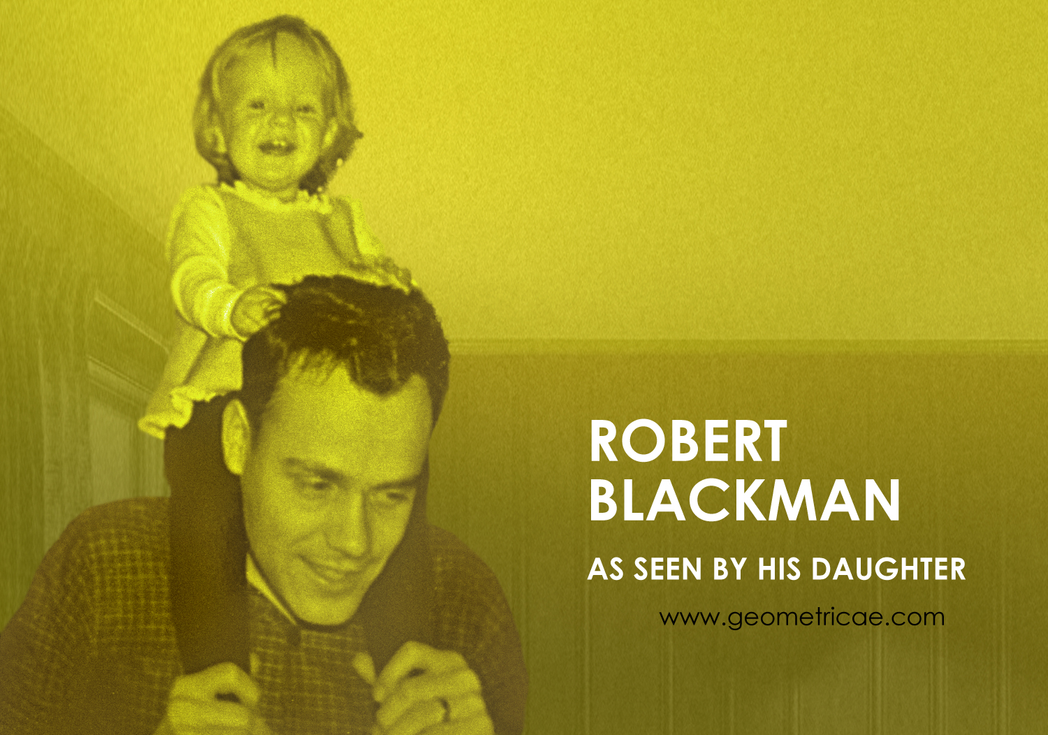
 Written by Perrin Blackman
Interview conducted by the fictional character Theodore Vladimir “TV” Leftoutski.
When Robert Blackman and fellow Art Research Center artists invented him, Theodore Vladimir Leftoutski (the unknown constructivist) was trying to get up a softball game out behind the Bauhaus, and he was way out in left field that day. The poor fictitious man never got his claim to fame, but he found his people that day in 1968.
Blackman, also an unknown constructivist, saw himself reflected in this pretend persona. Thus, it seems fitting that TV Leftoutski be the one to conduct this interview about him with his daughter, Perrin.
The interview took place in Perrin’s cozy but modest house in Lawrence, Kansas. Mr. Leftoutski arrived in usual style, in a nondescript car, wearing a nondescript coat, and carrying a nondescript briefcase of no particular color. It was immediately apparent that this… was the unknown constructivist.
Before settling him in with a cup of black coffee, Perrin showed him around her home. In the living room was a photo album with images from her father’s early period: the late 50s –early 60s.
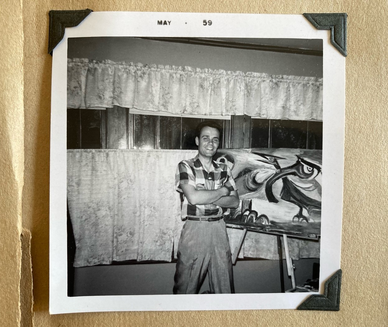
Oh, yes, I remember Bob’s abstract expressionist phase. It didn’t last long compared to his geometric work. What did he have to say about this kind of work later?
Well, he told me, “Everybody was doing that then,” and I thought of it as almost an apology in light of how his work progressed.
Was he ashamed of his early work?
No, definitely not. He just saw it as a phase, and I know he appreciated the fact that it was really fine work. It just wasn’t the direction he ultimately went. He knew he had a gift, but I think in the beginning, he didn’t know where he was going with it.
He did go to art school in Pittsburg, Kansas, not far from where he grew up in Liberal, Missouri. He graduated with a bachelor’s in Studio Art and a minor in Psychology in 1959 and went on to get a master’s in education in 1964, but even before college, he always knew he was different. He was more sensitive and thoughtful than the farm boys he grew up with, even from his earliest school days.
One time he showed me a kindergarten report from 1941. His teacher had written: “He sometimes does good handiwork and other times he draws or paints with no idea in mind merely experimenting with lines and colors – when asked what he has made he thinks a while then figures out a pretty good answer.”
I have an audio of him talking about it. Hang on…
[Perrin opens her laptop and plays an audio recording.]
Robert Blackman’s voice is heard: “I got a kindergarten report card… I knew I was right and they were wrong… [his voice comes and goes] So you couldn’t follow anybody, you couldn’t take any hints from anyone, you just had to do it.”
Even though he was a minimalist, he kept that report card because it was important to him. It helped him to understand his own mind.
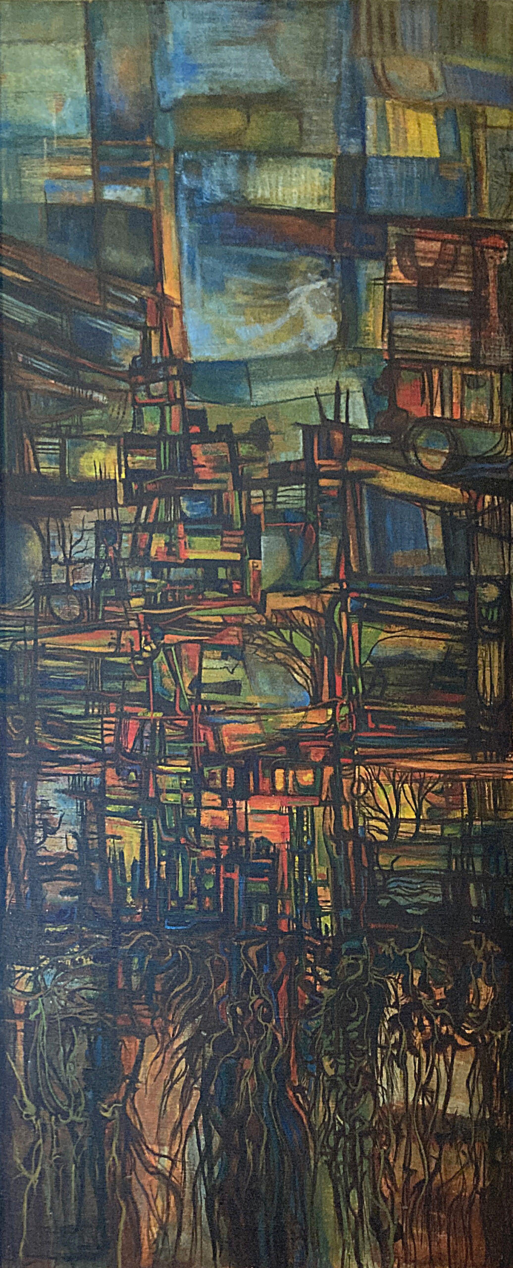
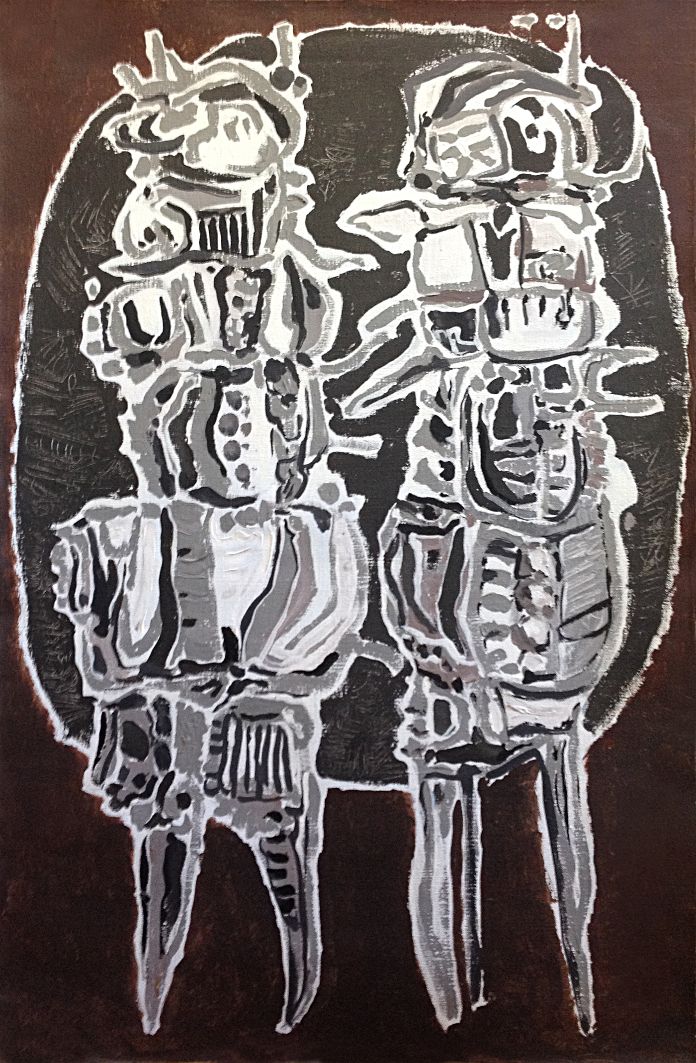
I wish I could see some of that childhood work, but the oldest pieces I have are from his college days and the period right after he married my mother, like this painting. It’s supposed to be a city. You can see the roots, then the people, then the skyline.
The back says it was done July 21, 1963. You were…?
I would have been almost 2 years old then. I remember growing up with the smell of oil paint and turpentine all around. He also did some portraits of me around then, and he worked on still life studies and other abstract paintings.
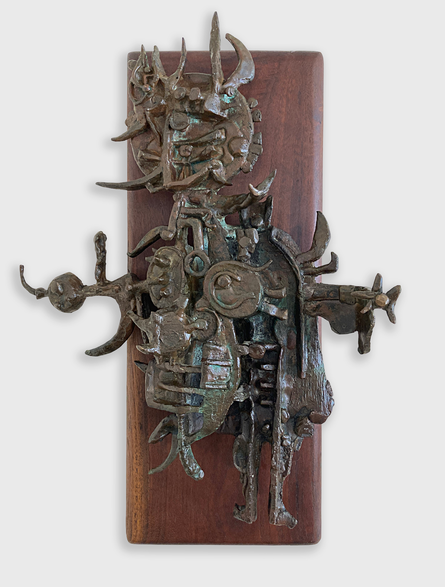
There were a few images that he repeated, a yappy dog, birds, and a corkscrew/can opener. You can see the corkscrew shapes in this painting and the bronze, for example.
I’m guessing it was made a bit later when we lived in Maryville, Missouri.

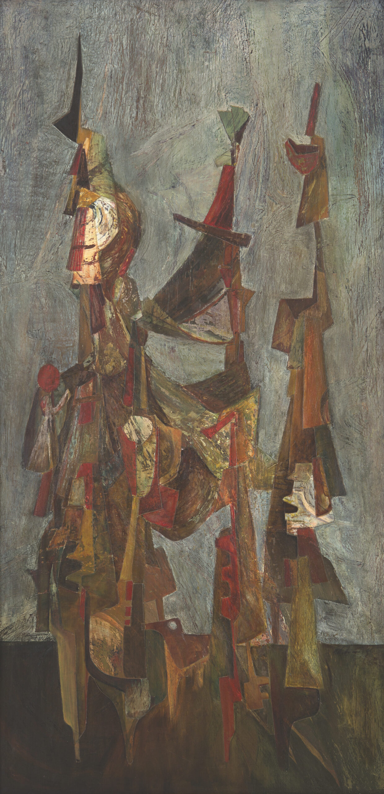
The same general lines and expression show up in a painting called “The Warrior.” It’s oil on Masonite board. I have an audio of him talking about it: Robert Blackman: “The image itself is a warrior, his staff, and his weapon. And they’ve all become the same thing. But he’s contemplating. He’s holding a red carnation which is a symbol of contemplation. So he’s a thoughtful warrior. And it has a very low horizon, and it has his little dog down here.”
So he was definitely using imagery and even telling stories during that time. I remember he did a kind of self-referential painting he called “Portrait of the Artist as a Provincial City.”
That one is lovely. It’s also oil on Masonite. It has the city motif again but it contains symbols that had meaning only to him. Very solid piece!

So during this time there were some darker, expressionistic paintings, but at the same time he worked with more vibrant colors. I remember the one called King and Counsel: Humphrey and Nixon. Kind of a political cartoon. He was trying to show how both sides of the political spectrum tend to be cut from the same cloth.
Right, he was already refusing to limit himself to one palette. The corkscrew/can opener design shows up there too, as a scepter!

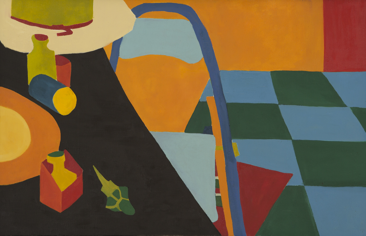
He also started flattening the images then and playing with the horizon line. More of a Matisse style or Calderesque approach.
He did one called “The Blue Chair” where he was experimenting with a flat perspective. The space is more ambiguous and he was working with areas of solid color. He wasn’t trying to express his feelings anymore at this point; he seemed to paint whatever was around.
How many different mediums did he work in?
He drew and used ink, but mostly oil paint, clay, or bronze during this time.
Before they dreamed me up, he moved the family from Pittsburg, Kansas to Maryville, Missouri to teach in the art department at Northwest Missouri State Teacher’s College (now it’s NWMSU). He was in charge of sculpture and ceramics there, correct?
Yes, I was about 6 years old. The art building was new and beautiful. It’s called the Olive DeLuce Fine Arts Building. A big circular mid-century modern structure built in 1965. I remember that the ground floor where his office was. It was only partially finished. They called it “The Pit” because part of the floor was still dirt! I spent hours down there playing with clay and watching my mother make jewelry and small bronze castings.
They had met and married in art school in Pittsburg. She took classes and tried to play the role of a housewife and fit in with the Welcome Wagon and the Dames Club while he taught. It was a rough time, leaving the expectations of the 1950s and moving into the 60s. It couldn’t have been easy.
What sort of work was he doing at this point?
Mostly ceramics, examples for his students, and bronze sculptures, but he continued with the transition from expressive to concrete painting.
And then…
Then all hell broke loose. It was 1969. There was a lot of tension in the air. His art students were being drafted by lottery and sent off to Vietnam to fight. He and my mother protested the war as much as they could with a child in tow. Ultimately the pressure and possibilities of the 60s led my parents to get a divorce, and that’s when he went to New York to see if he could tap into the art world there. He was planning to change his style of painting to become more non-objective.
He wanted to see what was going on, feel the vibe, see how he fit in. He hated leaving us though, and he was only gone for about six months, but when he returned his artwork and focus had changed dramatically.
That’s a pretty short time for such a change. Do you know anything about his time in New York?
Yes, mostly from letters he sent us. It sounds kind of miserable and yet exciting. He stayed at 203 Avenue A #15, a place owned by the famous (infamous?) Ed Sanders of the Peace Eye Bookstore. Sanders had used the place to print his publications but he wasn’t around anymore.
[Perrin pulls out a stack of letters from that time and reads Bob’s words]
“The main thing about this place is the dirt. Age old dirt and grime. You get the feeling that it’s on the inside working out, that things are dirty from the core. You can feel it crawling up your ankles like an oily film.
Am going up to the Museum of Modern Art today with [Terry] Twigg. Twigg thinks he has a job lined up where Ted works giving tours. I am not going to look for a job for a while yet. From what I have seen of the scene here so far I don’t much like it and may not stay too long. I do want to get this one bunch of paintings out of my head.”
That’s when he began working on The Road. It was the only sketch he had taken with him after “abandoning” his other work. It’s a 4 by 4 grid with a shifting horizon line in each square that leads to the Necker cube in the last frame. Most of the paintings from this time were done with cheap readily available materials, mostly black, white, and yellow paints, some ink or gouache.
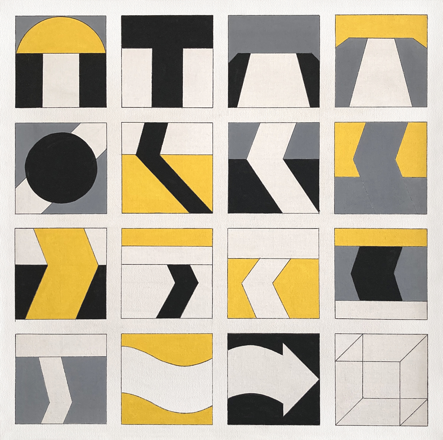
So clearly The Road was his most pivotal work because at this point, he wasn’t trying to express himself anymore. He was just exploring line, color, perspective.
Yes, and ultimately it led to a great many iterations.
I know he saw Sol Lewitt’s show, and he encountered the Anonima group in New York, right? Ernst Benkert, Ed Mieczkowski, and Francis Hewitt.
Yes, he spoke of them often, like close friends, but honestly, I don’t know if he ever spent time talking to them. He was like that, just watching and learning, from the outside.
Their tenets were: overlap, size change, brightness and light/shade. And they explored one at a time, right?
Yes, he said they set up “assignments” or rules every year, and everyone would explore what they could do within those constraints. He actually stayed faithful to those tenets longer than they themselves did.
I have a quote here from when he was talking about the purpose of the Anonima Group and the idea of just being anonymous.
He said, “The artist has the right to remain anonymous. Period. And really an obligation because when you get to the bottom of it, you don’t know what’s going on any more than anybody else.”
So as an artist, he really didn’t feel a need to explain his art. I think this concept gave him permission to do what he wanted to do: just paint and not focus on showing his work or even getting feedback. It somehow kept it pure.
And how else did Anonima’s ideas influence his artwork?
It was like finding a map to where he was already going. He took each tenet in turn and used those rules to guide his work.
I have one version of The Road that is very different from the others: it has an infinity shape right before the Necker cube instead of the arrow. He only used it once. I guess it was too obvious, too much of a symbol, but it’s my favorite. I asked him about it, but I can’t say I understood what he meant about it when he said: “If they can’t see anything more than their self-portrait, that’s what they get for being believers.”

I think it was a general comment on his work, not specifically about that painting.
Did he completely stop doing any figurative work?
No, but he was very focused on the geometric aspect. He doodled and dabbled with tiny self-portraits and cartoonish drawings on the back of envelopes. Oils didn’t work for what he was doing, and to get the colors he wanted, it had to be acrylic, pencil or watercolor.
So after six months in New York, he returned to Kansas City?
Yes, he had connections with the Art Research Center, and he wanted to be near St. Joseph, Missouri where my mother and I were living. I spent many weekends and summers watching him paint. I loved watching him mix colors, tape off areas, paint, wait for the paint to dry exactly enough, and then peel off the tape. It was usually a bit dramatic because he would either cuss and shake his head (knowing he would have to redo that spot) or smile and say nothing (if the lines were perfect).
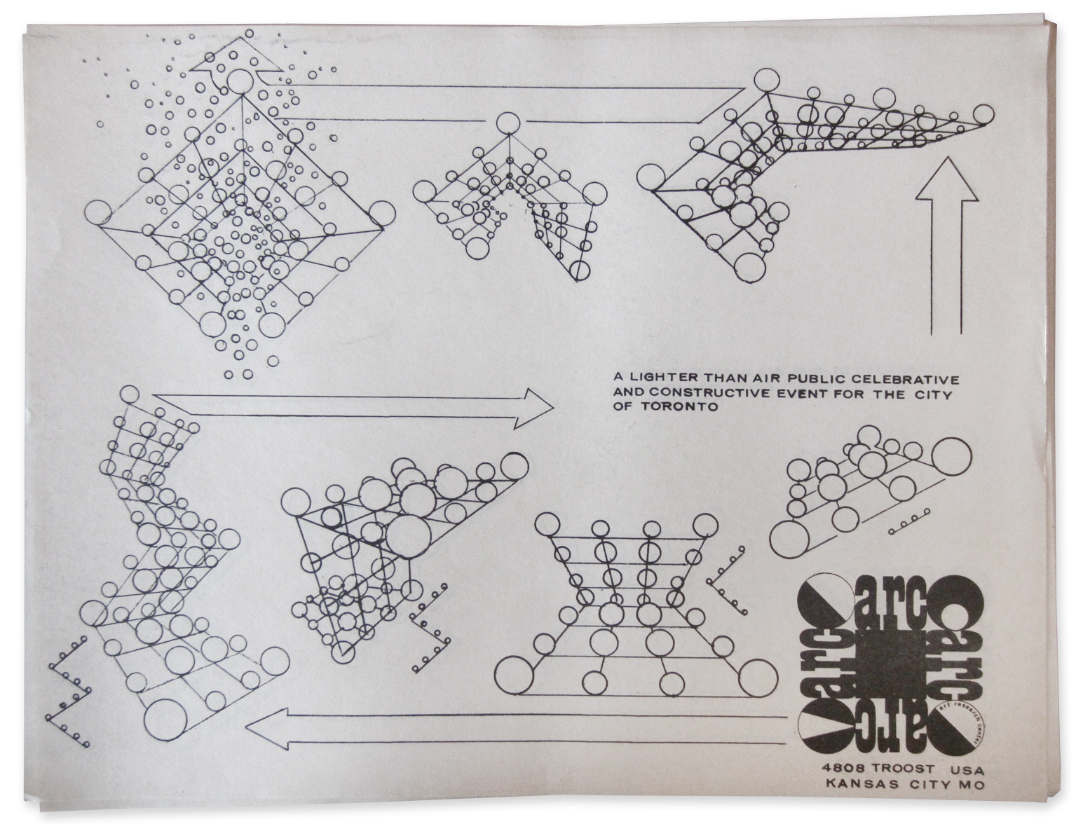
He also contributed work to shows and designed balloon structures with the ARC during that time, right? They had helium-filled balloons tied and floated on a rope grid.
Yes, he designed a 30-foot-high model that filled the Trolley Barn space in Kansas City in 1971. It was done again later at The University of Kansas at Allen Field House in Lawrence, Kansas and again at Crown Center in 72.
The biggest one he designed was exhibited in Canada. It was amazing. I was in fourth grade, about 10 years old, and I managed to get permission to miss school and go along to Toronto in 1971 to set it up!
I just remember loading into a van with a bunch of artists, my dad, Mike Stephens, and several others.
The van towed a trailer with another show we were returning to Zbigniew (Ziggy) Blazeje. It was boxes with colored plexiglass and lights. Needless to say, a van full of hippies towing mysterious boxes of “art” slowed us down at the border, but customs just sealed the trailer to be checked later and let us go. It may have helped their credibility that there was a kid in the van!
We stayed at Ziggy’s loft while they set up the muti-colored balloon structure at the University of Toronto in a big field.
The whole 180-foot piece was supposed to be released into the sky, but the air traffic controllers wouldn’t allow it, so instead they released smaller purple balloons through the other colors. Then they sold off the bigger balloons to spectators.


And you also got to hang out with the Art Research Center during that time. What else did he do with them?
He lived with Mike Stephens for a while near one of their galleries in the Trolley Barn area. I remember he always had a lot of space to work but never much money. I loved it. Just being around artists and musicians. I got to help them set up for shows now and then. There was one at an old ice cream factory, and I totally got into it, dragging boxes around and scrubbing out an old bathroom. It wasn’t work. It was like an adventure for me.
Did he put work in the shows?
Yes, he was involved in some ARC group shows, but he didn’t really like the gallery scene. He was a quiet person, not into being “the artist,” so he preferred to just make his art and not deal with the public aspect of it. He actually made fun of the whole thing in his quiet way.
One commentary he made was called “LIMITED EDITION” which was a joke because he printed the words “limited edition” over and over in a grid, and then copied it. When they ran out of copies to sell, he just went and printed more!
So, not a limited edition.
No, and he refused to sign them as well. It was hilarious! He loved poking fun at the art world.

Can you tell me about those early shows and prints?
I remember one show in 1979 at the ARC gallery where he showed his basic processes. He also participated in some of the Matrix and TELIC shows they did, and he helped design announcements for the Westport Trucker and in various ARC publications. Those continued to appear into the 80s when he did a grid of rotating circles for ARC’s 15th anniversary matrix show.
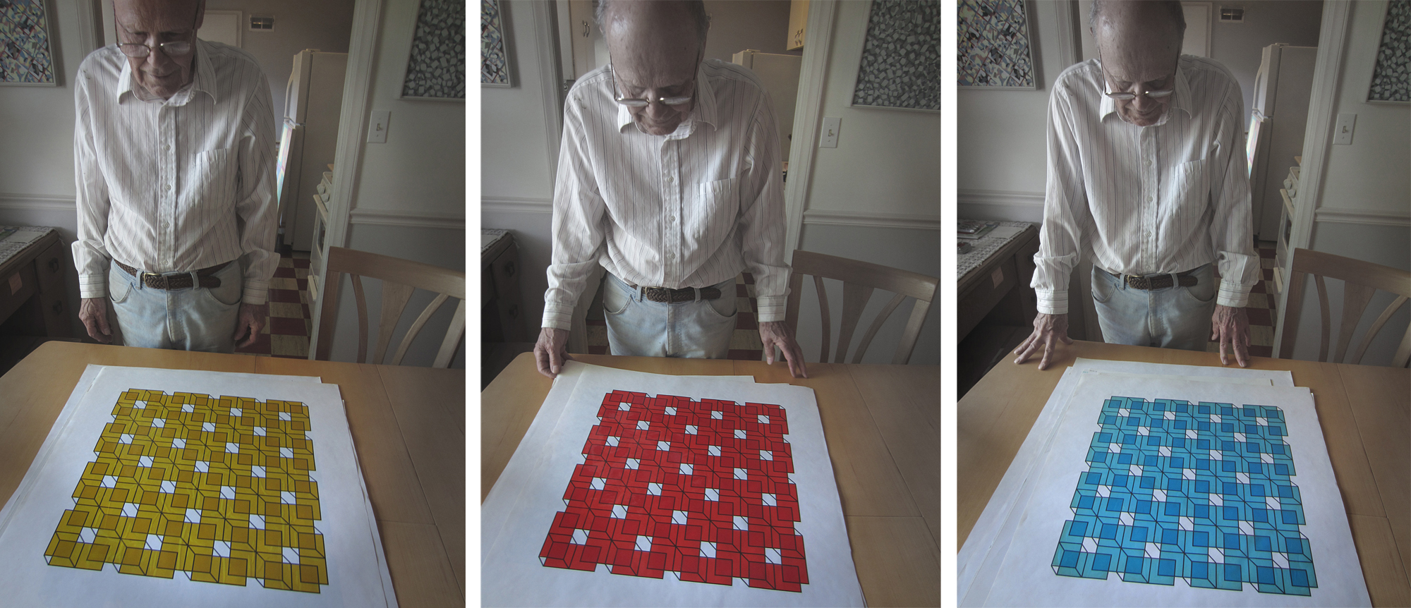
He also created two other graphics based on the Necker cube that he ended up calling the “Kenny Green” prints. Apparently, he had asked Kenny to make some prints for him, and Kenny made a bunch of extra prints! One has solid edges and the other has lines that continue past the edge. They were published in the Harrison Street Review in 1972.

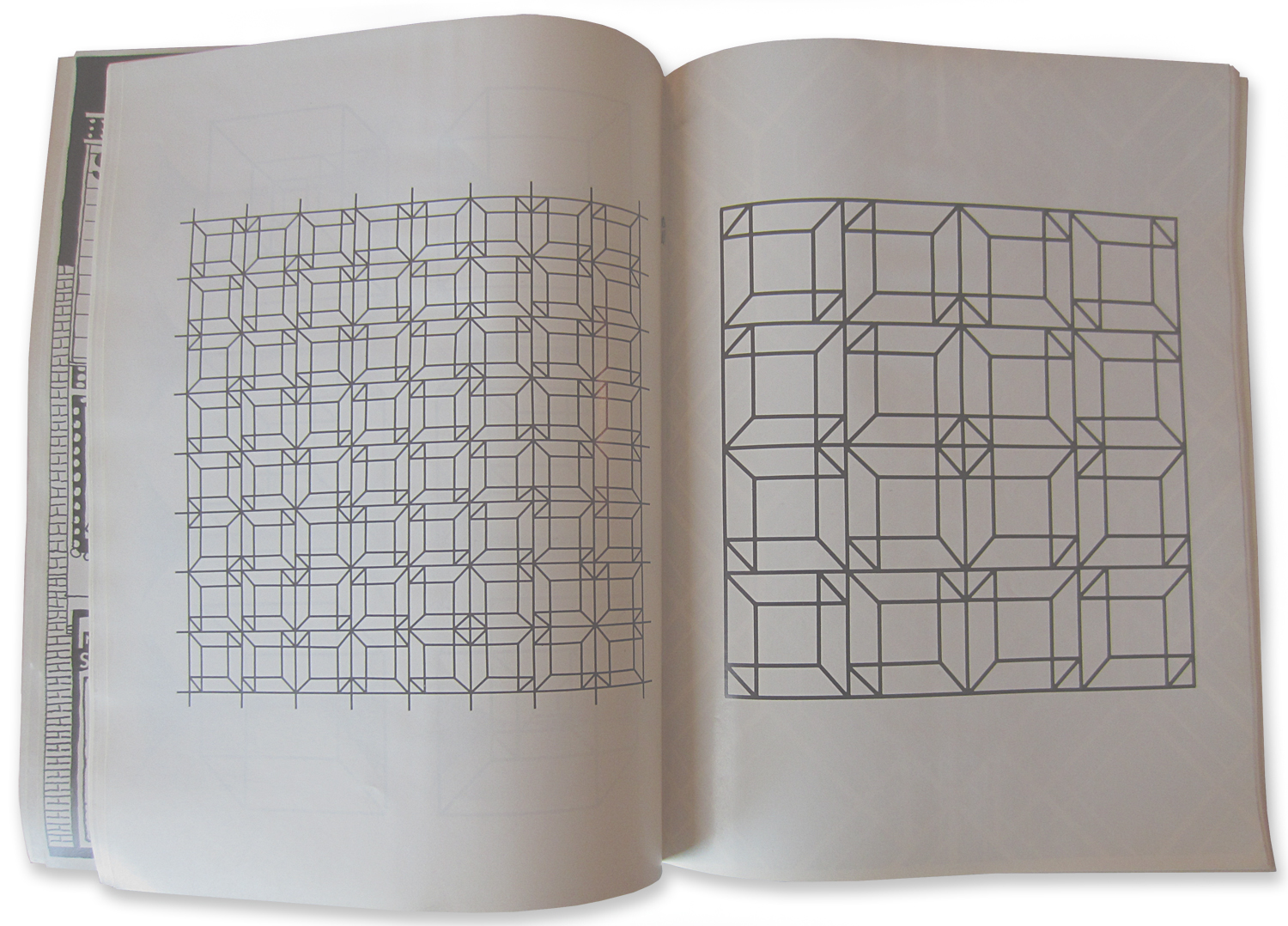
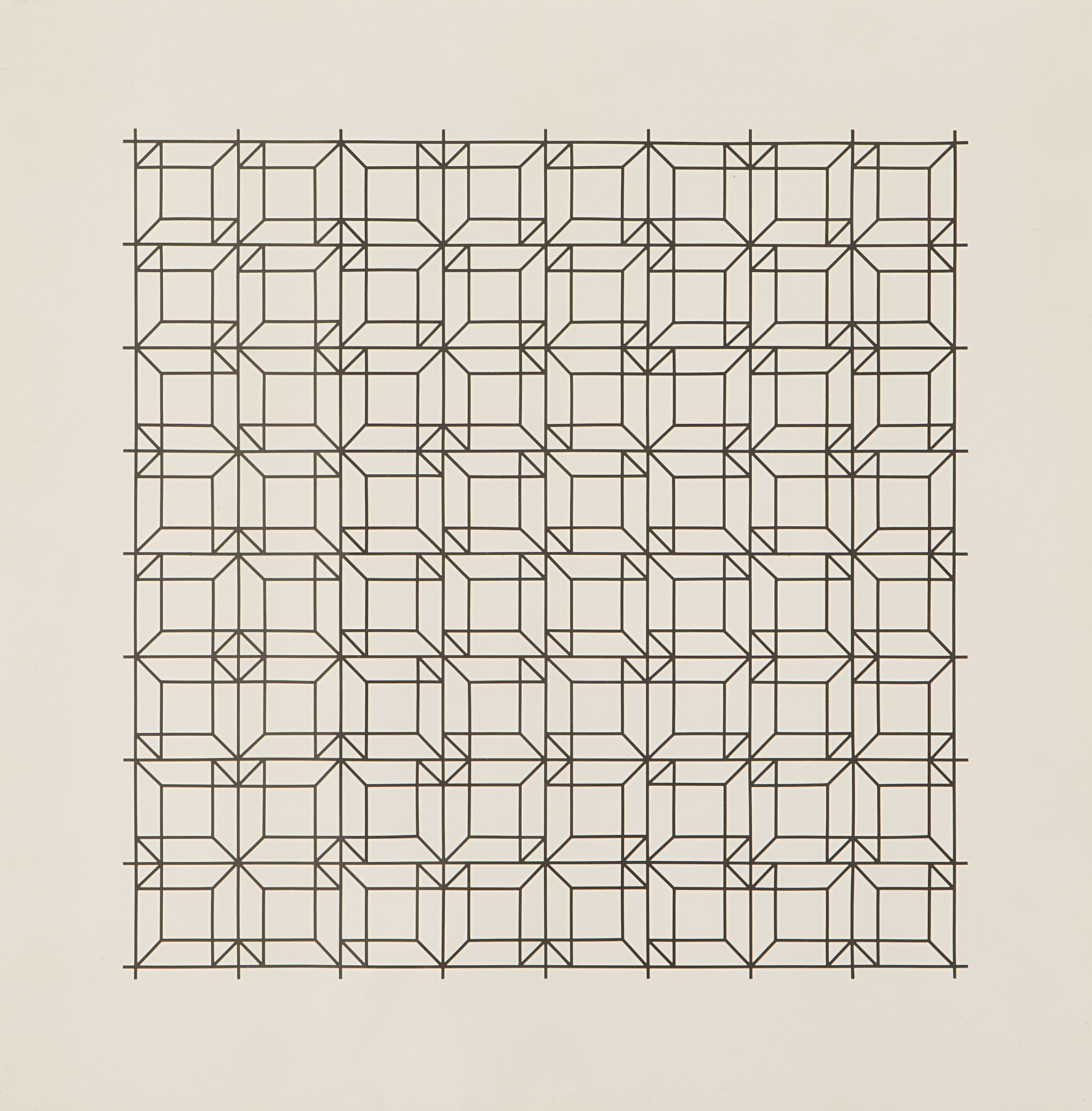
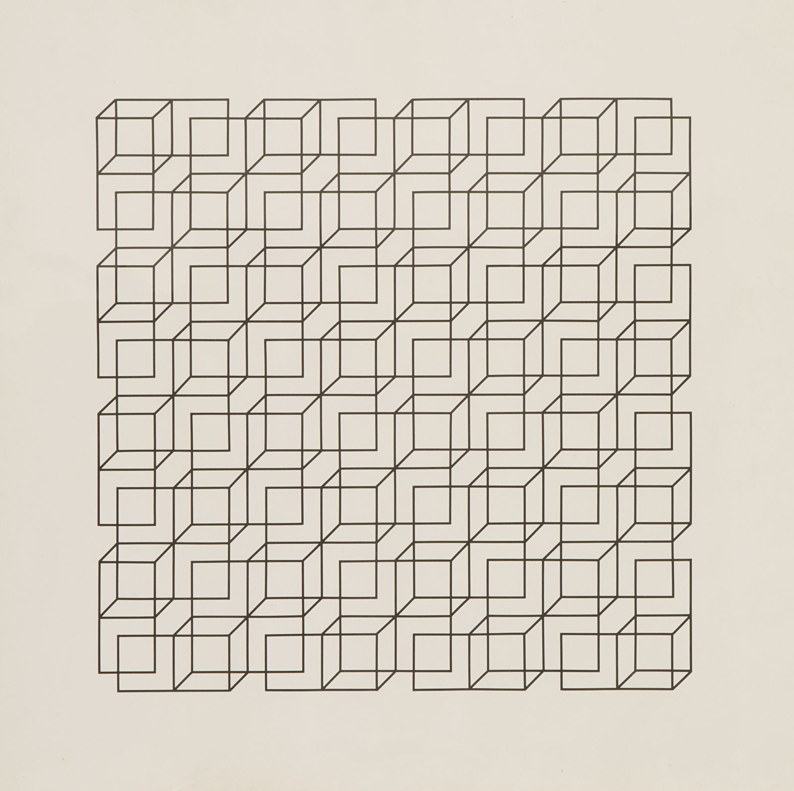
He was working as a graphic artist at a little three-person office in Kansas City, Kansas. That’s where he met his future wife, Susan Amato. That job gave him access to a lot of supplies: clear vellum, black line tape, colored cellophane, rulers, X-Acto knives.
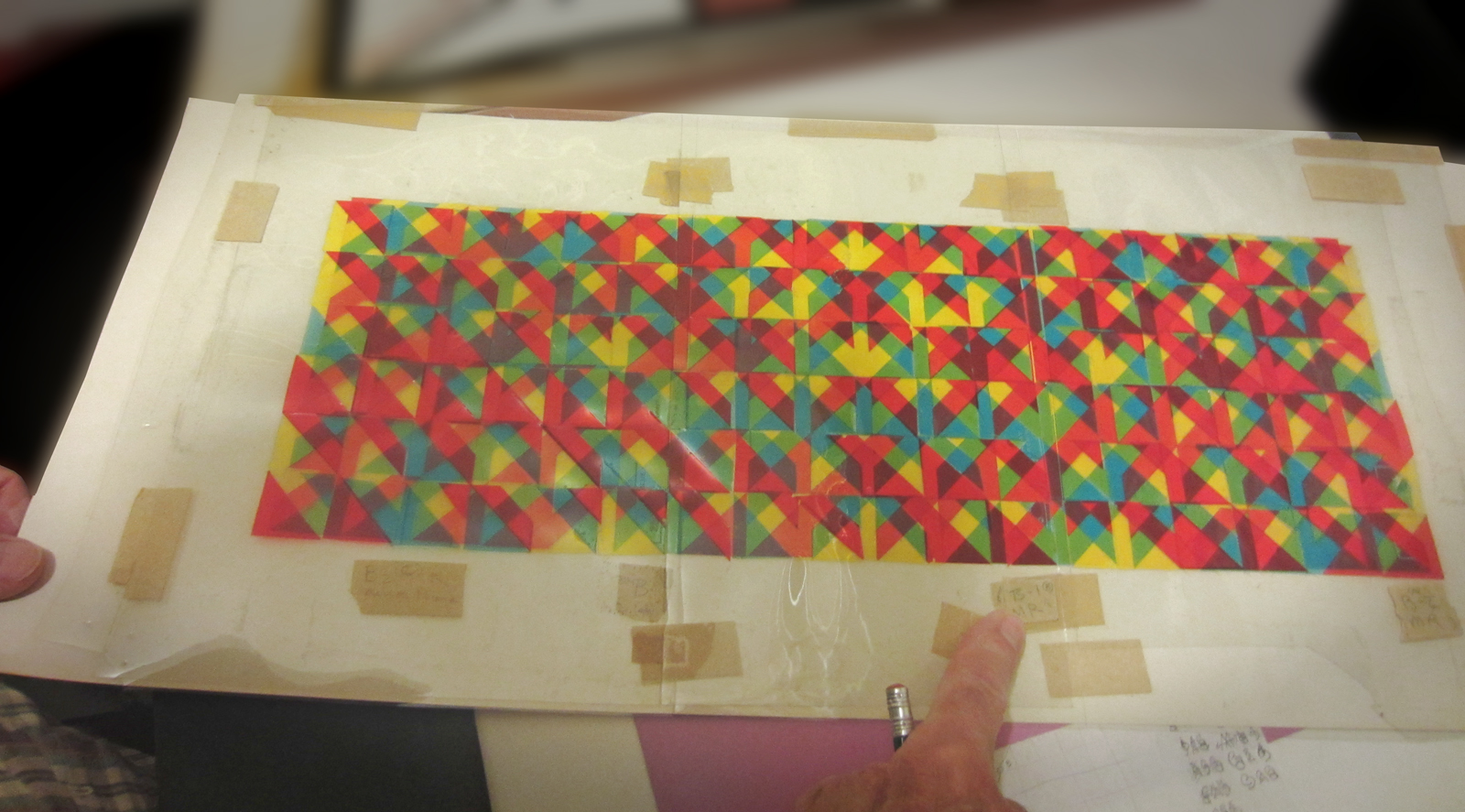
Some pieces were finished, like the Kenny Green prints, but some were color overlap plans for paintings. Today, you would just use a computer to map out the plan, but he had to make physical “sketches” or work it out numerically on grid paper. It got very complex very fast.
That’s when he transitioned from the Necker cube work to the POS era right?
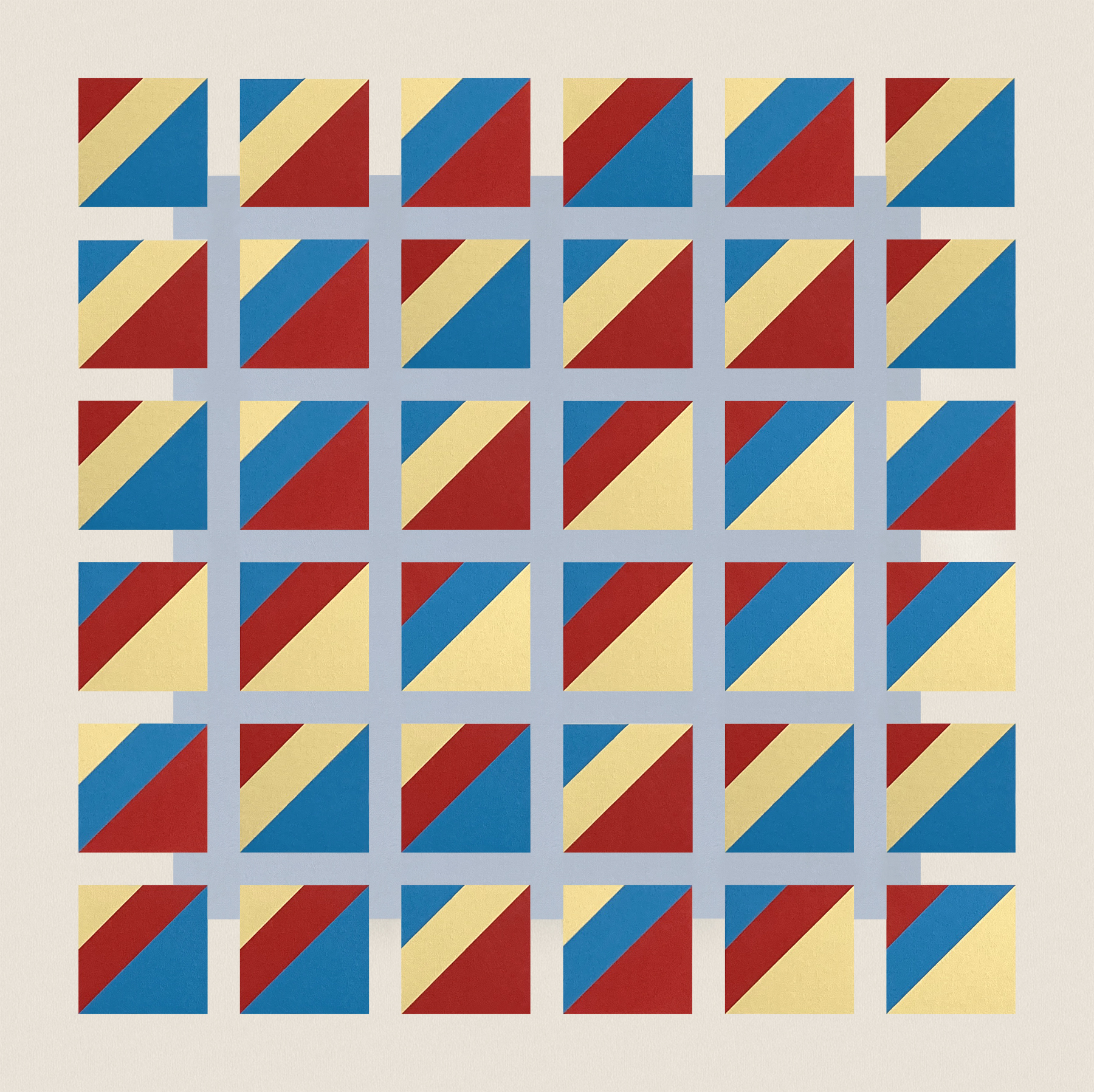
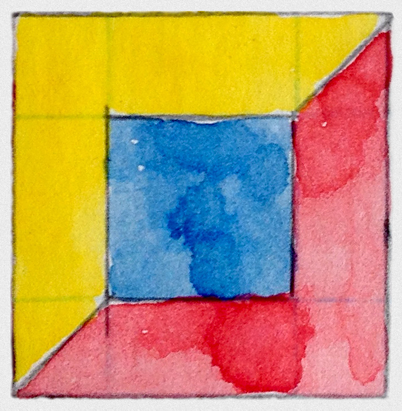
Yes, POS stands for primary overlap series, and he started it in the early 70s. It’s based on a simple square with 3 diagonal sections colored red, yellow, and blue. He said that he put them in that order because that’s how people say it: red, yellow, blue. Here’s a little painting he did later of the first one.
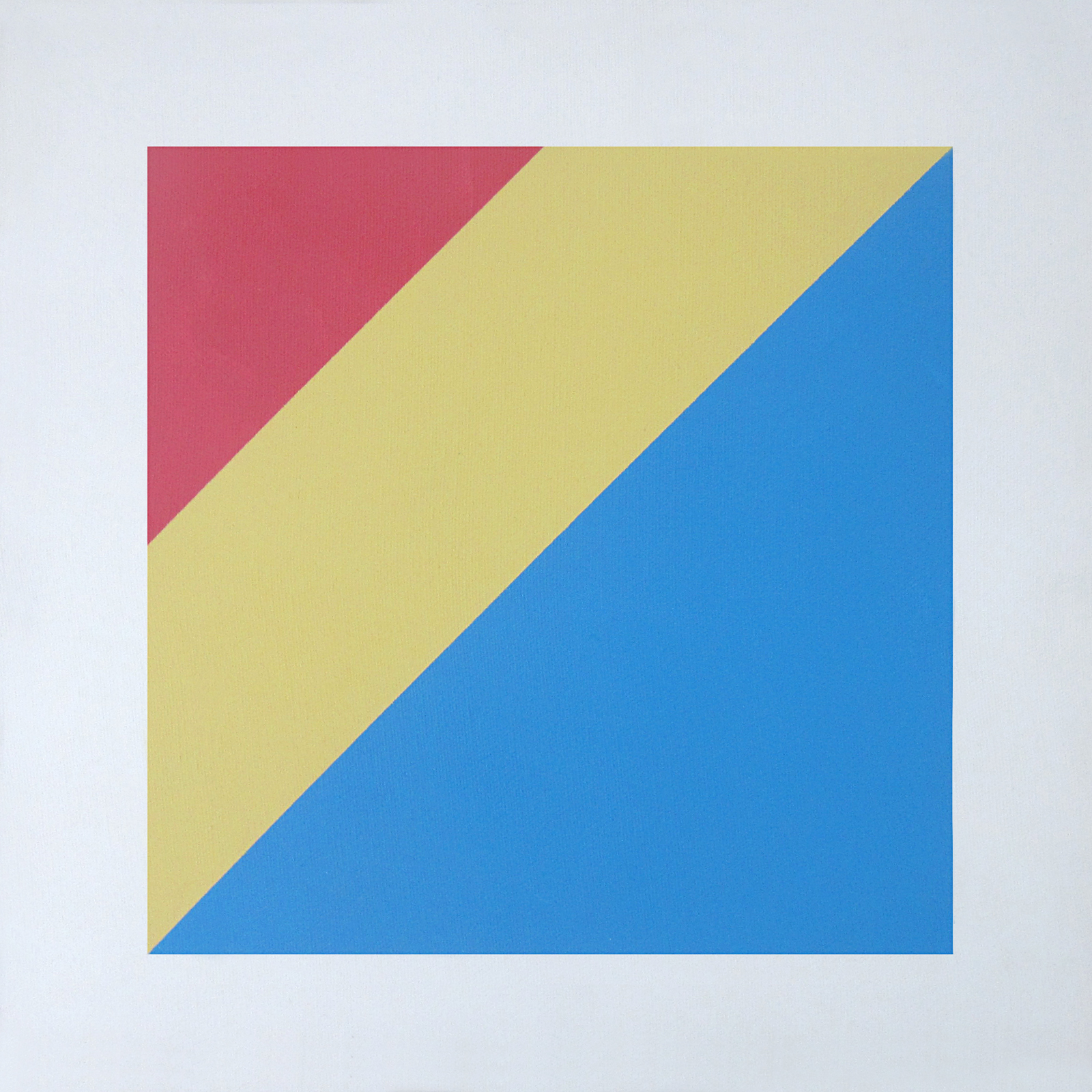
He did a number of variations on that theme, rotating the colors sequentially or randomly, making a grid of squares and sometimes putting spaces between them, and he experimented with different tones and values. (Perrin digs around in her digital photo file.)
Susan has most of the framed work, but I have some photos I can show you. This one is part of an “explanation wall for the 1979 ARC Process Exhibit. He said it was an “open grid form with colors assigned randomly (out of the hat) to form 36 units.” You can see that it has a blue square in the background. It’s the second of two.
And then came the secondary colors?
Right (gesturing to a painting on the wall). This one is one of the earliest from that series. It was done before he started mixing silica into the paint to tone down the gloss. I don’t have a specific date for it.

I notice you have it hung diagonally. Was that how he intended it?
No, I just like it that way!
Once we were looking at a painting, and I asked, “Which way is up?” And he replied, “ain’t no up in my world, I just deal with the space of the gods!” He got a kick out of letting the viewer make the decisions.
So, the next step was to offset and overlay these secondaries to get tertiary colors.
Yes, he overlaid and offset them again and came up with the 1-80 floats. He also called that set Macy’s Women’s Wear. They are absolutely gorgeous. So meticulous and so intelligent. There are four and if you look at the corners, you can see how he organized them, but how he kept perfect track of all those colors and balanced them out is beyond me. I would love to see all four displayed together.

There was also a set of six larger works. How did that come about?
Over the years, he completed six large panels. These used the secondary colors again, but they went on and on forever. Somehow, he got hold of some hollow wooden doors, and those became the panel series. He showed three in the 1979 show, and then finished the set later. He actually wanted to see them all shown together, and we talked with someone at the Spencer Museum at KU about exhibiting them. They agreed, but again, we just couldn’t deal with the art scene assertively enough to make it happen. He never got to see them all up at once, but I know he was particularly proud of that series.
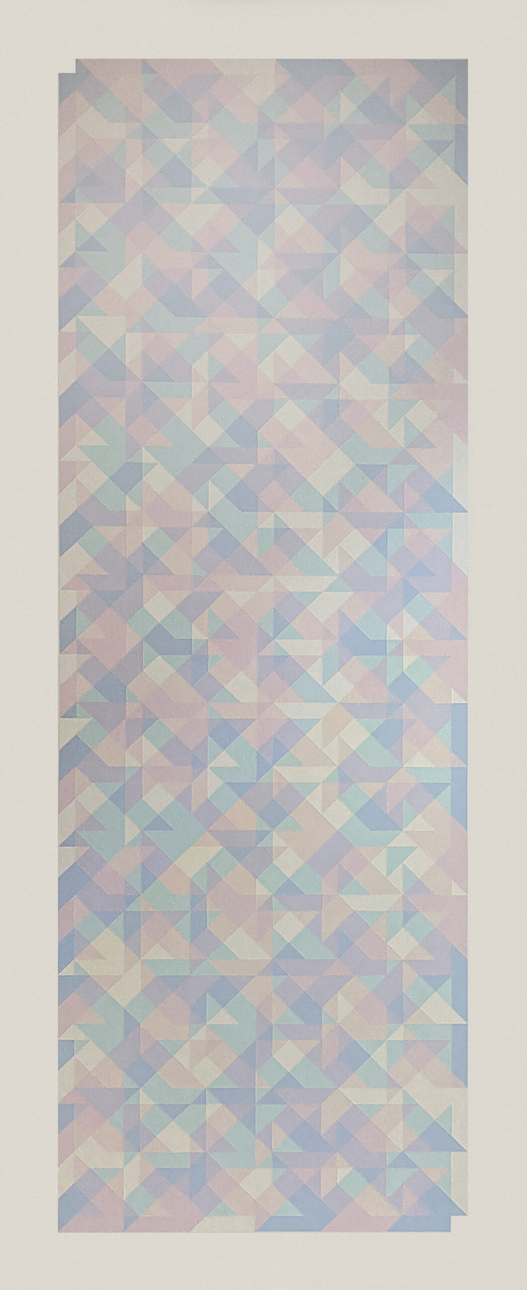
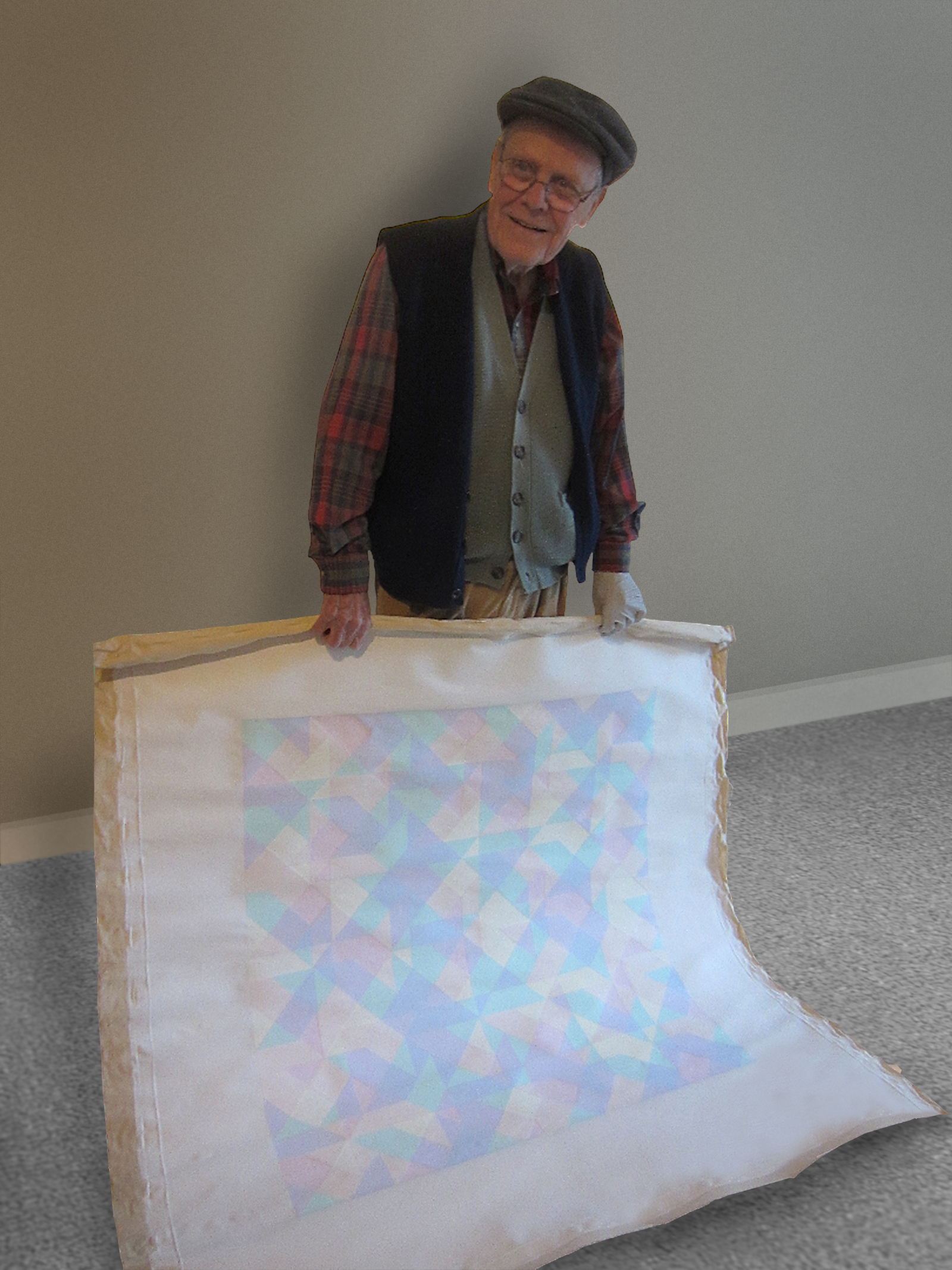
Some of these are so light. Do you think he was able to see or somehow appreciate distinctions between colors that most of us miss?
Absolutely. Once, he had a studio in the upstairs bedroom of a house at 3939 Genessee in Kansas City, and he said he knew something was wrong but he couldn’t put his finger on it. Finally, he realized that the roof next door was red, and it was affecting the light in his studio! What kind of person would notice that?
There’s one smaller square painting called “The Man without Qualities.” Do you have a picture of that one?
No, it’s really so light that it can’t be conveyed in a photograph. I guess some things are just meant to be seen in person.
True. So as he did these, he worked on iterations.
He repeated, he overlapped, he rotated the overlaps, he changed the tone, and he would enlarge or “blow up” various sections after that. He went from as bright and “juicy” as he could with saturated or neon colors to the other extreme with tints and shades so subtle that you can barely see the paint. He never painted straight from the tube though. He always mixed the colors so they were even.
Did he stay in sequence?
No, he worked back and forth, so just looking at the dates doesn’t really pin things down. Plus, he rarely wrote dates or titles on the back.
There are several sets of details from the pos series that could be shown as smaller independent sets. This one is an expansion of part of one of the doors. It’s called “Value Variation on White” and it’s one of two. The other has a different color border. More of a greenish tint.
He took the edges off of these, so you can’t tell where the first square was, and there are no cues to tell the viewer how the patterns were determined. I think this is my favorite permutation in the whole group. You can tell which way is up on these, though, because of the “flags” that occurred. He noticed that sometimes little flag patterns occurred here and there!
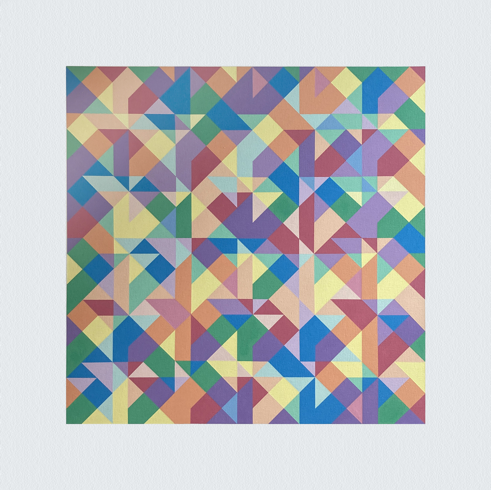

Yes, I can see a green one and a blue one near the bottom.
And another blue flag on the top right! That’s part of the fun of looking at these, finding the patterns among all the ambiguity. Here’s a smaller one where you can really see a purple and red flag at the bottom. There are two of these also. It was hung diagonally in the ARC Process Exhibit with the blue and green triangles at the top.
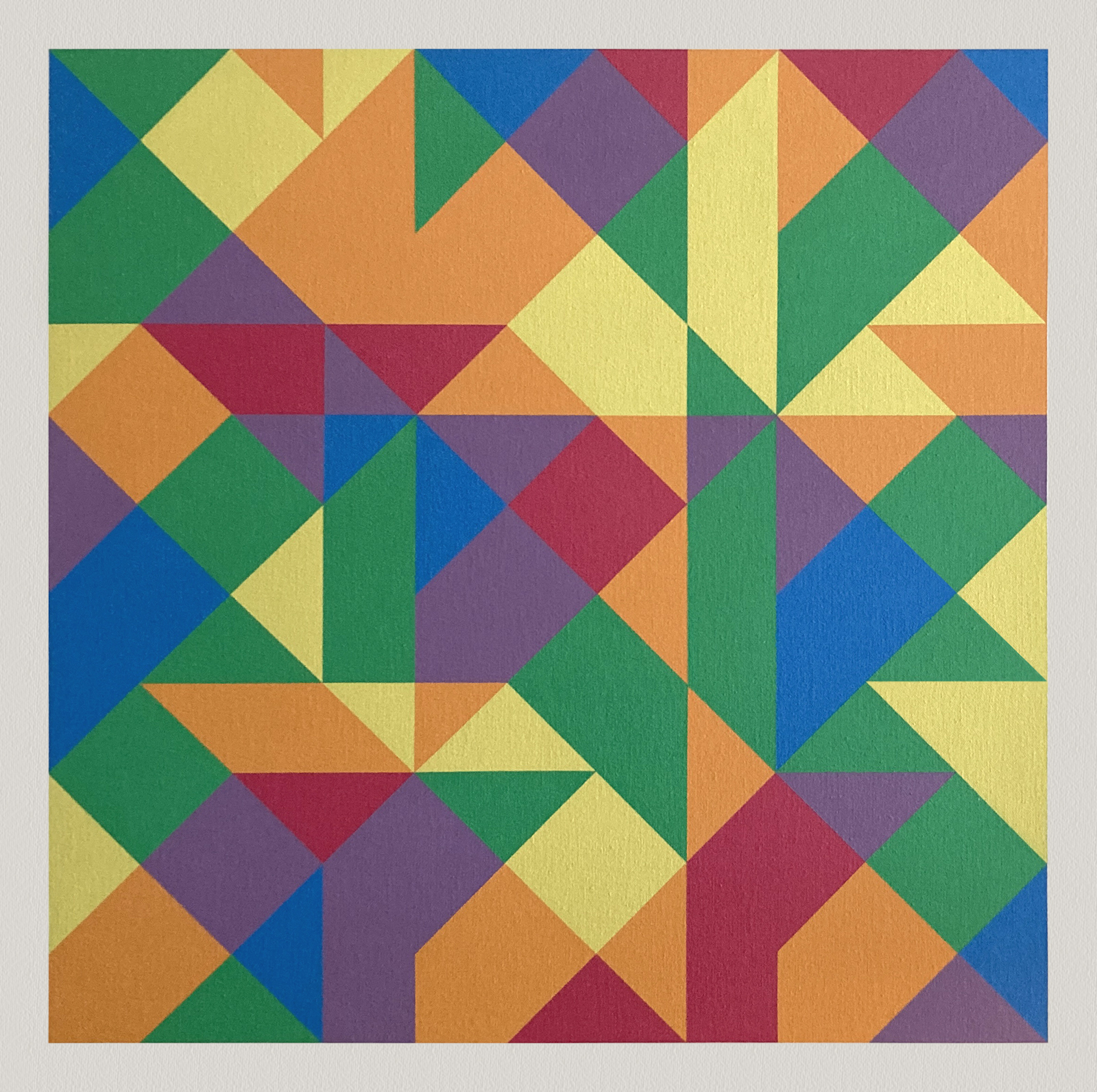
Were all the pos paintings in sets?
No, there were quite a few that can stand on their own. I remember a few that we sorted into the playful category of spiraling squares or squares spiraling.
Here are a couple from the Spiraling Squares series.
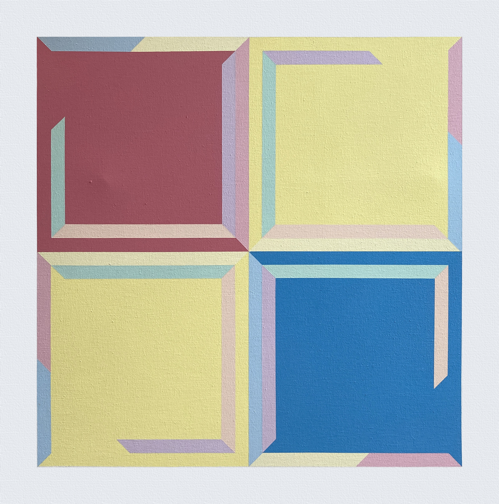

On this one he said, “It’s all about expansion, just a method of creating a square spiral, and it can go inward or outward, this one goes inward. The growth spiral is the relationship between symmetry and growth.”
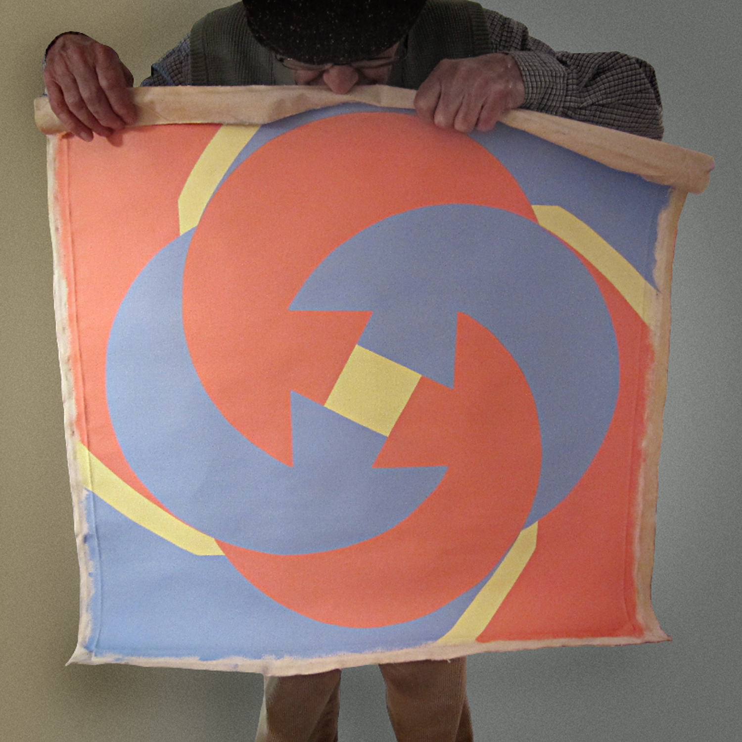
And the other extreme, these two called Square Spiraling basically involve just one square spinning?
Yes, it’s incredibly dynamic and easier to understand. It’s the basics of red, yellow and blue, but even that one had different versions.

Did he show any of the pos work?
Yes, he showed the process along with the first three panels in 1979 at the ARC gallery. It was reviewed by Donald Hoffman, art critic for the KC Star, who said his work was “astonishingly lyrical, given their origin in a procedure of systems and permutations.” Hoffman also said it was “as fine as geometric art can be.” The compliment made me proud, but I think my dad took it with a grain of salt.
That was the same show where there was some drama with a drunk guy who tried to walk off with one of the panels. My dad and Susan were there unloading the paintings and Susan saw the guy take it. They went outside and managed to retrieve it from him.
So, showing his art in galleries was really risky. With a set like this, if anything happened to one, the whole point would be ruined.
In 1985, he did show the other three panels at Virginia Hillix’s Bedyk Gallery, a safer location in Westport, Kansas City. That might have been the last time he showed his work.
But he continued to paint?
Absolutely. He kept working with grid systems even after his hands were shaking too much to really control the meticulous “tape, paint, let dry, peel tape” process that I watched for so many years.
That’s when he started on more painterly works on canvas board or plexiglass.
Did he explain his art to you? Did you understand his system?
I understood the basics, but each piece was different, and he did a lot of work but then just put it away, never explained or showed it. There was always a system though, and rules. Like which way he rotated an image and how he selected the color sequence. He had a little bottle with 6 colored pieces of painted canvas, and he would shake it and select a color randomly which informed his next move on the yodels.
Yodels?
That was what we called the ones he did that weren’t entirely taped.
Did he stop doing these geometric paintings when he started on the yodels?
No, he worked back and forth. The yodels were different because they didn’t have hard edge except where they overlapped. They were still on a grid, but it’s a lot more difficult to detect.
I’m guessing he changed over to a more fluid brush stroke because he was developing Parkinson’s Disease, and he was shaky, but I can’t imagine how that would have been easier than taping and painting such meticulous edges. I mean, those pos edges are perfect. No sloppiness at all. Even the brush strokes go in particular directions! It’s almost impossible to appreciate the detail in a digital image. You have to see them in person, in natural light.
How did he come up with the name?
The yodels got their name from Jimmie Rodgers’ Blue Yodel series. My dad was a big jazz and blues lover. The Bedyk Gallery show in 1985 called “Jumping the Blues and Other Primaries” was a nod to musicality and the connection between art and rhythm.
That’s partly why I referred to him as the Winner of the Glass Bead Game after the book by Hermann Hesse. I really think he went further than anyone in trying to connect his art with the way the world works.
These “yodels,” you said they were more of a continuous field style?
Perrin: A lot of his work dealt with continuous field, but it’s really apparent with the yodels. That’s why he only used simple frames or just painted over the edge of the canvas on a lot of his work. It urges the eye and brain to extend off the painting, to speculate about what would come next.
And there were rules for the yodels, too, right?
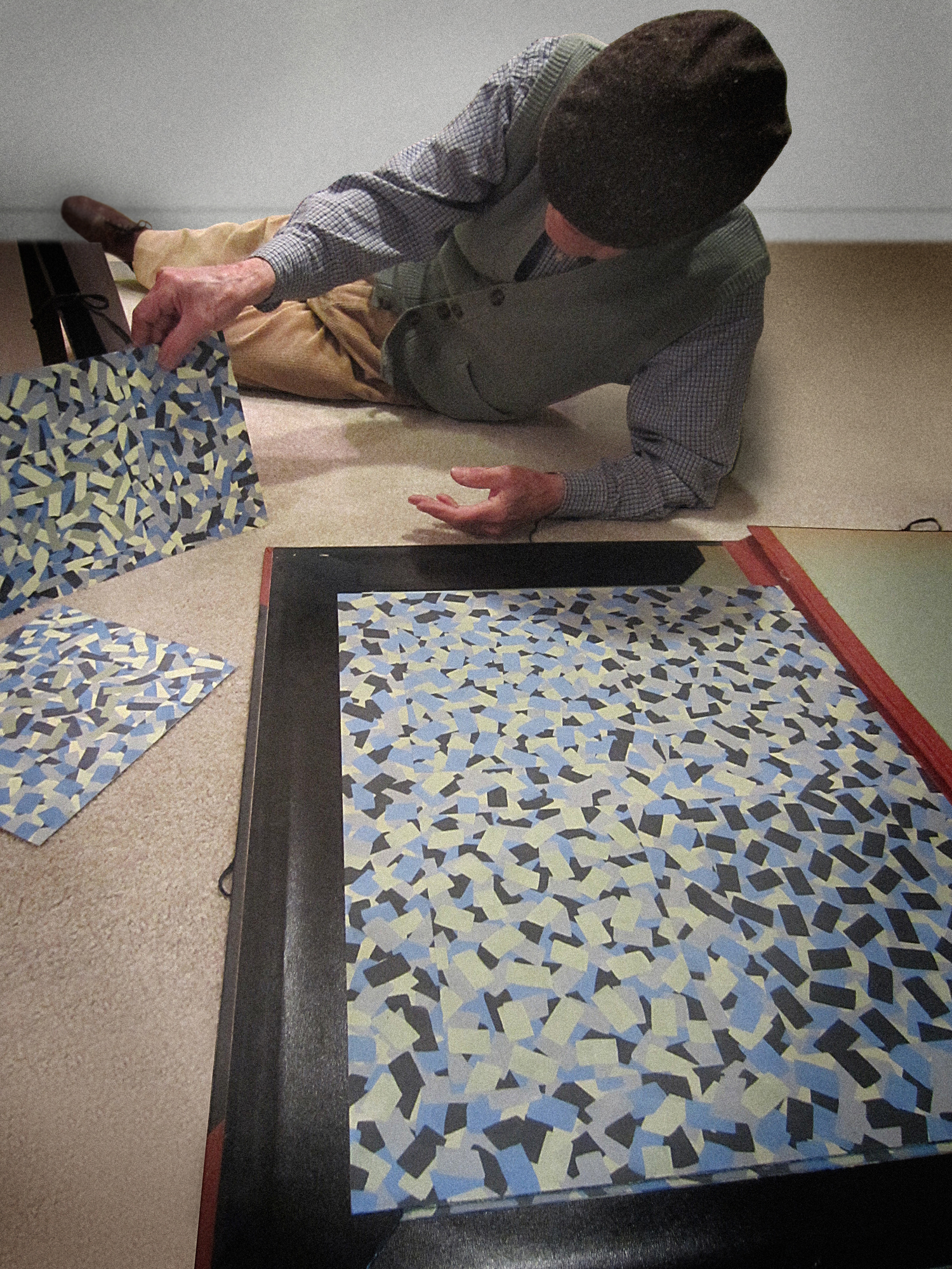
Absolutely. Even with the softer brush strokes, there were clear areas of overlap or size and hue variation. It was the same concept but in a different style, like this one. It’s a color study working with diagonally placed squares. You can see that there are two parallel lines cutting the image into 9 squares, but even the colors inside those lines rotate through the spectrum as they cross the plane. It’s mind-boggling!
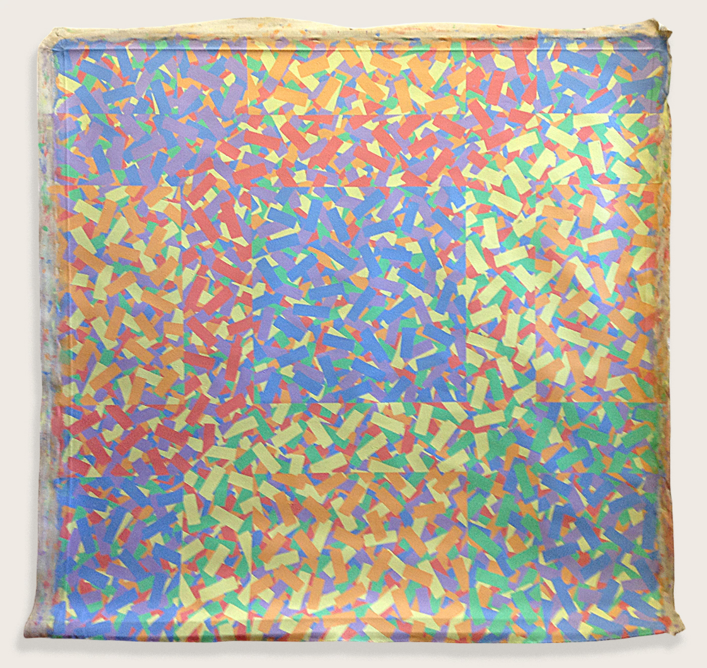
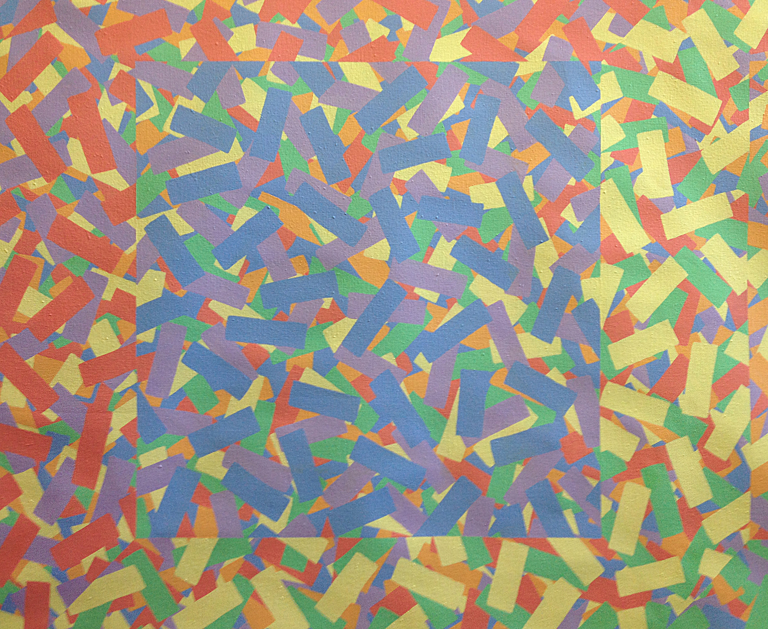
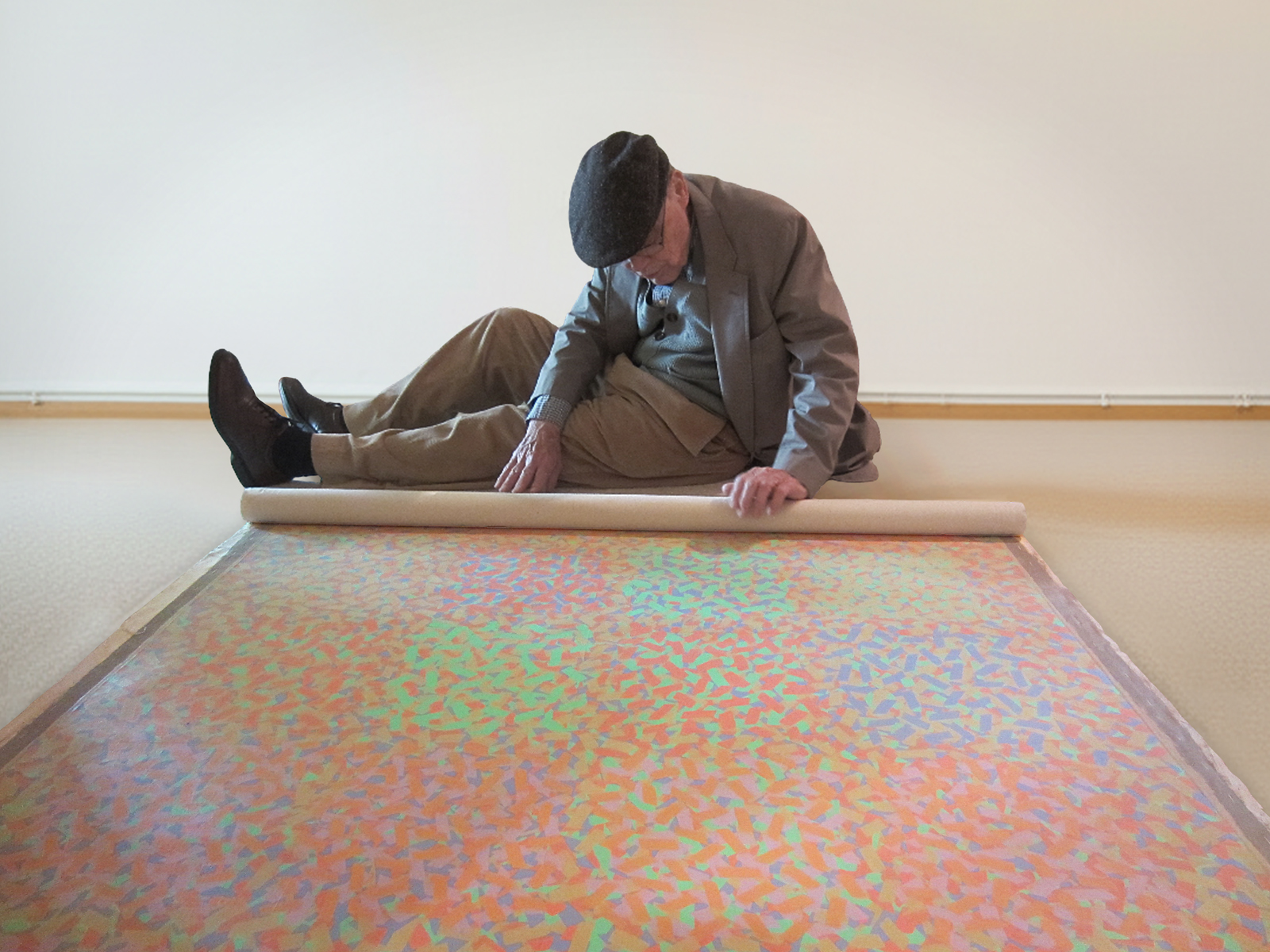
He had to puzzle over many of the paintings himself, even after we found little numerical keys on the backs. I have a little video here of him explaining the system for this one. [Perrin finds the video of Bob sitting on the floor next to an unrolled canvas.]
He explains, “so you have one grid which is rotating on a color system going this way, diagonally. Then on top of that you have these squares which are also the same color but are in a different position. There’s no top nor bottom, no … there ain’t no top, you’ve got two fields of activity, one starts down here and moves that way, just suggesting that it’s continuous field going on and on, then there’s this big square, same size as this…” He sighs and sits back from the painting and shakes his head. He laughs, “Now you see why I never wrote this shit down. That’s how I was thinking at that time…”
Were they all similar colors?
No, it was just like the pos iterations. There were different sets of yodels where he would work with a particular color scheme. Here’s one with the whole spectrum that he labeled “Mark Twain.” It has no reference to the writer. That was the name of the building that his studio was in in 92. You can see that he wrote a sequence on the back to show how he laid it out.
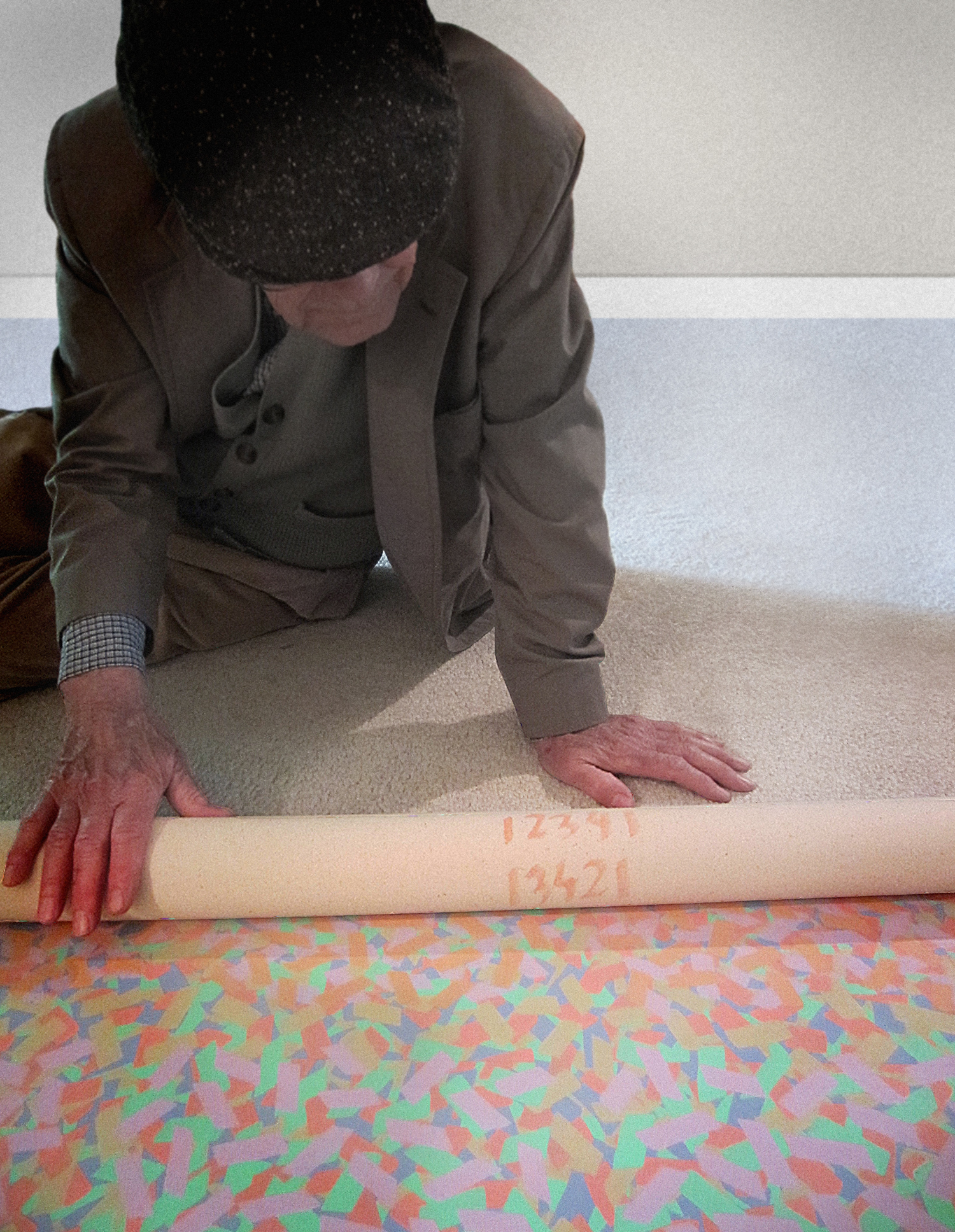
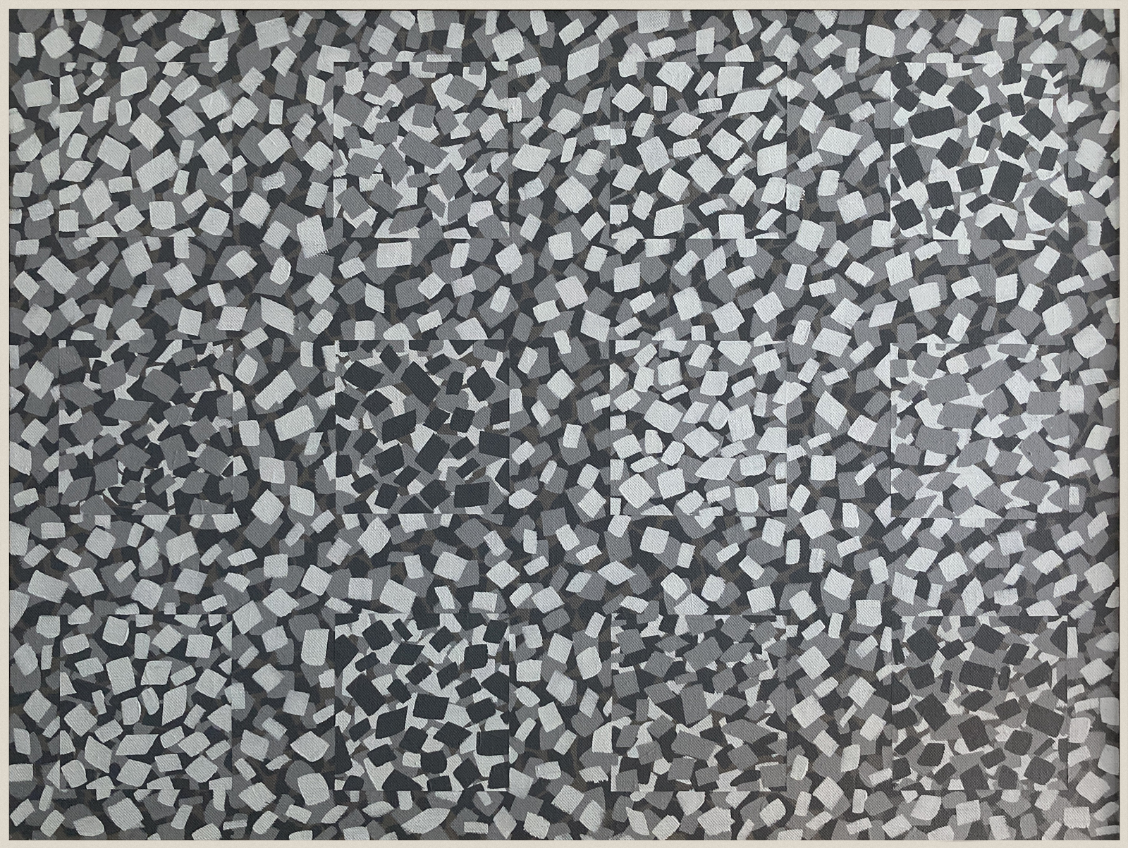
There were also some were only tones of black and gray or very dark muted colors. The darkest ones can’t really be expressed in photos, but there is this one with 12 squares that stands on its own. There’s a thick boundary between the squares, and then within that the layering of paint was part of the rotation.
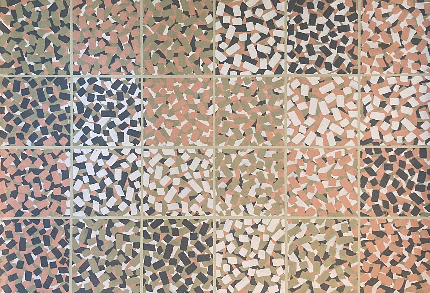
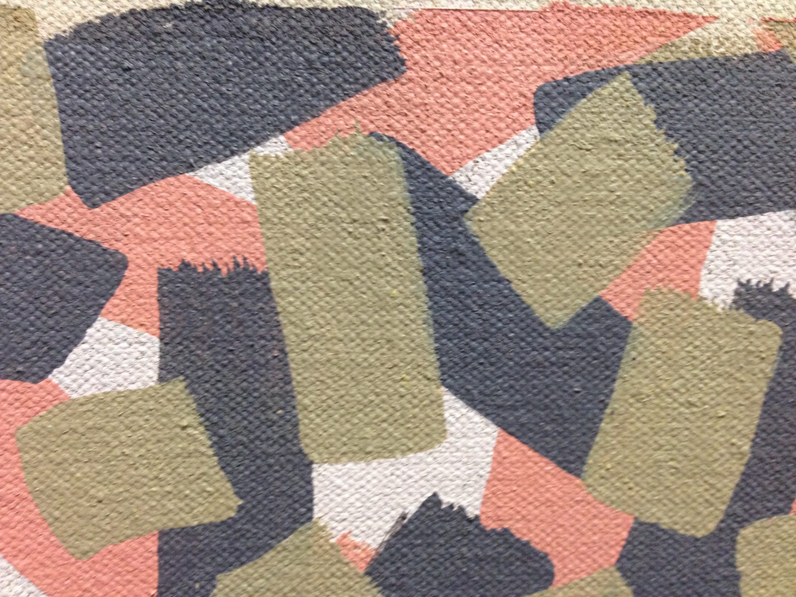
Here’s another one that isn’t part of a series. It’s orange with a 4 x 6 grid and very thin boundary lines that separate the squares. He said it was “24 ways that 4 colors can be placed on each other, but it’s all one color – orange.” The brushwork in this is really fun because you can see the edge of the strokes.
And these are rolled, never stretched or framed to show? It seems like once he got a series into his head, he had to do it. I mean, he was clearly driven to complete the work. To…
…see how it comes out. That’s how he phrased it. One time I told him that someone asked me why I made art if I didn’t want to sell it. He said, “Tell her you do it to see how it comes out.”
So his work wasn’t intended to provoke a response like Op Art. I mean, it seems like much more than that.
Right, I actually recorded us talking about Op Art in general, and he described his work in relation to it. [Robert Blackman’s voice fades in] “…it’s that ambiguity that must be established somehow, when you’re just making models of an idea, and these aren’t models of an idea, these are actual in-house in-head illusions, you have to see them, to understand that, and that’s different from what most Op Art is.”
So, he just needed to see what was going on in his head. I know he was really interested in the psychology of perception, not just the mechanical/visual aspect.
Yes, and after looking at the paintings, I understand why he was so driven to see them on canvas rather than carry them around in his brain.
Do you have a favorite of these yodels?
Yes, it’s called “Malta Cats.” He painted it after he and Susan travelled to Mexico for a vacation in 2000.
I managed to get a recording of him talking about it later. Here it is.


[Robert Blackman’s voice] “When I went to Mexico and stayed with that artist… [architect Francisco Robles] he used to do abstractions of various places he’d been and when I came home, I did one about Malta. It’s about the cats on Malta. The idea is that there are no 45-degree angles. Your eye tries to make them but they aren’t there. I wanted to make the image flat even though there are overlapping parts. It’s Greek colors plus blue and green, blue for the sea, and green for … I don’t know, trees?”
“I had to have some green because everybody’s got a little green on their island, even if it’s not much… and the blue was for the water and the sky, and the rest of the colors were cat colors or stone colors, but that’s neither here nor there.” (Perrin) “So is it just random?” (RB) “Well, no, it is but it isn’t. It is not random in that it plays a game of confusing front and back without using obvious divisions like 45-degree moves. Perrin: You avoided… (RB) “…except occasionally just to screw everything up” [Both laughing] (Perrin) “There’s one I see very clearly and it doesn’t overlap.” (RB) [chuckles]
So, he broke his own rules?
Why not?
Did he spend a lot of time in Greece?
Yes. He traveled whenever he could. Being an art professor, he and Susan travelled every summer, and he even took a one-year sabbatical so they could live in Paris in the mid 80s. Susan was working on her PhD in Art History during that time. Over the years, they traveled widely. I know they visited England, the Netherlands, France, Germany, Switzerland, Austria, Italy, Spain, Portugal and Mexico among other countries – always with an eye for enjoying the artwork and architecture.
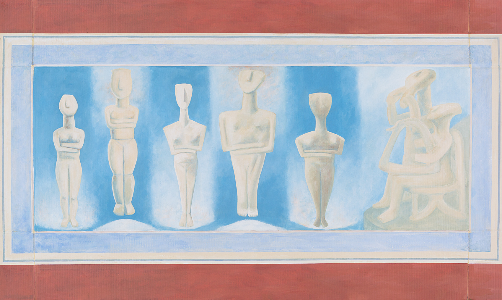
He did have a special affection for Greece though. He even tried to learn the language at one point. It inspired a really large painting of Cycladic statues on cardboard. It’s very different from his other work. I think he appreciated the clean lines and simple colors of Greek art.
Are there other paintings that stand alone like these?
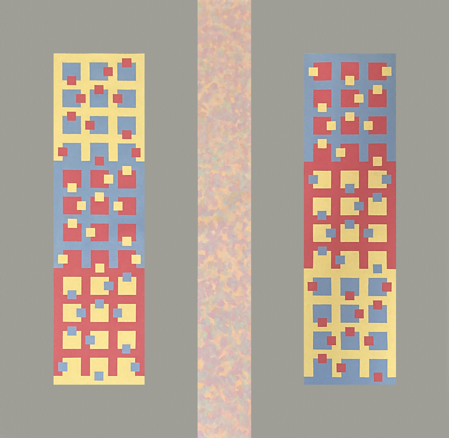
Yes, there are quite a few that are unrelated to the pos series or the yodels, such as “He said, she said.” It’s a conversation between two friends, a married couple he knew. I love it because it breaks the rule about not interjecting stories or ideas into the work. It’s actually very expressive. He showed it to me and said that it was “the difference between the way men and women talk.” The red, yellow, blue squares show the man’s part, and the multi-colored stripe down the center is the woman’s.
Not to change the subject, but isn’t there a bit of a disconnect between the kinds of art he was drawn to and his own art style? He distrusted societal systems, but he embraced systematic painting.
I always wondered about that. He loved the Gothic cathedrals of Europe, but he had no use for religion or iconography in his own life. I think that he was able to appreciate all kinds of painting and architecture, especially those of the Italian Renaissance.
I remember once he was showing me a painting and he joked, “See! I could have been an artist.”
I said, “If you’re not an artist, what are you?”
He replied, “I’m a painter.”
So he was drawn to the craft more than the subject matter. That makes sense in a way, to want to understand both ends of the spectrum.
He could appreciate both ends of the spectrum without over-emotionalizing any of it.
Right, he preferred to think of himself as “The Man Without Qualities,” from Robert Musil’s book, able to perceive the world without inflicting his own feelings on it. Part of the less is more school of thought. He used to say, “If it isn’t better left unsaid, it is probably not worth mentioning.”
He also loved the poetry of the Greek writer C. P. Cavafy, and you picked one of his poems to read when you scattered his ashes.
Susan picked that one out, and it was perfect. He specifically said he didn’t want a funeral or pageantry. “No prayers, no purple, no cheating,” I think is how he put it. So, we met with two of his oldest friends TM Stephens (Mike) and Bob Scagliotti when we scattered his ashes, and Bob read a modernized version of the poem. It’s exactly how he lived his life.
As Much As You Can (1913)
And if you cannot make your life as you want it,
at least try this
as much as you can: do not disgrace it
in the crowding contact with the world,
in the many movements and all the talk.
Do not disgrace it by taking it,
dragging it around often and exposing it
to the daily folly
of relationships and associations,
Till it becomes like an alien burdensome life.
So now, there is a body of work that has rarely been shown or even seen by the public. Where is his art now? What’s the plan?
It’s mostly split between his wife, Susan, and me. A few paintings have been sold or gifted. We are working on a Catalogue Raisonné and trying to find a safe home for the collection.
What about donating the artwork?
That’s a possibility. He did contact his alma mater, Pittsburg State University, about donating a piece, but he wasn’t comfortable with where they wanted to display it. It wouldn’t have been in a protected area.
We’ve also approached some local museums, but the process is slow, and as you know, unknown constructivist artists often fade into the background.
There are around 180 paintings: some framed, some rolled, various sizes, and there are several boxes of ephemera from that time as well.
Difficult to find a home for his legacy.
Yes. The art world is a slippery slope for someone who basically spent his whole life avoiding interaction with the art world. It’s also a challenge to put a narrative on someone who resisted stories. Promoting or marketing the work really just wasn’t his calling. Now that job is left to us.
Yes, as the embodiment of the unknown constructivist, I can certainly understand his reluctance to deal with all of that. But still, there are many who do appreciate this kind of work, and their numbers are growing.
Absolutely! I’m not as reticent as he was about trying to find a place for his legacy. I’ve been able to find like-minded artists and appreciation in Turkey, Poland, Hungary and Costa Rica. During COVID, it became more common to send digital versions of work, so that allowed me to show his work posthumously.
I was able to include his work in Erdem Küçükköroğlu’s virtual “Konstrucktiv ist” exhibitions (8, 11 & 12 in 2020 and 2023). Also, in 2025, K28 Gallery in Budapest showed a video I made during the ARC 55th Anniversary Exhibition. It was a montage titled “Winner of the Glass Bead Game.”
So you’re getting his name out there now. Are you willing to sell his work?
I’m open to it, but mostly I want it to be protected and shown in context so it can be understood for what it really is. It’s so delicate and beautiful, and the world is so… rough. People should see it.
So you have hope that you can find a place for this collection?
I do. Especially now that Artificial Intelligence is redefining the whole concept of art, and there is an insane rush to create ever more saleable content. I still believe there is room, and not just room, but a necessity, to give people a chance to experience simple colors and lines and brushstrokes – art that doesn’t tell you what to do or how to feel.
I mean, his work isn’t the background for anything else. And it isn’t the foreground either. It just is.
I agree, and I hope that you can find a place for his work in the great museums and collections of the world. People need to understand that some art is just there to allow them to think, not to tell them what to think, but to ask more questions than it answers.
Absolutely. Doing this work helped him pin down the corners of the chaotic world, and really, that in and of itself is enough.
Part Two
At this point, we needed a little break, so Perrin brought out a typical American lunch: coffee, chips, and sandwiches followed by more coffee.
TV chewed quietly for a while, then sat back and said:
I can’t help but notice your own work throughout the house. Can we talk about Bob’s influence on your work now?
Sure!
You’re an artist, but you’re also a writer and a teacher. How did growing up around all these ideas influence you?
Well, I definitely have a very strong preference for process over product, and I’m really interested in self-organizing systems. I see the world that way. I always wonder about who leads and who follows after a big event and how that happens. I can apply it to politics, office culture, teaching, relationships… it’s everywhere if you notice it.
Did you study those theories in school?
No, I majored in English as an undergrad, and I took a lot of art classes, but it wasn’t on my radar then. After college I worked in a camera store, and then got a job at KU Medical Center as an ophthalmic photographer, so I worked with retina specialists and neuro-ophthalmologists. One was Dr. Martin Mainster who did work on chaos theory and fractals as well as early lasers. I had the honor of helping him illustrate his articles with retina photos. It’s fascinating to see how one small change in those complex systems can have a catastrophic effect on a person’s vision.
And your dad could appreciate these images partly because of his interest in the golden mean, in those natural biological patterns.
Exactly, he was interested in how the patterns occur naturally, but also in our psychological perception. We talked about it often. He introduced me to Oliver Sacks’ book “The Man Who Mistook His Wife for a Hat” and I was hooked.
I was able to return the favor by showing him Aldous Huxley’s 1942 book “The Art of Seeing.” Huxley talks about at how we “see” and construct narratives physically, but he also focused on the concept of perception.
And after working for eye doctors, you started teaching?
Yes. I got a master’s in teaching English as a Second Language (TESOL) so I could teach at the college level. During my studies, I realized that the “soft science” of pedagogy was borrowing ideas from the “hard science” concept of chaos theory, and I began to explore the topic.
I ended up writing a graduate paper about the topic. A version of it was published in “Complicity” as “A New Science Look at Negotiating Curriculum and Classrooms.”
Does that still inform your teaching style?
It does. I pay a great deal of attention to structure when it comes to classroom dynamics. Too much structure kills creativity, but too little makes for a chaotic experience. A good instructor has to ride the wave between those two extremes if students are to feel comfortable learning.
And what about your own artwork?
I also enjoy working with grids and iterations on a theme, and like him, I tend to resist forcing my own ideas on the viewer. But unlike him, I’ve dabbled in a lot of different mediums.
What mediums have you worked in?
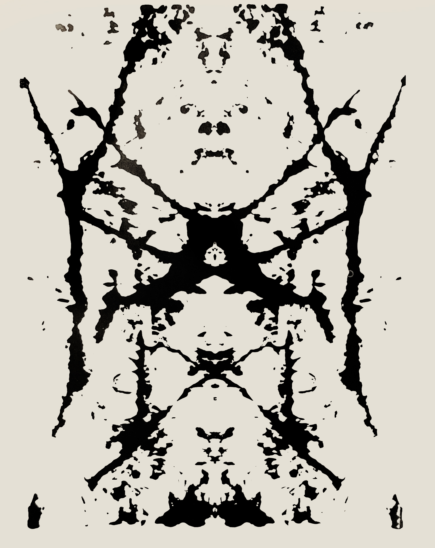
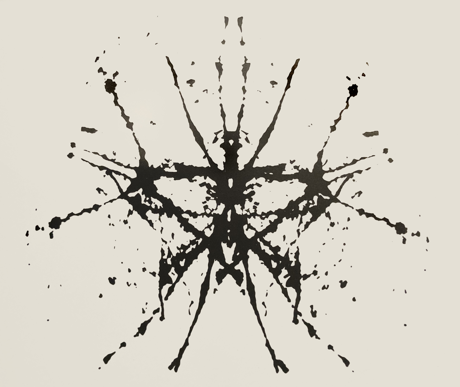
Mostly collage but I did a lot of sketching in the 90s. Then I discovered Photoshop and learned how to manipulate my drawings digitally which allowed for multiple iterations of a single image. The ophthalmic photography job provided a darkroom, so there was a phase where I took a lot of 35mm pictures and even did a little series work. I remember I had printed a couple of high contrast images of a tree on clear plastic and accidentally overlapped them. When I saw that I could create an infinite series of images from that, I knew I had to do it. I called it the Inkblot Series.
I also got into hot glass for a while. In 2010, I moved to Davis, California and learned about flameworking at their Craft Center. I realized later that the chemistry in glass was similar to the rules of ceramic glazing that my dad understood, so we had some nice talks about how to achieve certain colors.
Do you sell your work?
Not usually. I prefer to give it to people who appreciate it. I feel like marketing leads to creating a “brand” which kills creativity. It takes all the fun out of it.
And now?
Right now, I’m inspired by rusty metal and bits of colorful trash. I remember my dad and I used to go for walks in Kansas City and pick up odd things. Then we would take them home and I would create little masterpieces. Now, if I find a rusty washer or an old piece of fencing that looks like a grid, I’ll snatch it up and take it home to work on.
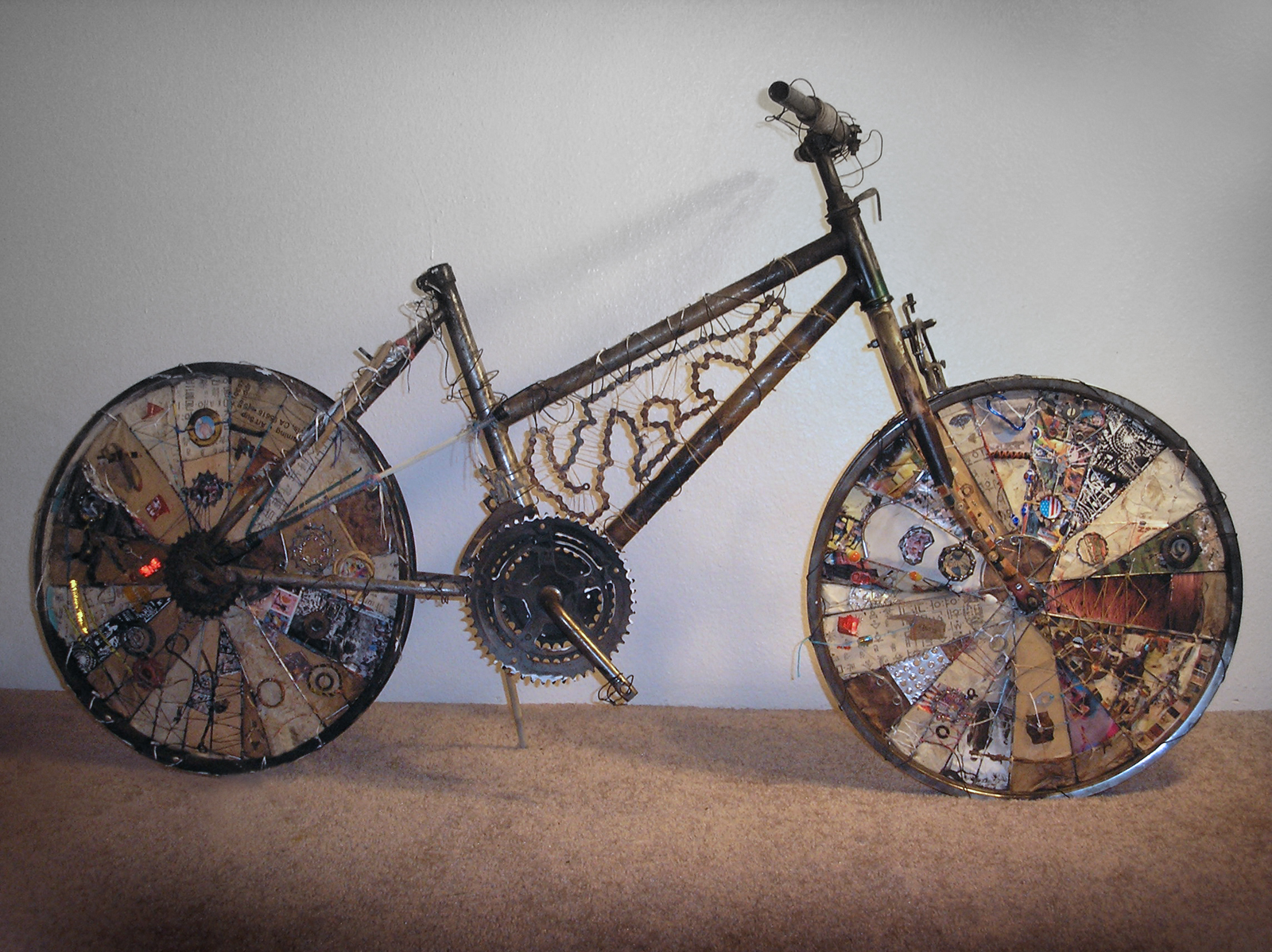
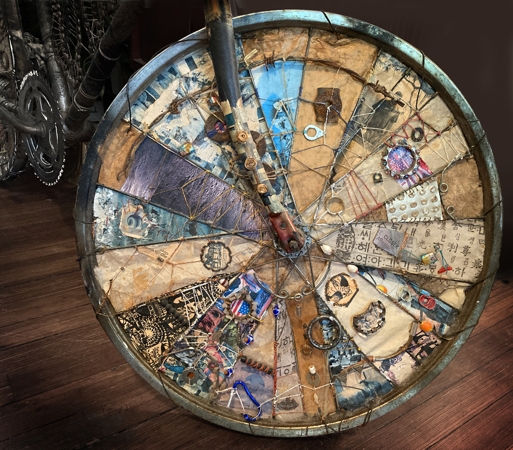
Tell me about the bicycle assemblage.
I found a burnt, rusty bike in a fire pit in California at the Bike Church. That’s a place people can go repair their bikes and get free help.
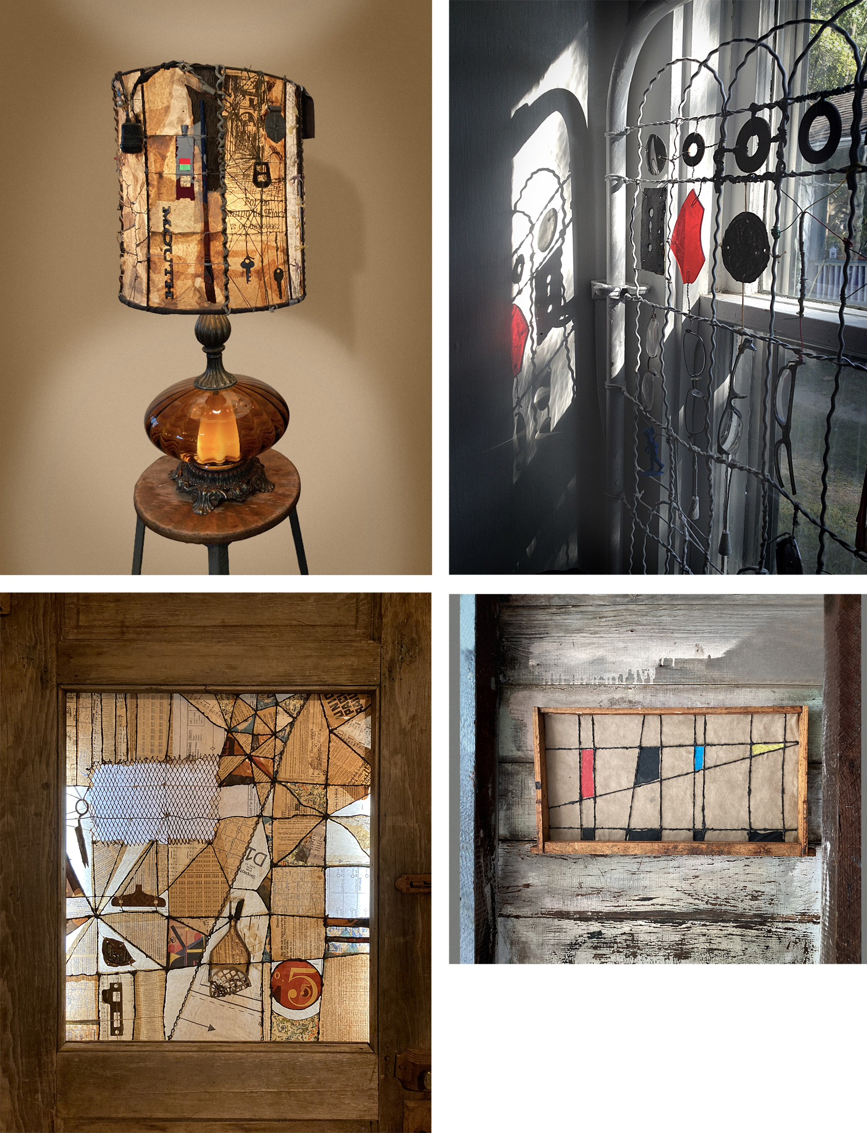
I asked if I could take it home and they let me. I attached other bike-related trash to the frame and eventually ended up creating little paper collages inside the triangles between the spokes. I had already done a lamp like that, and recently I finished a door, a window and a gate.
I’ll use anything that lends itself to a grid or geometric frame. Oh, and I used some old beehive frames as well. I picked up beekeeping in California too. Now those little guys have structure!
So, your work isn’t really about expressing yourself then.
Right, I just fill in the blanks, and I let the viewer decide what the piece is about based on their perspective. I mean, the bike is called “bike” and the door is called “door,” but I don’t mind if the project takes on a story as well.
What about the project with the birds? That one does have a specific meaning.
It does, but even without the story, the images can be appreciated.
I called it “49 boids.” It came from a photo I found online of some birds circling above a vigil for the victims of the Pulse nightclub massacre in 2016.
Someone at the vigil saw the birds circling above and took a picture. Then they realized there were exactly 49 birds in the photo, and there had been exactly 49 victims.
Now, this isn’t a narrative that would have inspired my dad. But for me, I kept looking closer at the photo, and I saw that each bird could be enlarged into its basic geometric elements. Each one was beautiful and unique, like each person who was killed at that club. Some were flying alone and some in groups. It seemed like a sacred task, to bring out the possibilities in each bird.
This is where my dad’s aesthetic came in. As I enlarged each one I decided on rules. For instance, I didn’t add any elements or change the lines. I only abstracted or enhanced the images by toggling through contrast, saturation, or tint.
In the end, I had the 49 images as well as multiple iterations of each bird. These were featured in a 2023 in a book called “Discursive Geometry & More” edited by Mark Starel.


Did Bob live long enough to see these?
Yes, and he appreciated the final product. What’s not to like about all those crisp corners! I think he might have been a little baffled by the story line and the inspiration, but I’m sure he recognized his own influence.
Maybe I’m just a less intense iteration of him in the end. In chaos theory it’s called the “darkness principle” – the fact that you can’t ever make an exact duplicate of anything, and you can’t step in the same stream twice!
[Smiling quietly] Yes, I think that’s true. But that doesn’t seem like such a dark thing. Every iteration just adds a little chaos and complexity to the mix. It keeps life interesting.
At this point TV began to gather up his things and start the process of the long midwestern goodbye that he had learned from his Kansas City comrades. (If you aren’t aware, it begins with slapping both hands on one’s thighs and saying,
“Well…”
As they moved toward the door, TV promised to write or call or do one of those things that we all say but never really follow up on and headed out to his nondescript car, in his nondescript coat, and with his nondescript briefcase of no particular color.